# Svelte Reorderable List
A simple and accessible reorderable list component for Svelte 5.
## Features
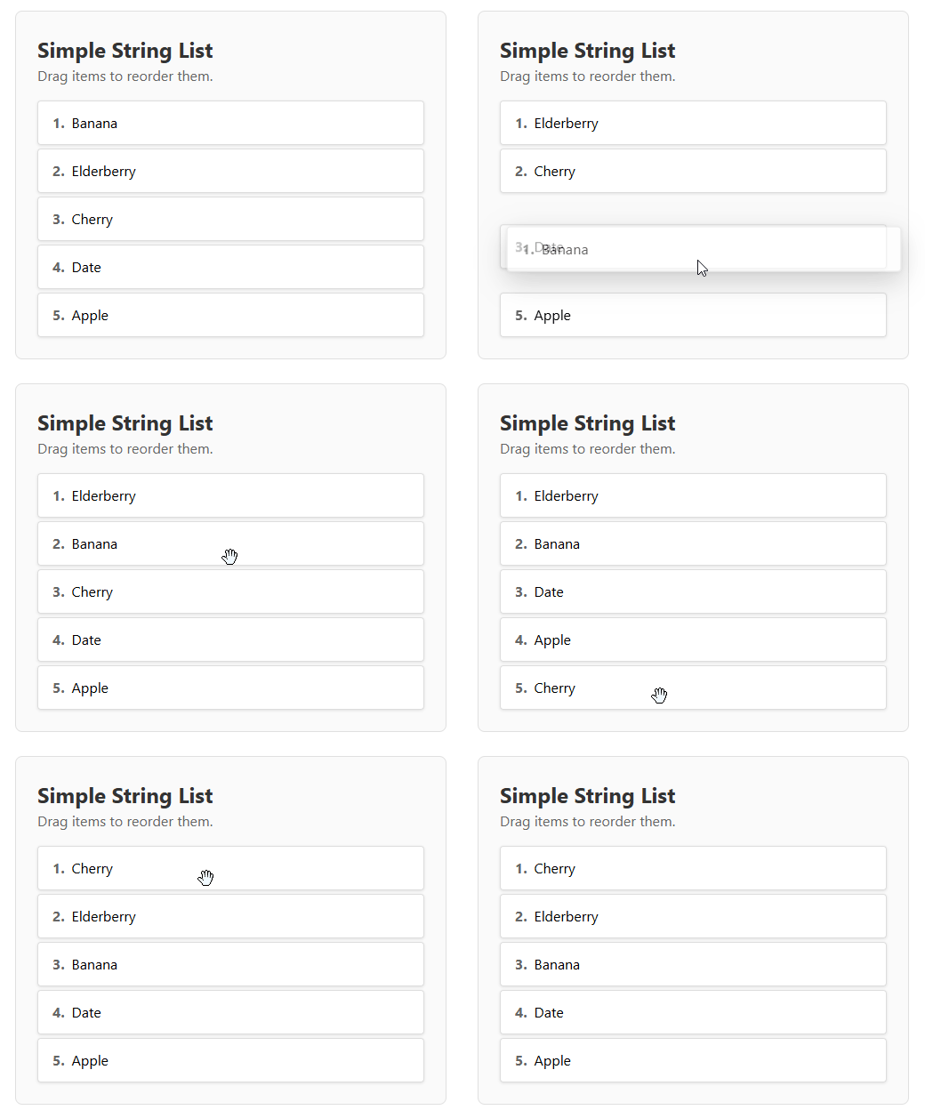
- Drag and drop to reorder items.
- Touch support for mobile devices.
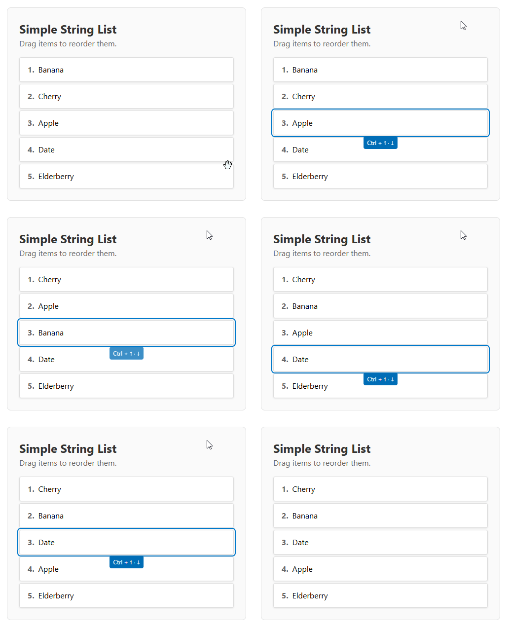
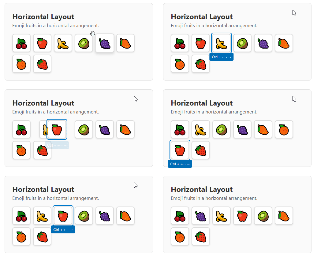
- Accessibility support: keyboard navigation with Ctrl + Arrow keys.
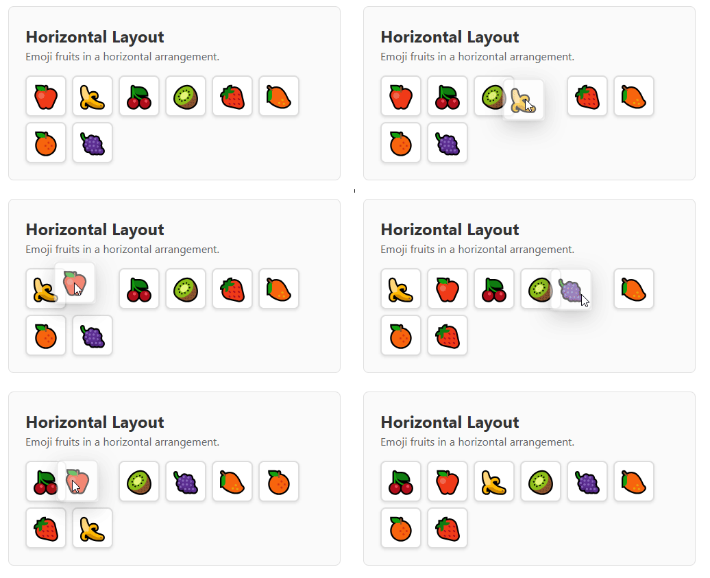
- Horizontal and vertical lists.
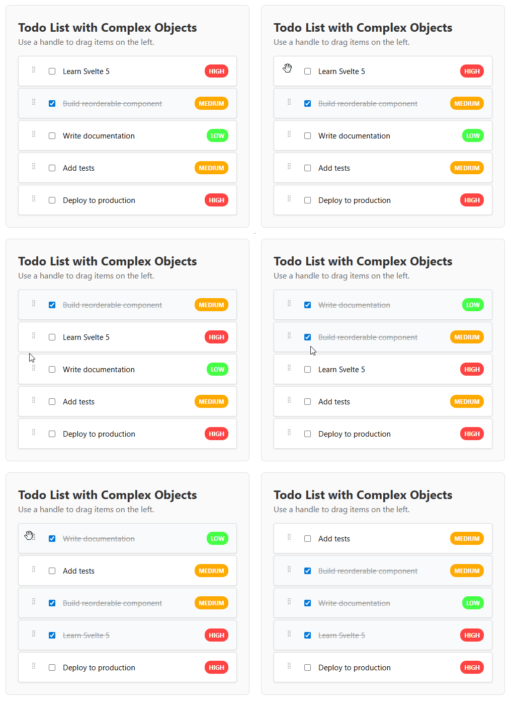
- Customizable drag handle.
- Built with Svelte 5 runes.
## Installation
```bash
pnpm install svelte-reorderable-list
```
## Demo
### Basic List Reordering
### Horizontal Layout
### Custom Drag Handle
### Keyboard Navigation
Use `Tab` key to focus element and then `Ctrl`+`Arrows` to move.
**Vertical Lists:**
**Horizontal Lists:**
## Usage
Here is a basic example of how to use the `ReorderableList` component.
```svelte
{#snippet item(item, index)}
{item.text}
{/snippet}
```
## Props
| Prop | Type | Required | Default | Description |
| ------------------- | ------------------------------------------ | -------- | ----------- | ------------------------------------------------------------------------------------------------------- |
| `items` | `ItemType[]` | Yes | `undefined` | The array of items to be displayed. |
| `getKey` | `(item: ItemType) => string` | Yes | `undefined` | A function that returns a unique key for each item. |
| `item` | `Snippet<[ItemType, number]>` | Yes | `undefined` | A Svelte 5 snippet for rendering each item. It receives the item and its index. |
| `onUpdate` | `(items: ItemType[]) => void` | Yes | `undefined` | Callback function that is called with the new item order after a change. |
| `direction` | `"horizontal" \| "vertical"` | No | `"vertical"` | The direction of the list. |
| `disabled` | `boolean` | No | `false` | When `true`, the reordering functionality is disabled. |
| `cssSelectorHandle` | `string` | No | `undefined` | A CSS selector for the drag handle. If not provided, the entire item is draggable. |
## Theming and Customization
The components use CSS custom properties for theming. You can customize the appearance by overriding these variables in your CSS:
```css
:root {
/* Focus and interaction colors */
--reorderable-focus-color: #007acc;
--reorderable-focus-offset: 2px;
--reorderable-focus-radius: 3px;
/* Drag clone appearance */
--reorderable-drag-shadow: 0 10px 30px rgba(0, 0, 0, 0.3);
--reorderable-drag-opacity: 0.6;
--reorderable-drag-scale: 1.02;
/* Keyboard tip styling */
--reorderable-keyboard-tip-bg: #016DB6;
--reorderable-keyboard-tip-color: white;
--reorderable-keyboard-tip-radius: 4px;
/* Drop indicators (for tree component) */
--reorderable-drop-indicator-color: #007acc;
--reorderable-drop-indicator-radius: 2px;
--reorderable-drop-child-bg: rgba(0, 122, 204, 0.2);
}
```
### Example: Dark Theme
```css
:root {
--reorderable-focus-color: #4fc3f7;
--reorderable-keyboard-tip-bg: #2196f3;
--reorderable-drop-indicator-color: #4fc3f7;
--reorderable-drag-shadow: 0 10px 30px rgba(0, 0, 0, 0.5);
}
```
### Example: Custom Brand Colors
```css
:root {
--reorderable-focus-color: #6366f1;
--reorderable-keyboard-tip-bg: #4f46e5;
--reorderable-drop-indicator-color: #6366f1;
--reorderable-drop-child-bg: rgba(99, 102, 241, 0.1);
}
```
## Tree Component
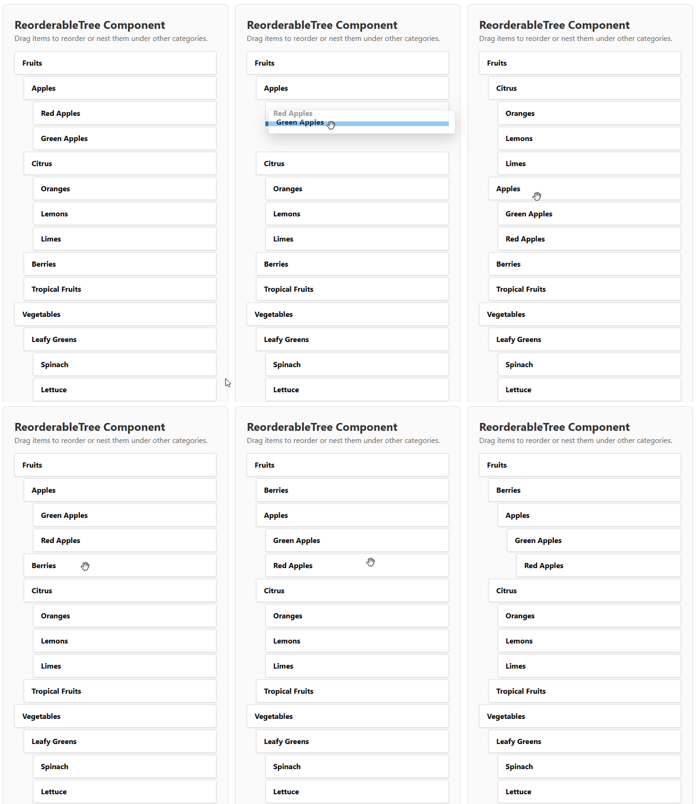
### Tree Demo
### Tree Keyboard Navigation
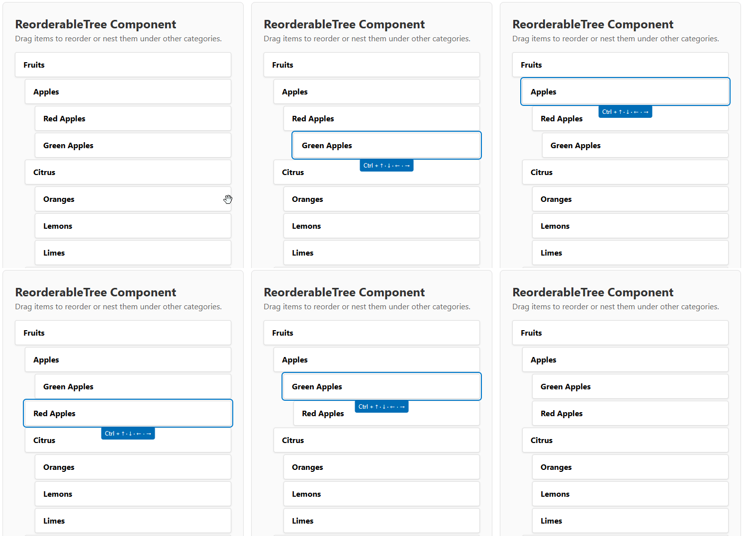
Use `Tab` key to focus element and then `Ctrl`+`Arrows` to move.
The library also includes a `ReorderableTree` component for hierarchical data. It supports two input modes:
### Tree Mode (Hierarchical Structure)
```svelte
{#snippet item(item, index)}
{item.name}
{/snippet}
```
### Flat Mode (Parent-Child References)
For easier data management, you can also use a flat structure where hierarchy is defined by `parentKey` references:
```svelte
{#snippet item(item, index)}
{item.name}
{/snippet}
```
### Tree Component Props
The `ReorderableTree` component automatically detects the input mode based on the props provided.
#### Tree Mode Props
| Prop | Type | Required | Default | Description |
| ------------------- | ------------------------------------------ | -------- | ----------- | ------------------------------------------------------------------------------------------------------- |
| `treeNodes` | `TreeNode[]` | Yes | `undefined` | The array of tree nodes to be displayed. |
| `getKey` | `(item: ItemType) => string` | Yes | `undefined` | A function that returns a unique key for each item. |
| `onUpdate` | `(nodes: TreeNode[]) => void` | Yes | `undefined` | Callback function that is called with the new tree structure after a change. |
#### Flat Mode Props
| Prop | Type | Required | Default | Description |
| ------------------- | ----------------------------------------------- | -------- | ----------- | ------------------------------------------------------------------------------------------------------- |
| `flatNodes` | `FlatTreeNode[]` | Yes | `undefined` | The array of flat tree nodes with parentKey references. |
| `onUpdate` | `(flatNodes: FlatTreeNode[]) => void` | Yes | `undefined` | Callback function that is called with the new flat structure after a change. |
#### Common Props
| Prop | Type | Required | Default | Description |
| ------------------- | ------------------------------------------ | -------- | ----------- | ------------------------------------------------------------------------------------------------------- |
| `item` | `Snippet<[ItemType, number]>` | Yes | `undefined` | A Svelte 5 snippet for rendering each item. It receives the item and its index. |
| `disabled` | `boolean` | No | `false` | When `true`, the reordering functionality is disabled. |
| `cssSelectorHandle` | `string` | No | `undefined` | A CSS selector for the drag handle. If not provided, the entire item is draggable. |
| `levelPadding` | `string` | No | `"20px"` | CSS padding value for each nesting level. |
#### Type Definitions
```typescript
interface TreeNode {
item: ItemType;
children?: TreeNode[];
}
interface FlatTreeNode {
item: ItemType;
key: string;
parentKey?: string;
}
```
### Choosing Between Tree and Flat Mode
#### Use Tree Mode When:
- Your data is naturally hierarchical (e.g., file systems, nested categories)
- You prefer working with nested object structures
- You need to maintain the tree structure in your existing data model
#### Use Flat Mode When:
- Your data comes from a database with parent-child relationships
- You need easier state management and updates
- You want to avoid deep nesting complexity
- You're working with dynamic hierarchies that change frequently
Both modes provide identical functionality and user experience - the choice is purely about data structure preference.
### Tree Keyboard Navigation
- Use `Tab` to focus on an item.
- `Ctrl + ↑/↓`: Move item up/down within the same level
- `Ctrl + ←`: Move item up one level (make it sibling of its parent)
- `Ctrl + →`: Make item a child of the previous item
## Accessibility
### General Accessibility Features
- Full keyboard navigation support
- ARIA attributes for screen readers
- Focus management with visible focus indicators
- Reduced motion support for users with vestibular disorders
- High contrast mode support
### Keyboard Navigation
#### List Component
- Use `Tab` to focus on an item.
- Once an item is focused, use `Ctrl + ArrowUp/ArrowDown` for vertical lists or `Ctrl + ArrowLeft/ArrowRight` for horizontal lists to move the item.
#### Tree Component
- Use `Tab` to focus on an item.
- Once an item is focused, use the keyboard shortcuts described above for tree navigation.