# Svelte Unstyled Tags

Svelte Unstyled Tags is a customisable Tags Input Component for Svelte.

It is in development and things might change like class names.

## Installation

```bash
npm install svelte-unstyled-tags
yarn add svelte-unstyled-tags
pnpm add svelte-unstyled-tags
```

Import it in your Svelte component like this:

```javascript
import TagsInput from 'svelte-unstyled-tags';
```

## Usage

Use the component in your Svelte files:

```svelte
<script>
    let tags = [];
</script>

<TagsInput bind:tags={tags} />
```

You can pass tags array to component with `bind:tags` and pass your configuration through props.

## Configuration Options

The following are the customisable options that come with the package:

| Parameter                    | Type             | Description                                          | Default     |
| ---------------------------- | ---------------- | ---------------------------------------------------- | ----------- |
| `tags`                       | array of strings | The array to store the tag values                    | [ ]         |
| `maximumTags`                | number           | Maximum number of tags                               | Infinity    |
| `onlyUnique`                 | boolean          | Only allow unique tags                               | false       |
| `inputPlaceholderText`       | string           | Placeholder text for the tag input field             | 'Add a tag' |
| `addTagKey`                  | string           | The keyboard key that triggers the addition of a tag | 'Enter'     |
| `showLabel`                  | boolean          | Show label for the input                             | false       |
| `labelText`                  | string           | Text for the label                                   | 'Tags'      |
| `showAddButton`              | boolean          | Show an add button                                   | false       |
| `addButtonText`              | string           | Text for the add button                              | 'Add Tag'   |
| `showClearAllButton`         | boolean          | Show a clear all button                              | false       |
| `showClearAllButtonText`     | string           | Text for the clear all button                        | 'Clear all' |
| `removeTagButtonText`        | string           | Text for the tag remove button                       | 'x'         |
| `componentWrapperClasses`    | string           | CSS Classes for component wrapper                    | ''          |
| `allTagsWrapperClasses`      | string           | CSS Classes for the 'all tags' wrapper               | ''          |
| `tagWrapperClasses`          | string           | CSS Classes for each tag wrapper                     | ''          |
| `tagClasses`                 | string           | CSS Classes for each tag                             | ''          |
| `inputClasses`               | string           | CSS Classes for the input                            | ''          |
| `inputButtonsSectionClasses` | string           | CSS Classes for the input buttons section            | ''          |
| `labelClasses`               | string           | CSS Classes for label                                | ''          |
| `removeTagButtonClasses`     | string           | CSS Classes for the tag remove buttons               | ''          |
| `addButtonClasses`           | string           | CSS Classes for the add button                       | ''          |
| `clearAllButtonClasses`      | string           | CSS Classes for the clear all button                 | ''          |
| `buttonsSectionClasses`      | string           | CSS Classes for the buttons section                  | ''          |

## Listen for changes to tags

This component dispatches a 'input' event whenever the tags array changes. You can listen for it like this:

```svelte
<TagsInput bind:tags={tags} on:input="{event => console.log(event.detail)}"/>
```

This will log the new tags array whenever it changes.

## Examples

Code examples below to make the component look like this:
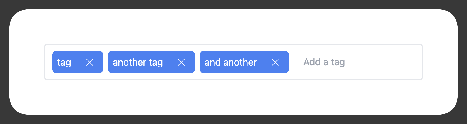
![A screenshot of how the examples below look](https://raw.githubusercontent.com/edjw/svelte-unstyled-tags/main/example.png)

### Styling with Tailwind classes

Here's an example of how you might style the various parts of the component using Tailwind classes.

```svelte
<Tags
    bind:tags
    componentWrapperClasses="flex flex-wrap"
    allTagsWrapperClasses="flex flex-row items-center gap-x-2 gap-y-2 flex-wrap"
    tagsInputWrapperClasses="flex items-center border-2 border-gray-200 py-2 px-3 rounded-md mt-2"
    tagWrapperClasses="flex items-center justify-between bg-blue-500 text-white px-2 py-1.5 rounded-md min-w-[5rem]"
    tagClasses="pr-4"
    tagRemoveButtonClasses="cursor-pointer rounded px-2 hover:outline"
    inputClasses="ml-4 px-2 py-2 border-b"
/>
```

### Styling with vanilla CSS
You can also put these classes in your global `.css` file if you don't want to use these `:global()` modifiers
```svelte
<Tags bind:tags />


<style>
	:global(.svelteUnstyledTagsWrapper) {
		display: flex;
		flex-wrap: wrap;
	}
	:global(.tagsInputWrapper) {
		display: flex;
		align-items: center;
		border: 2px solid #e5e7eb;
		padding: 0.5rem 0.75rem;
		border-radius: 0.375rem;
		margin-top: 0.5rem;
	}
	:global(.allTagsWrapper) {
		display: flex;
		flex-direction: row;
		align-items: center;
		column-gap: 0.5rem;
		row-gap: 0.5rem;
		flex-wrap: wrap;
	}
	:global(.tagWrapper) {
		display: flex;
		align-items: center;
		justify-content: space-between;
		background-color: #3b82f6;
		color: #ffffff;
		padding: 0.375rem 0.5rem;
		border-radius: 0.375rem;
		min-width: 5rem;
	}
	:global(.tag) {
		padding-right: 1rem;
	}
	:global(.tagRemoveButton) {
		cursor: pointer;
		border-radius: 0.125rem;
		padding: 0 0.5rem;
	}
	:global(.tagRemoveButton:hover) {
		outline: 2px auto;
	}
	:global(.tagsInput) {
		margin-left: 1rem;
		padding: 0.5rem;
		border-bottom: 1px solid #e5e7eb;
	}
</style>

```


## Example HTML output

This is an example of the HTML markup that's created.

```html
<div
	class="svelteUnstyledTagsWrapper"
	id="fyz9g1k7rplq0rl3c8"
>
	<label
		for="tagsInput-fyz9g1k7rplq0rl3c8"
		class="screen-reader-only"
		>Tags</label
	>
	<div class="tagsInputWrapper">
		<div
			class="allTagsWrapper"
			role="list"
		>
			<div
				class="tagWrapper"
				role="listitem"
				data-tag="tag"
				data-index="0"
			>
				<span
					class="tag"
					data-tag-id="tag-0"
					>tag</span
				>
				<button class="removeTagButton">✕</button>
			</div>
			<div
				class="tagWrapper"
				role="listitem"
				data-tag="another tag"
				data-index="1"
			>
				<span
					class="tag"
					data-tag-id="another tag-1"
					>another tag</span
				>
				<button class="removeTagButton">✕</button>
			</div>
			<div
				class="tagWrapper"
				role="listitem"
				data-tag="and another"
				data-index="2"
			>
				<span
					class="tag"
					data-tag-id="and another-2"
					>and another</span
				>
				<button class="removeTagButton">✕</button>
			</div>
		</div>
		<div class="inputButtonsSection">
			<input
				id="tagsInput-fyz9g1k7rplq0rl3c8"
				class="tagsInput"
				type="text"
				placeholder="Add a tag"
			/>
		</div>
	</div>
</div>

```

## Licence

MIT