<p align="center">
  <img src="https://raw.githubusercontent.com/daylilyfield/svrollbar/main/docs/svrollbar.png" />
</p>

<p align="center">
  <img src="https://raw.githubusercontent.com/daylilyfield/svrollbar/main/docs/svrollbar-default.gif" />
  <img src="https://raw.githubusercontent.com/daylilyfield/svrollbar/main/docs/svrollbar-gradation-track.gif" />
  <img src="https://raw.githubusercontent.com/daylilyfield/svrollbar/main/docs/svrollbar-crossfade.gif" />
  <img src="https://raw.githubusercontent.com/daylilyfield/svrollbar/main/docs/svrollbar-fly.gif" />
</p>

# svrollbar

[![npm](https://badge.fury.io/js/svrollbar.svg)](https://badge.fury.io/js/svrollbar)
[![license](https://img.shields.io/badge/License-MIT-yellow.svg)](https://opensource.org/licenses/MIT)
[![actions](https://github.com/daylilyfield/svrollbar/workflows/build%20%26%20test/badge.svg)](https://github.com/daylilyfield/svrollbar/actions)

[![coverall](https://coveralls.io/repos/github/daylilyfield/svrollbar/badge.svg?branch=main)](https://coveralls.io/github/daylilyfield/svrollbar?branch=main)

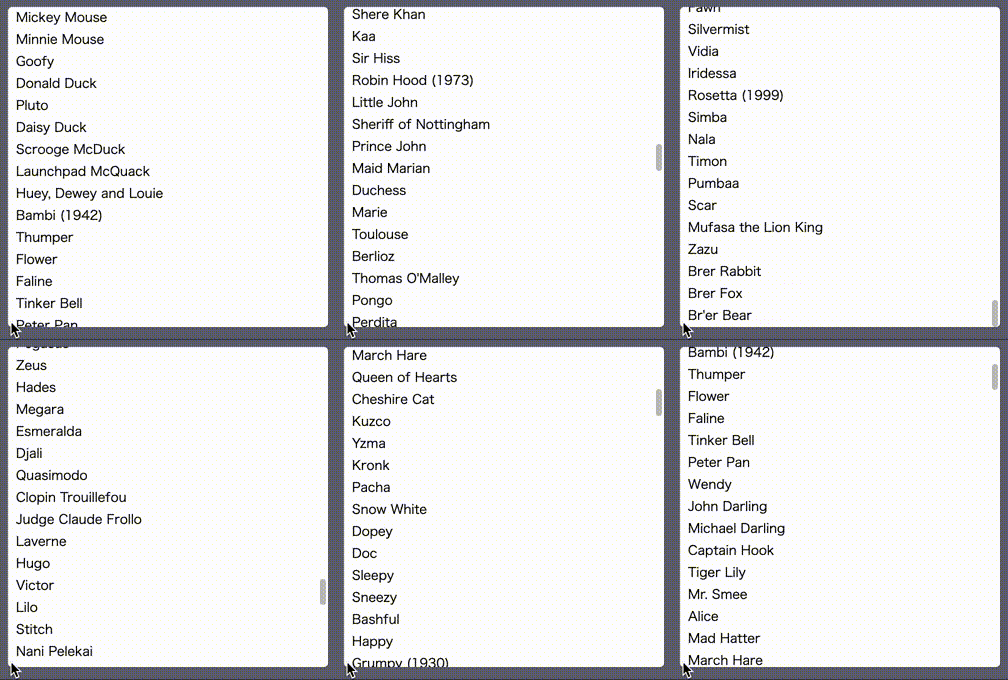
svrollbar is the custom scrollbar made by svelte.

- [how to install](#how-to-install)
- [examples](#examples)
- [how to use](#how-to-use)
  - [replace window scrollbar](#replace-window-scrollbar)
  - [make scrollble area](#make-scrollable-area)
  - [replace overflow-based scrollbar](#replace-overflow-based-scrollbar)
  - [integrate 3rd party libraries](#integrate-3rd-party-libraries)
- [components spec](#components-spec)
- [how to customize transition](#how-to-customize-transition)
- [how to customize style](#how-to-customize-style)
- [how to customize scrollbar visibility](#how-to-customize-scrollbar-visibility)

## how to install

```bash
npm install svrollbar
```

## examples

example website is [here](https://daylilyfield.github.io/svrollbar/)

example svelte REPL is [here](https://svelte.dev/repl/d600db3bde4742ec8d9751e009d94159?version=3.35.0).

## how to use

svrollbar has two components; `Svrollbar.svelte` and `Svroller.svelte`.
svrollbar is supposed to use with svelte,
but if you want, you can use svrollbar without svelte.

### replace window scrollbar

if you would like to customize your window scrollbar,
you simply write down `Svrollbar.svelte` with empty properties,

```svelte
<Svrollbar />
```

this is equivalent to:

```svelte
<Svrollbar viewport={document.scrollingElement} contents={document.body} />
```

yes, you can see the customized scrollbar on the right side of your browser window.
please watch out [example website](https://daylilyfield.github.io/svrollbar/)
to see the live example.

### make scrollable area

if you try to make scrollable area within a part of your web site,
you may prefer to use `Svroller.svelte`.
the below example shows you the list which has 50 rows
in a 10rem x 10rem square scrollable area with the custom scrollbar.

```svelte
<script lang="ts">
  import { Svroller } from 'svrollbar'

  const items = Array.from({ length: 50 }).map((_, i) => `item ${i}`)
</script>

<Svroller width="10rem" height="10rem">
  {#each items as item (item)}
    <div>{item}</div>
  {/each}
</Svroller>
```

### replace overflow-based scrollbar

on the other hand, it is better to use `Svrollbar.svelte`
if you already have a kind of scrollable viewport or contents.

```svelte
<script lang="ts">
  import { Svrollbar } from 'svrollbar'

  const items = Array.from({ length: 50 }).map((_, i) => `item ${i}`)

  export let viewport: Element
  export let contents: Element
</script>

<div class="wrapper">
  <div bind:this={viewport} class="viewport">
    <div bind:this={contents} class="contents">
      {#each items as item (item)}
        <div>{item}</div>
      {/each}
    </div>
  </div>
  <Svrollbar {viewport} {contents} />
</div>

<style>
  .wrapper {
    position: relative;
    width: 10rem;
  }

  .viewport {
    position: relative;
    width: 10rem;
    height: 10rem;
    overflow: scroll;
    border: 1px solid gray;
    box-sizing: border-box;

    /* hide scrollbar */
    -ms-overflow-style: none;
    scrollbar-width: none;
  }

  .viewport::-webkit-scrollbar {
    /* hide scrollbar */
    display: none;
  }
</style>
```

notice, you do not need to specify fixed value to width or height of viewport.
you can set min-\*, max-\*, and any dynamic and reactive value because
svrollbar observes both viewport size and its content size by ResizeObserver.

### integrate 3rd party libraries

if you would like to integrate svrollbar into some kind of virtual list
implemenation such as
[svelte-virtual-list](https://github.com/sveltejs/svelte-virtual-list)
or
[svelte-tiny-virtual-list](https://github.com/Skayo/svelte-tiny-virtual-list),
you can do that in the following way.

```svelte
<script lang="ts">
  import { onMount } from 'svelte'
  import VirtualList from 'svelte-tiny-virtual-list'
  import { Svrollbar } from 'svrollbar'

  const items = Array.from({ length: 50 }).map((_, i) => `item ${i}`)

  let viewport: Element
  let contents: Element

  onMount(() => {
    viewport = document.querySelector('.virtual-list-wrapper')
    contents = document.querySelector('.virtual-list-inner')
  })
</script>

<div class="wrapper">
  <Svrollbar {viewport} {contents} />
  <VirtualList width="10rem" height={160} itemCount={items.length} itemSize={16}>
    <div slot="item" let:index let:style {style}>
      {items[index]}
    </div>
  </VirtualList>
</div>

<style>
  :global(.virtual-list-wrapper) {
    /* hide scrollbar */
    -ms-overflow-style: none !important;
    scrollbar-width: none !important;
  }

  :global(.virtual-list-wrapper::-webkit-scrollbar) {
    /* hide scrollbar */
    display: none !important;
  }

  .wrapper {
    position: relative;
    width: 10rem;
  }
</style>
```

## components spec

see [here](./COMPONENT_INDEX.md).

## how to customize transition

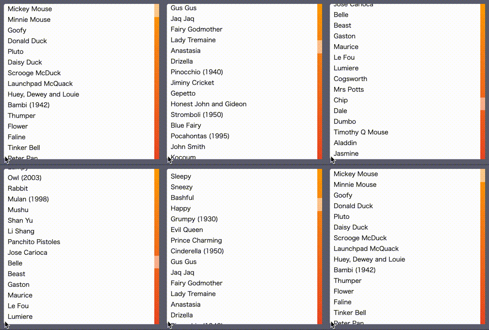
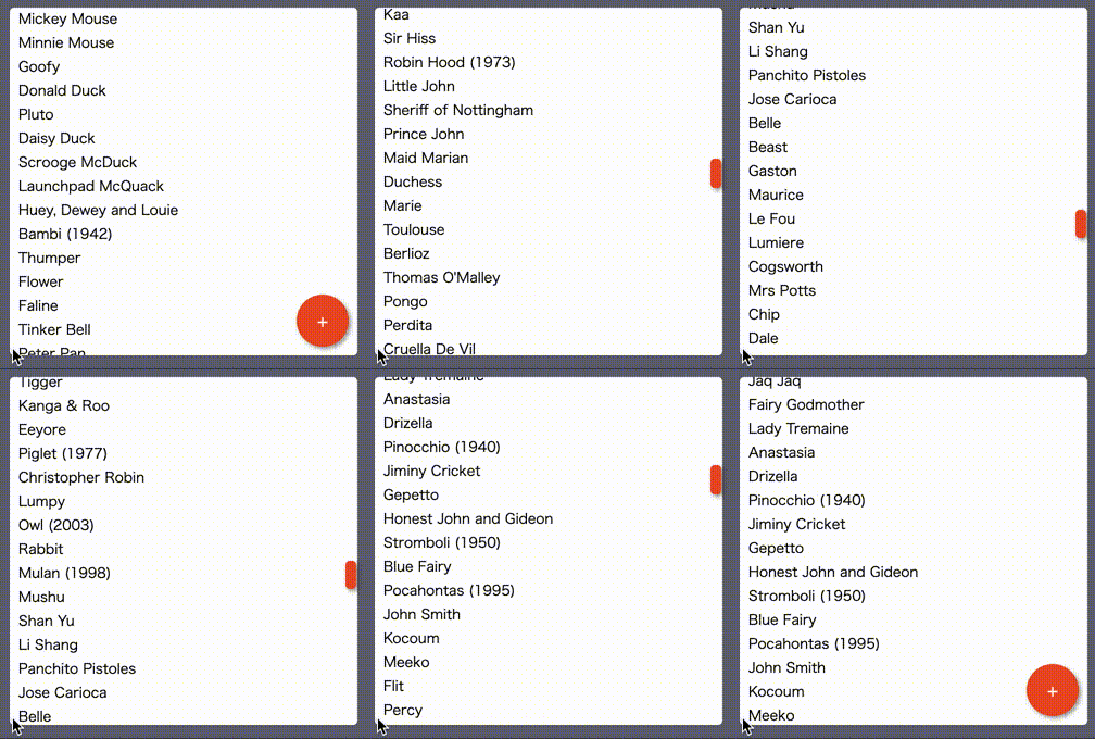
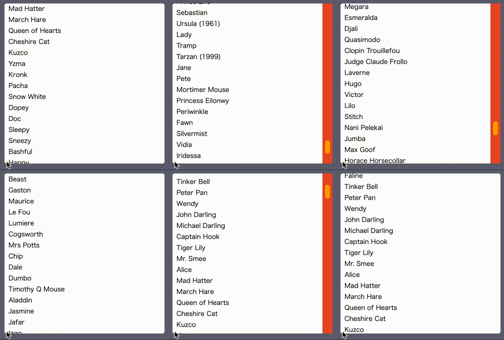
since the simple fade animation is really a bore,
you can replace the default fade (show/hide) animation with your one.
the transition function is compatible with the svelte transition.

```svelte
<script>
  import { fly } from 'svelte/transition'
  import { Svroller } from 'svrollbar'

  const items = Array.from({ length: 50 }).map((_, i) => `item ${i}`)
  const flyLeft = (node) => fly(node, { x: -160 })
  const flyRight = (node) => fly(node, { x: 30 })
</script>

<Svroller
  width="10rem"
  height="10rem"
  vTrackIn={flyLeft}
  vTrackOut={flyLeft}
  vThumbIn={flyRight}
  vThumbOut={flyRight}>
  {#each items as item (item)}
    <div>{item}</div>
  {/each}
</Svroller>
```

## how to customize style

you can customize svrollbar style with css variables.

| variable                     | default |
| ---------------------------- | ------- |
| --svrollbar-track-width      | 10px    |
| --svrollbar-track-background | initial |
| --svrollbar-track-radius     | initial |
| --svrollbar-track-opacity    | 1       |
| --svrollbar-track-shadow     | initial |
| --svrollbar-thumb-width      | 6px     |
| --svrollbar-thumb-background | gray    |
| --svrollbar-thumb-radius     | 0.25rem |
| --svrollbar-thumb-opacity    | 0.5     |
| --svrollbar-thumb-shadow     | initial |

```svelte
<script lang="ts">
  import { Svroller } from 'svrollbar'

  const items = Array.from({ length: 50 }).map((_, i) => `item ${i}`)
</script>

<div class="container">
  <Svroller width="10rem" height="10rem">
    {#each items as item (item)}
      <div>{item}</div>
    {/each}
  </Svroller>
</div>

<style>
  .container {
    border: 3px solid #5d7150;
    width: 10rem;

    --svrollbar-track-width: 20px;
    --svrollbar-track-background: #85b4b9;
    --svrollbar-track-opacity: 1;

    --svrollbar-thumb-width: 10px;
    --svrollbar-thumb-background: #d9ab55;
    --svrollbar-thumb-opacity: 1;
  }
</style>
```

## how to customize scrollbar visibility

you can customize scrollbar visibility with `alwaysVisible` and `initiallyVisible` properties.

| property         | default | description                          |
| ---------------- | ------- | ------------------------------------ |
| alwaysVisible    | false   | scrollbar is always visible          |
| initiallyVisible | false   | scrollbar is visible until scrolling |