# taro-modal-form
> Enhancing `taro`'s `Form` capabilities
## 🌐 Switch Language
- [English](./README.md)
- [中文](./README.zh-CN.md)
## ⚡ Features
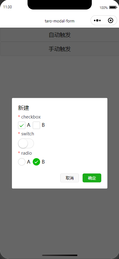
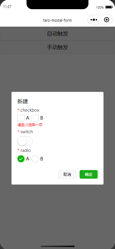
> The `ModalForm` component is used to create forms within a modal. The form supports validation, dynamic opening/closing, form submission, and more.
- Auto Open/Close
```tsx
Auto Trigger}
onFinish={async() => {
try {
return true; // Return true to close
} catch (error) {
return false; // Your error handling logic
}
}}
>
//children
```
- Manual Control
```tsx
setOpen(isOpen)}
>
//children
```
## ⚙️ Options
### ModalForm
| Property | Type | Required | Description |
|---------------|---------------------------------------------------|----------|--------------------------------------------------------------------|
| `trigger` | `React.ReactNode` | No | The element that triggers the modal, such as a button. |
| `children` | `React.ReactNode` | Yes | Form items, should be wrapped within `ModalFormItem`. |
| `open` | `boolean` | No | Controls whether the modal is open. |
| `onOpenChange`| `(isOpen: boolean) => void` | No | Triggered when the modal state changes. |
| `title` | `string` | No | Title of the modal. |
| `width` | `number` | No | Width of the modal in pixels. |
| `zIndex` | `number` | No | `z-index` of the modal. |
| `onFinish` | `(values: Record) => Promise` | No | Callback triggered on form submission, returns a `Promise` where `true` closes the modal, and `false` keeps it open. |
| `formProps` | `Omit` | No | Other form properties; `onSubmit` and `onReset` are automatically handled. |
| `cancelBtnText` | `string` | No | Text for the cancel button. |
| `finishBtnText` | `string` | No | Text for the finish button. |
| `footer` | `React.ReactNode` | No | Custom content for the modal footer area. |
| `rules` | `RuleItem[]` | No | Validation rules for form items, an array of `RuleItem`. |
### ModalFormItem
| Property | Type | Required | Description |
|------------|-----------------|----------|-------------------------------------------------|
| `name` | `string` | Yes | Name of the form item, must be unique. |
| `children` | `React.ReactNode` | Yes | Content of the form item, supports form-bound components. |
## 📦 Installation
Install using npm, includes `Typescript` type declarations.
```sh
npm install taro-modal-form
```
## 🔨 Usage
```tsx
import {
Button,
Checkbox,
CheckboxGroup,
Radio,
RadioGroup,
Switch,
View,
} from "@tarojs/components";
import ModalForm, { ModalFormItem } from "taro-modal-form";
export default function App() {
return (
Auto Trigger}
onFinish={async (values) => {
try {
console.log(values);
return true;
} catch (error) {
return false;
}
}}
rules=[
{
name: "checkbox",
required: true,
message: "Please select at least one option"
},
{
name: "switch",
required: true,
},
{
name: "radio",
required: true,
},
]
>
A
B
A
B
);
}
```
## Preview
## 📜 License
This project is licensed under the [MIT license](./LICENSE)
---