# taro-modal-form

> 增强`taro`的`Form`表单能力

## 🌐 切换语言

- [English](./README.md)
- [中文](./README.zh-CN.md)

## ⚡功能

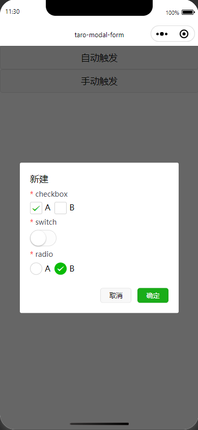
> `ModalForm` 组件用于在模态框中创建表单。表单支持表单项校验、动态打开/关闭、表单提交等功能。

- 自动打开/关闭

```tsx
<View>
	<ModalForm
		title="新建"
		trigger={<Button>自动触发</Button>}
		onFinish={async() => {
			try {
				return true; // 返回true关闭
			} catch (error) {
				return false; // 你的错误处理逻辑
			}
		}}
	>
	//children
	</ModalForm>
</View>
```

- 手动控制

```tsx
<View>
	<ModalForm
		title="新建"
		open={open}
		onOpenChange={(isOpen)=> setOpen(isOpen)}
	>
	//children
	</ModalForm>
</View>
```

## ⚙️ 选项

### ModalForm

| 属性            | 类型                                                | 是否必填 | 说明                                                                      |
| --------------- | --------------------------------------------------- | -------- | ------------------------------------------------------------------------- |
| `trigger`       | `React.ReactNode`                                   | 否       | 用于触发打开模态框的元素，例如按钮。                                      |
| `children`      | `React.ReactNode`                                   | 是       | 表单项，应该包含在 `ModalFormItem` 中。                                   |
| `open`          | `boolean`                                           | 否       | 控制模态框是否打开。                                                      |
| `onOpenChange`  | `(isOpen: boolean) => void`                         | 否       | 当模态框状态变化时触发。                                                  |
| `title`         | `string`                                            | 否       | 模态框的标题。                                                            |
| `width`         | `number`                                            | 否       | 模态框的宽度，单位为像素。                                                |
| `zIndex`        | `number`                                            | 否       | 模态框的 `z-index`。                                                      |
| `onFinish`      | `(values: Record<string, any>) => Promise<boolean>` | 否       | 表单提交时触发的回调函数，返回一个 `Promise`，`true`关闭，`false`不关闭。 |
| `formProps`     | `Omit<FormProps, "onSubmit""onReset">`              | 否       | 表单的其他属性，`onSubmit` 和 `onReset` 会被自动处理。                    |
| `cancelBtnText` | `string`                                            | 否       | 取消按钮的文本。                                                          |
| `finishBtnText` | `string`                                            | 否       | 完成按钮的文本。                                                          |
| `footer`        | `React.ReactNode`                                   | 否       | 自定义模态框底部区域的内容。                                              |
| `rules`         | `RuleItem[]`                                        | 否       | 表单项的校验规则，`RuleItem` 数组。                                       |

### ModalFormItem

| 属性       | 类型              | 是否必填 | 说明                                                |
| ---------- | ----------------- | -------- | --------------------------------------------------- |
| `name`     | `string`          | 是       | 表单项的名称，必须唯一。                            |
| `children` | `React.ReactNode` | 是       | 表单项的内容，支持 `Form` 绑定的表单组件。 |

## 📦 安装

使用npm直接安装，包含`Typescript`的类型声明

```sh
npm install taro-modal-form
```

## 🔨 使用

```tsx
import {
	Button,
	Checkbox,
	CheckboxGroup,
	Radio,
	RadioGroup,
	Switch,
	View,
} from "@tarojs/components";
import ModalForm, { ModalFormItem } from "taro-modal-form";

export default function App() {
	return (
		<View>
			<ModalForm
				title="新建"
				trigger={<Button>自动触发</Button>}
				onFinish={async (values) => {
					try {
						console.log(values);
						return true;
					} catch (error) {
						return false;
					}
				}}
				rules={[
					{
						name: "checkbox",
						required: true,
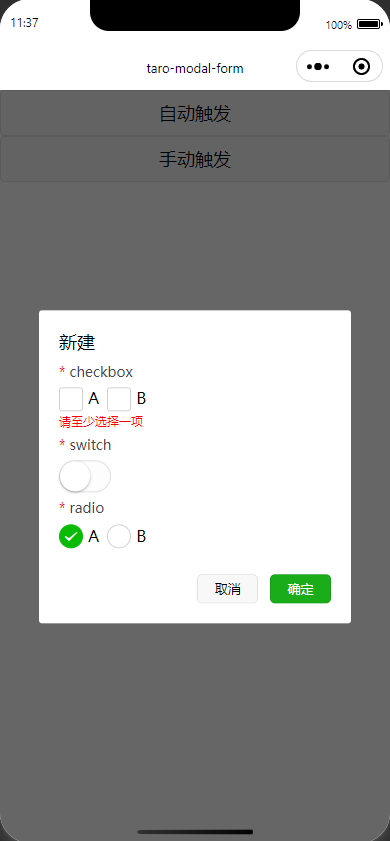
						message: "请至少选择一项"
					},
					{
						name: "switch",
						required: true,
					},
					{
						name: "radio",
						required: true,
					},
				]}
			>
				<ModalFormItem name="checkbox">
					<CheckboxGroup
						style={{
							display: "flex",
							gap: 8,
						}}
					>
						<Checkbox value="a">A</Checkbox>
						<Checkbox value="b">B</Checkbox>
					</CheckboxGroup>
				</ModalFormItem>

				<ModalFormItem name="switch">
					<Switch />
				</ModalFormItem>

				<ModalFormItem name="radio">
					<RadioGroup
						style={{
							display: "flex",
							gap: 8,
						}}
					>
						<Radio value="a">A</Radio>
						<Radio value="b">B</Radio>
					</RadioGroup>
				</ModalFormItem>
			</ModalForm>
		</View>
	);
}
```

## 预览

![preview-0](https://raw.githubusercontent.com/phaoer/taro-modal-form/master/images/preview-0.png)
![preview-1](https://raw.githubusercontent.com/phaoer/taro-modal-form/master/images/preview-1.png)

## 📜 许可证

本项目基于[MIT license](./LICENSE)

---