# rc-tooltip
---

React Tooltip

[![NPM version][npm-image]][npm-url]
[![build status][travis-image]][travis-url]
[![Test coverage][coveralls-image]][coveralls-url]
[![gemnasium deps][gemnasium-image]][gemnasium-url]
[![node version][node-image]][node-url]
[![npm download][download-image]][download-url]

[npm-image]: http://img.shields.io/npm/v/rc-tooltip.svg?style=flat-square
[npm-url]: http://npmjs.org/package/rc-tooltip
[travis-image]: https://img.shields.io/travis/react-component/tooltip.svg?style=flat-square
[travis-url]: https://travis-ci.org/react-component/tooltip
[coveralls-image]: https://img.shields.io/coveralls/react-component/tooltip.svg?style=flat-square
[coveralls-url]: https://coveralls.io/r/react-component/tooltip?branch=master
[gemnasium-image]: http://img.shields.io/gemnasium/react-component/tooltip.svg?style=flat-square
[gemnasium-url]: https://gemnasium.com/react-component/tooltip
[node-image]: https://img.shields.io/badge/node.js-%3E=_0.10-green.svg?style=flat-square
[node-url]: http://nodejs.org/download/
[download-image]: https://img.shields.io/npm/dm/rc-tooltip.svg?style=flat-square
[download-url]: https://npmjs.org/package/rc-tooltip

## Screenshots

<img src="http://gtms03.alicdn.com/tps/i3/TB1NQUSHpXXXXaUXFXXlQqyZXXX-1312-572.png" width="600"/>

## Feature

* support ie8,ie8+,chrome,firefox,safari


## install

[![rc-tooltip](https://nodei.co/npm/rc-tooltip.png)](https://npmjs.org/package/rc-tooltip)

## Usage

```js
var Tooltip = require('rc-tooltip');
var React = require('react');
var ReactDOM = require('react-dom')
ReactDOM.render(<Tooltip placement="left" trigger={['click']} overlay={<span>tooltip</span>}><a href='#'>hover</a></Tooltip>, container);
```

## Example

http://localhost:8007/examples

online example: http://react-component.github.io/tooltip/examples/

## API

### props

<table class="table table-bordered table-striped">
    <thead>
    <tr>
        <th style="width: 100px;">name</th>
        <th style="width: 50px;">type</th>
        <th style="width: 50px;">default</th>
        <th>description</th>
    </tr>
    </thead>
    <tbody>
        <tr>
          <td>overlayClassName</td>
          <td>string</td>
          <td></td>
          <td>additional className added to popup overlay
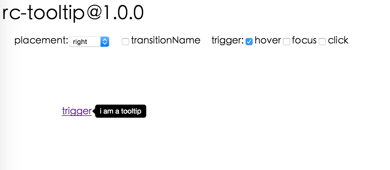
</td>
        </tr>
        <tr>
          <td>trigger</td>
          <td>string[]</td>
          <td>['hover']</td>
          <td>which actions cause tooltip shown. enum of 'hover','click','focus'</td>
        </tr>
        <tr>
          <td>mouseEnterDelay</td>
          <td>number</td>
          <td>0</td>
          <td>delay time to show when mouse enter.unit: s.</td>
        </tr>
        <tr>
          <td>mouseLeaveDelay</td>
          <td>number</td>
          <td>0.1</td>
          <td>delay time to hide when mouse leave.unit: s.</td>
        </tr>
        <tr>
          <td>overlayStyle</td>
          <td>Object</td>
          <td></td>
          <td>additional style of overlay node</td>
        </tr>
        <tr>
          <td>prefixCls</td>
          <td>String</td>
          <td>rc-tooltip</td>
          <td>prefix class name</td>
        </tr>
        <tr>
          <td>transitionName</td>
          <td>String</td>
          <td></td>
          <td>same as https://github.com/react-component/css-transition-group</td>
        </tr>
        <tr>
          <td>onVisibleChange</td>
          <td>Function</td>
          <td></td>
          <td>call when visible is changed</td>
        </tr>
        <tr>
          <td>visible</td>
          <td>boolean</td>
          <td></td>
          <td>whether tooltip is visible</td>
        </tr>
        <tr>
          <td>defaultVisible</td>
          <td>boolean</td>
          <td></td>
          <td>whether tooltip is visible initially</td>
        </tr>
        <tr>
          <td>placement</td>
          <td>String</td>
          <td></td>
          <td>one of ['left','right','top','bottom', 'topLeft', 'topRight', 'bottomLeft', 'bottomRight']</td>
        </tr>
        <tr>
          <td>align</td>
          <td>Object: alignConfig of [dom-align](https://github.com/yiminghe/dom-align)</td>
          <td></td>
          <td>value will be merged into placement's config</td>
        </tr>
        <tr>
          <td>onPopupAlign</td>
          <td>function(popupDomNode, align)</td>
          <td></td>
          <td>callback when popup node is aligned</td>
        </tr>
        <tr>
          <td>overlay</td>
          <td>React.Element</td>
          <td></td>
          <td>popup content</td>
        </tr>
        <tr>
          <td>arrowContent</td>
          <td>React.Node</td>
          <td>null</td>
          <td>arrow content</td>
        </tr>
        <tr>
          <td>getTooltipContainer</td>
          <td>function</td>
          <td></td>
          <td>function returning html node which will act as tooltip contaier</td>
        </tr>
        <tr>
          <td>destroyTooltipOnHide</td>
          <td>boolean</td>
          <td>false</td>
          <td>whether destroy tooltip when tooltip is hidden</td>
        </tr>
    </tbody>
</table>


## Development

```
npm install
npm start
```

## Test Case

http://localhost:8007/tests/runner.html?coverage

## Coverage

http://localhost:8007/node_modules/rc-server/node_modules/node-jscover/lib/front-end/jscoverage.html?w=http://localhost:8007/tests/runner.html?coverage

## License

rc-tooltip is released under the MIT license.
