
---
# txend-react-native-ui-datepicker
[](https://github.com/prettier/prettier)
[](https://github.com/farhoudshapouran/react-native-ui-datepicker/blob/main/LICENSE)
DateTimePicker component for React Native that allows you to create a customizable date and time picker. The component uses [Day.js](https://day.js.org/) library and it contains a set of style props that allows you to change every item of calendar based on your own UI design. Please visit [demo](https://farhoudshapouran.github.io/react-native-ui-datepicker/).

## Installation
```sh
npm install txend-react-native-ui-datepicker
```
Or
```sh
yarn add txend-react-native-ui-datepicker
```
## Usage
```js
import DateTimePicker from 'txend-react-native-ui-datepicker';
import dayjs from 'dayjs';
export default function App() {
const [value, setValue] = useState(dayjs());
return (
setValue(date)}
/>
)
}
const styles = StyleSheet.create({
container: {
flex: 1,
backgroundColor: '#F5FCFF',
},
});
```
For more, take a look at the `/example` directory.
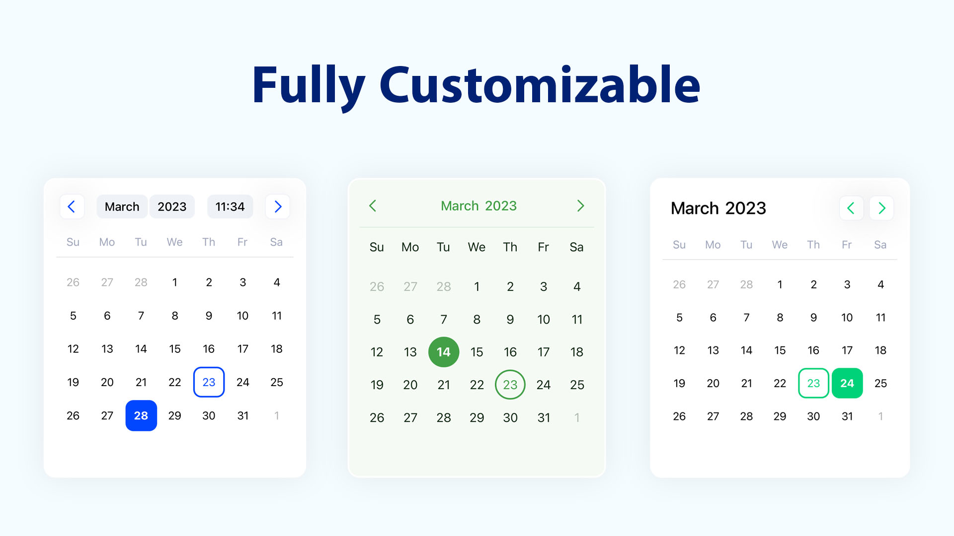
## Available props
| Name | Type | Default | Description |
| ------------------------ | --------------- | --------------- | -------------------------------------------------------------------------------------- |
| value | `DateType` | `Dayjs` | DatePicker value to display selected date |
| onValueChange | `func` | `() => {}` | Called when the new date selected from DatePicker |
| mode | `string` | `'datetime'` | Defines the DatePicker mode `['datetime', 'date', 'time']` |
| locale | `string` | `'en'` | Defines the DatePicker locale |
| minimumDate | `DateType` | `null` | Defines DatePicker minimum selectable date |
| maximumDate | `DateType` | `null` | Defines DatePicker maximum selectable date |
| firstDayOfWeek | `number` | `0` | Defines the starting day of week, number 0-6, 0 - Sunday, 6 - Saturday |
| displayFullDays | `boolean` | `false` | Defines show previous and next month's days in the current calendar view |
| calendarTextStyle | `TextStyle` | `null` | Defines all text styles inside the calendar (Days, Months, Years, Hours, and Minutes) |
| selectedTextStyle | `TextStyle` | `null` | Defines selected (Day, Month, Year) text styles |
| selectedItemColor | `string` | `'#0047FF'` | Defines selected (Day, Month, Year) background and border colors |
| headerContainerStyle | `ViewStyle` | `null` | Defines calendar header container style |
| headerTextContainerStyle | `ViewStyle` | `null` | Defines calendar header texts (Month, Year, Time) containers style |
| headerTextStyle | `TextStyle` | `null` | Defines calendar header text styles (Month, Year, Time) |
| headerButtonStyle | `ViewStyle` | `null` | Defines calendar header "prev and next buttons" containers style |
| headerButtonColor | `string` | `null` | Defines calendar header "prev and next buttons" icon color |
| headerButtonSize | `number` | `18` | Defines calendar header "prev and next buttons" icon size |
| headerButtonsPosition | `string` | `'around'` | Defines calendar header "prev and next buttons" positions `['around', 'right', 'left']`|
| buttonPrevIcon | `ReactNode` | `undefined` | Defines calendar header "prev button" custom icon |
| buttonNextIcon | `ReactNode` | `undefined` | Defines calendar header "next button" custom icon |
| dayContainerStyle | `ViewStyle` | `null` | Defines days containers style |
| todayContainerStyle | `ViewStyle` | `null` | Defines today container style |
| todayTextStyle | `TextStyle` | `null` | Defines today text style |
| monthContainerStyle | `ViewStyle` | `null` | Defines months containers style |
| yearContainerStyle | `ViewStyle` | `null` | Defines years containers style |
| weekDaysContainerStyle | `ViewStyle` | `null` | Defines weekdays container style |
| weekDaysTextStyle | `TextStyle` | `null` | Defines weekdays texts style |
| timePickerContainerStyle | `ViewStyle` | `null` | Defines time picker container style |
| timePickerTextStyle | `TextStyle` | `null` | Defines time picker (Hours, Minutes) texts style |
## Contributing
See the [contributing guide](CONTRIBUTING.md) to learn how to contribute to the repository and the development workflow.
## Consider supporting with a ⭐️ [Star on GitHub](https://github.com/farhoudshapouran/react-native-ui-datepicker)
If you are using the library in one of your projects, please consider supporting it with a star.
## License
MIT