# use-a-hook

**114 React hooks, one context state factory, and fewer “wait, I built this last week” moments.**

Building a SaaS app? Give your search box a breather, remember a teammate’s preferences, tame keyboard shortcuts, and keep a chat scrolled to the latest message. Pick the hook that solves today’s problem and keep building.

- **React 18 and 19**, with TypeScript types and editor hints.
- **Import what you use.** Individual entry points and tree-shakeable ESM; CommonJS is included too.
- **React is the only runtime dependency.** No UI kit, animation engine, or server cache comes along for the ride.
- **115 complete examples**, with real use cases and plain-language API comments.

[Try the live playground](https://use-a-hook.pages.dev/) · [Install and try it](#your-first-hook-the-tiny-reveal) · [Find a hook](#what-are-you-building) · [Full API reference](#full-api-reference) · [Source and issues](https://github.com/sannminwin/use-a-hook)

## Try it in your browser

**[Open the live playground](https://use-a-hook.pages.dev/)** — choose a demo, try it out, then open **View code** to copy a standalone React example. **How it works** explains the behavior and its limits.

| Try a workflow | What you can explore |
| --- | --- |
| [Search and sort](https://use-a-hook.pages.dev/#search) | Debounced search, sorting, and active-customer filtering. |
| [Autosave](https://use-a-hook.pages.dev/#autosave) | Queued saves, a simulated failure, and manual retry. |
| [Keyboard shortcuts](https://use-a-hook.pages.dev/#shortcuts) | Scoped shortcuts, key sequences, and protected form fields. |
| [Streaming chat](https://use-a-hook.pages.dev/#chat) | Scroll-away behavior and returning to the latest message. |
| [Saved preferences](https://use-a-hook.pages.dev/#preferences) | Persisted appearance, row density, and preview language. |

The playground also includes the [complete API reference for all 115 exports](https://use-a-hook.pages.dev/#reference). The five interactive demos run in your browser; autosave and chat use local simulations, with no account or API key required.

## Install

```sh
npm install use-a-hook
```

You need an existing React 18 or React 19 application. This package supplies reusable behavior; you provide the components and styling. The examples are TSX files, ready for a TypeScript React app. In a Next.js App Router project, keep hook consumers in a client component with `'use client'` at the top.

## Your first hook: the tiny reveal

**The mission:** show internal invoice notes only when a teammate asks. No treasure map required.

Copy this component into your app and render `<InvoiceNotes />`:

```tsx
'use client';

import { useToggle } from 'use-a-hook';

export default function InvoiceNotes() {
  const [visible, toggle] = useToggle();
  return (
    <section>
      <button aria-expanded={visible} aria-controls="invoice-notes" onClick={toggle}>
        Internal notes
      </button>
      <p id="invoice-notes" hidden={!visible}>
        Client approved the revised delivery date.
      </p>
    </section>
  );
}
```

`useToggle()` starts at `false`. The first returned item, `visible`, is the current value. The second, `toggle`, flips it. The third is a setter, available when you want to choose a specific value. Call hooks at the top level of a component or another hook, rather than inside conditions or event handlers.

## Give the search box a coffee break

**The mission:** let someone finish typing before updating the results. The input stays responsive; the results wait 300 milliseconds after the latest edit.

```tsx
'use client';

import { useState } from 'react';
import { useDebouncedValue } from 'use-a-hook';

const customers = ['Ada Studio', 'Beacon Bakery', 'Cedar Design'];
export default function CustomerSearch() {
  const [query, setQuery] = useState('');
  const settled = useDebouncedValue(query, 300);
  const matches = customers.filter((name) =>
    name.toLowerCase().includes(settled.toLowerCase()),
  );
  return (
    <section>
      <input
        aria-label="Find customers"
        value={query}
        onChange={(event) => setQuery(event.target.value)}
      />
      <ul>
        {matches.map((name) => (
          <li key={name}>{name}</li>
        ))}
      </ul>
    </section>
  );
}
```

This demo filters a local list and makes no network requests. Debouncing a value does not cancel an existing request; use your data-fetching library’s cancellation and caching when connecting a real API.

## A preference with a memory

**The mission:** remember whether your teammate likes compact table rows. Comfortable spacing should not require a daily negotiation.

```tsx
'use client';

import { useLocalStorage } from 'use-a-hook';

export default function TableDensity() {
  const [dense, setDense, reset] = useLocalStorage(
    'demo-table-density',
    false,
    { fallbackToMemory: true }
  );
  return (
    <section>
      <label>
        <input
          type="checkbox"
          checked={dense}
          onChange={(event) => setDense(event.target.checked)}
        />{' '}
        Compact rows
      </label>
      <button onClick={reset}>Forget this preference</button>
      <p>Rows are {dense ? 'compact' : 'comfortable'}.</p>
    </section>
  );
}
```

The third returned value resets the preference. This demo opts into memory fallback: if browser storage is blocked, it still works in the current page, but the choice will not survive a reload. Stored data is JSON by default, so keep it small and use a custom serializer for other formats.

## Let a milestone make an entrance

**The mission:** celebrate shipped projects with a short count-up, then let the browser get back to work.

```tsx
'use client';

import { useCountUp, useReducedMotion } from 'use-a-hook';
export default function Milestone() {
  const reduced = useReducedMotion();
  const count = useCountUp(2500, { duration: reduced ? 0 : 1200 });
  return (
    <section>
      <p>
        Celebrating {Math.round(count.value).toLocaleString('en-US')} shipped
        projects!
      </p>
      <button
        onClick={() => {
          count.reset();
          count.resume();
        }}
      >
        Encore
      </button>
    </section>
  );
}
```

The demo respects reduced-motion preferences. Durations are in **milliseconds**. When the animation completes, its frame loop stops; the number does not need to rehearse all day.

## What are you building?

| Today’s job | Hooks to start with |
| --- | --- |
| Search, filter, sort, and page through customers | `useSearch`, `useFilteredList`, `useSortedList`, `usePagination` |
| Render a long list or load the next batch | `useVirtualList`, `useInfiniteLoader`, `useInfiniteScroll` |
| Save drafts and show submission feedback | `useAutosave`, `useSubmit`, `useDirty`, `useUnsavedChanges` |
| Remember settings and switch languages | `useLocalStorage`, `useTheme`, `useLocale`, `useTranslation` |
| Share state without every consumer rerendering | `createContextState`, `useStoreSelector` |
| Handle keyboard shortcuts and outside clicks | `useHotkeys`, `useClickOutside`, `useEventListener` |
| Measure a panel and adapt its contents | `useResizeObserver`, `useElementRect`, `useContainerQuery` |
| Follow a streaming chat | `useStickToBottom` |
| Run timers or animate values | `useTimer`, `useStopwatch`, `useElapsedTime`, `useCountUp` |
| Recover a widget or capture a chart | `useErrorBoundary`, `useScreenshot` |
| Manage cookies, image loading, or a portal host | `useCookie`, `useImage`, `usePortal` |

The expandable reference below contains all 114 hooks and the context factory. Every entry explains a real use case, includes a complete component, and comments its signature for developers still getting comfortable with TypeScript.

## Small imports, practical performance

Use the package root:

```ts
import { useToggle } from 'use-a-hook';
```

Or an explicit entry point:

```ts
import { useToggle } from 'use-a-hook/useToggle';
```

Our production consumer checks measure **158 bytes gzip** for `useToggle` and **21,848 bytes gzip** when intentionally importing every export, with React externalized. These are bundle measurements, not runtime benchmarks. Tree-shaking depends on your bundler configuration.

Keep input arrays and objects immutable. Keep expensive selectors and comparators stable when their hook relies on reference memoization. Reach for frame callbacks when you need animation; a theme toggle does not need its own animation loop.

## A few things to know before shipping

- **Your application owns the backend.** Authentication, permissions, billing, server validation, and caching remain application concerns. Keep using your existing server-state library.
- **Browser hooks start with server-safe defaults.** Some values become available after mounting or hydration. Supply consistent initial snapshots when the first visible value matters.
- **Headless means you own the UI.** Portal hosts and focus helpers are building blocks; use a complete dialog primitive when you need modal behavior.
- **One state owner when state should be shared.** Independent `useTheme()` calls own independent local state. Use controlled state, a provider, or the context factory to share settings.

Read the [practical guide](https://unpkg.com/use-a-hook@0.3.2/GUIDE.md) for lifecycle contracts, storage errors, cancellation, accessibility boundaries, and more composition examples. The [hotkey guide](https://unpkg.com/use-a-hook@0.3.2/HOTKEYS.md) covers chords, sequences, groups, and focus-scoped shortcuts. The [reference study](https://unpkg.com/use-a-hook@0.3.2/RESEARCH.md) explains the decisions behind the hook upgrades.

## Full API reference

<details>
<summary><strong>Open all 115 stories, complete examples, and commented API signatures</strong></summary>

Try five interactive workflows in the [live playground](https://use-a-hook.pages.dev/). For searchable documentation, open the [live API reference](https://use-a-hook.pages.dev/#reference).

Small hooks are easier to remember when they have a job to do. Each entry pairs a real application situation with a complete React example, an explanation, and a practical boundary.

Every example below is a standalone TSX module with imports and a default component. Copy it into a client component file in a React application with `use-a-hook` installed. An app endpoint or asset is needed only where the accompanying tip says so. Local previews are labeled as previews rather than pretending to perform a server operation.

Examples are type-checked with `npm run test:examples`. Read [README.md](https://unpkg.com/use-a-hook@0.3.2/README.md) for shared lifecycle and server-rendering contracts.

Signature reading guide: `?` means an argument or property is optional; its comment explains the default. `T`, `K`, and other generic letters stand for types inferred from your values. `A` often represents a list of callback arguments. `|` means either type is allowed; `undefined` means no value is available yet. `readonly` tuples are fixed-position return lists: use array destructuring to give each position a name.

`() => void` describes a function that returns nothing. `Promise<T>` describes asynchronous work that eventually produces a `T`. `React.Dispatch<React.SetStateAction<T>>` is a React setter: pass a new value or a function that receives the previous value. Comments inside each signature explain its specific inputs and outputs.

Generated from catalog.json, examples/, and build declarations. Run `npm run build` to refresh.

## useToggle

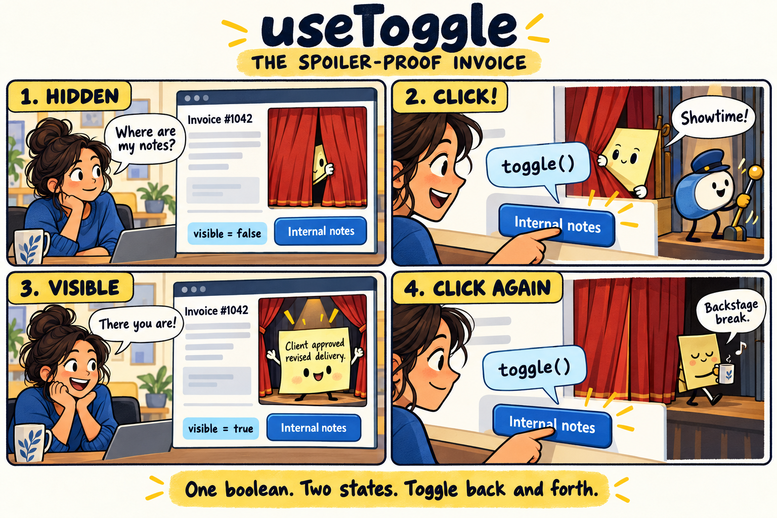
**The spoiler-proof invoice**
![Four-panel useToggle comic. An authorized teammate clicks Internal notes: visible changes from false to true, revealing the invoice note. Clicking toggle again returns visible to false and the note takes a backstage break.](https://unpkg.com/use-a-hook@0.3.2/assets/comics/useToggle.png)

*One boolean, two states: toggle() changes false to true, then back to false.*

An invoice screen hides internal notes until a teammate asks to see them. No treasure map required.

**Why this hook helps:** A boolean and a stable toggle action keep the reveal/hide interaction small and readable.

**Keep in mind:** Use a full dialog primitive if the revealed content must trap focus; this example is an inline disclosure.

[Open the complete example](https://unpkg.com/use-a-hook@0.3.2/examples/useToggle.tsx)

```tsx
'use client';

import { useToggle } from 'use-a-hook';

export default function InvoiceNotes() {
  const [visible, toggle] = useToggle();
  return (
    <section>
      <button aria-expanded={visible} aria-controls="invoice-notes" onClick={toggle}>
        Internal notes
      </button>
      <p id="invoice-notes" hidden={!visible}>
        Client approved the revised delivery date.
      </p>
    </section>
  );
}
```

<details>
<summary>API signature</summary>

Boolean state with stable toggle and setter.

```ts
export declare function useToggle(
  // Whether the value starts on or off. Defaults to false.
  initialValue?: boolean
):
  // Returns: A fixed three-item array: the current value, a toggle action, and a setter.
  readonly [
    // The current true/false value.
    boolean,
    // Call with no arguments to flip true to false, or false to true.
    () => void,
    // React state setter: pass a boolean or a function that receives the previous boolean.
    import("react").Dispatch<import("react").SetStateAction<boolean>>
  ];
```

</details>

## useCounter

**Seats, not accidental seat mountains**

A workspace administrator adds or removes paid seats before checkout. The minus button should not manufacture negative employees.

**Why this hook helps:** Counter actions compose when updates happen in the same batch, and reset clears the proposed change.

**Keep in mind:** The hook does not impose business limits. Enforce minimums and maximums in your UI and on the server.

[Open the complete example](https://unpkg.com/use-a-hook@0.3.2/examples/useCounter.tsx)

```tsx
'use client';

import { useCounter } from 'use-a-hook';

export default function SeatPicker() {
  const seats = useCounter(1);
  return (
    <section>
      <p>Seats: {seats.count}</p>
      <button disabled={seats.count <= 1} onClick={() => seats.decrement()}>
        Remove seat
      </button>
      <button onClick={() => seats.increment()}>Add seat</button>
      <button onClick={seats.reset}>Start over</button>
    </section>
  );
}
```

<details>
<summary>API signature</summary>

Counter state with stable functional actions and reset.

```ts
export declare function useCounter(
  // The starting number. Defaults to 0; reset uses the latest initialValue argument.
  initialValue?: number
):
  // Returns: The current count and actions for changing it.
  {
    // The number currently displayed.
    count: number;
    // Add step to the count. Leaving step out adds 1.
    increment: (step?: number) => void;
    // Subtract step from the count. Leaving step out subtracts 1; the hook does not enforce a minimum.
    decrement: (step?: number) => void;
    // Restore the latest initialValue argument.
    reset: () => void;
    // Set the count directly, or calculate it from the previous count.
    set: import("react").Dispatch<import("react").SetStateAction<number>>;
  };
```

</details>

## usePrevious

**Yesterday called; it brought a number**

A sales dashboard shows whether the latest monthly total rose or fell from the last displayed total.

**Why this hook helps:** The hook remembers the previous committed value without scheduling another render just to keep history.

**Keep in mind:** This is render history, not a database of yesterday’s sales. Read historical business data from your API.

[Open the complete example](https://unpkg.com/use-a-hook@0.3.2/examples/usePrevious.tsx)

```tsx
'use client';

import { useState } from 'react';
import { usePrevious } from 'use-a-hook';

export default function RevenueTrend() {
  const [revenue, setRevenue] = useState(1200);
  const previous = usePrevious(revenue);
  return (
    <section>
      <p>Revenue: ${revenue}</p>
      <p>
        {previous === undefined
          ? 'No previous reading yet.'
          : `Change since last render: ${revenue - previous}`}
      </p>
      <button onClick={() => setRevenue((value) => value + 100)}>
        Record another sale
      </button>
    </section>
  );
}
```

<details>
<summary>API signature</summary>

Read the value from the previous committed render.

```ts
export declare function usePrevious<
  // The type of value you pass in, such as a number or a customer object.
  T
>(
  // The value to remember after this render commits.
  value: T
):
  // Returns: The value from the previous committed render, or undefined on the first render.
  T | undefined;
```

</details>

## useDebouncedValue

**Search without the keyboard drum solo**

A customer directory waits for a short typing pause before applying its search term.

**Why this hook helps:** The input stays immediate while the debounced value drives filtering or a query key.

**Keep in mind:** Debouncing limits update frequency; it does not cancel an older request. Pair remote search with a query library or cancellable fetch.

[Open the complete example](https://unpkg.com/use-a-hook@0.3.2/examples/useDebouncedValue.tsx)

```tsx
'use client';

import { useState } from 'react';
import { useDebouncedValue } from 'use-a-hook';

const customers = ['Ada Studio', 'Beacon Bakery', 'Cedar Design'];
export default function CustomerSearch() {
  const [query, setQuery] = useState('');
  const settled = useDebouncedValue(query, 300);
  const matches = customers.filter((name) =>
    name.toLowerCase().includes(settled.toLowerCase()),
  );
  return (
    <section>
      <input
        aria-label="Find customers"
        value={query}
        onChange={(event) => setQuery(event.target.value)}
      />
      <ul>
        {matches.map((name) => (
          <li key={name}>{name}</li>
        ))}
      </ul>
    </section>
  );
}
```

<details>
<summary>API signature</summary>

Delay publishing a value until changes settle.

```ts
import { type DebounceOptions } from './useDebouncedCallback.js';

export interface DebouncedValueOptions<T> extends DebounceOptions {
  // Compare the published and incoming values. Defaults to Object.is.
  equalityFn?: (previous: T, next: T) => boolean;
}

export declare function useDebouncedValue<
  // The type of your input and returned value; the hook keeps them the same.
  T
>(
  // The latest input value; the initial input is available immediately.
  value: T,
  // How long to wait after the last change, in milliseconds. Defaults to 300.
  delay?: number,
  // Optional scheduling edges, maxWait, and an equality function.
  options?: DebouncedValueOptions<T>
):
  // Returns: The most recent value whose waiting period has finished.
  T;
```

</details>

## useDebouncedCallback

**One preview, hold the confetti**

A report builder regenerates a preview after the user pauses editing a heading.

**Why this hook helps:** The scheduled callback keeps the newest arguments. A Preview now button can flush pending work immediately.

**Keep in mind:** Use useAutosave for persistent writes that must be serialized; debouncing alone does not prevent overlapping saves.

[Open the complete example](https://unpkg.com/use-a-hook@0.3.2/examples/useDebouncedCallback.tsx)

```tsx
'use client';

import { useState } from 'react';
import { useDebouncedCallback } from 'use-a-hook';

export default function ReportHeading() {
  const [heading, setHeading] = useState('Quarterly wins');
  const [preview, setPreview] = useState(heading);
  const update = useDebouncedCallback((text: string) => setPreview(text), 400, {
    maxWait: 1200
  });
  return (
    <section>
      <input
        aria-label="Report heading"
        value={heading}
        onChange={(event) => {
          setHeading(event.target.value);
          update(event.target.value);
        }}
      />
      <button onClick={() => update.flush()}>Preview now</button>
      <h2>{preview}</h2>
    </section>
  );
}
```

<details>
<summary>API signature</summary>

Configurable callback debounce with bounded waiting, pending inspection, cancel, and flush.

```ts
export interface ScheduledCallback<A extends unknown[], R> {
  (...args: A): void;
  // Cancel the pending call without running it.
  cancel(): void;
  // Run pending work now and return its result; return undefined if nothing is waiting.
  flush(): R | undefined;
}

export interface ControlledCallback<A extends unknown[], R> extends ScheduledCallback<A, R> {
  // Read whether a callback invocation is waiting; this does not trigger renders.
  isPending(): boolean;
}

export interface DebounceOptions {
  // Run at the start of a burst. Defaults to false.
  leading?: boolean;
  // Run the newest pending call after quiet time. Defaults to true.
  trailing?: boolean;
  // Maximum delay during continuous calls, clamped to at least delay.
  maxWait?: number;
}

export declare function useDebouncedCallback<
  // The list of argument types accepted by your callback.
  A extends unknown[],
  // The type of value your callback returns.
  R
>(
  // The function to run after calls stop arriving. The latest committed callback is used.
  callback: (...args: A) => R,
  // The quiet period in milliseconds. Defaults to 300.
  delay?: number,
  // Optional leading/trailing edges and maximum wait. Defaults to trailing-only behavior.
  options?: DebounceOptions
):
  // Returns: A callable scheduler with cancel(), flush(), and isPending(). Cleanup cancels work; it never flushes side effects automatically.
  ControlledCallback<A, R>;
```

</details>

## useThrottledCallback

**The slider with an inside voice**

A dashboard slider emits many changes, but a secondary preview only needs an update every 100 milliseconds.

**Why this hook helps:** Time-based throttling delivers a leading update and the newest trailing value without rendering for every scheduled call.

**Keep in mind:** Use useRafCallback for paint-aligned visual movement. A millisecond throttle serves a different timing contract.

[Open the complete example](https://unpkg.com/use-a-hook@0.3.2/examples/useThrottledCallback.tsx)

```tsx
'use client';

import { useState } from 'react';
import { useThrottledCallback } from 'use-a-hook';

export default function PreviewQuality() {
  const [value, setValue] = useState(50);
  const [preview, setPreview] = useState(50);
  const publish = useThrottledCallback((quality: number) => setPreview(quality), 100);
  return (
    <section>
      <input
        aria-label="Preview quality"
        type="range"
        value={value}
        onChange={(event) => {
          const next = Number(event.target.value);
          setValue(next);
          publish(next);
        }}
      />
      <p>Preview quality: {preview}%</p>
    </section>
  );
}
```

<details>
<summary>API signature</summary>

Configurable leading/trailing callback throttle with pending inspection, cancel, and flush.

```ts
import type { ControlledCallback } from './useDebouncedCallback.js';

export interface ThrottleOptions {
  // Run immediately when a new time window starts. Defaults to true.
  leading?: boolean;
  // Run the newest pending arguments at the end of the window. Defaults to true.
  trailing?: boolean;
}

export declare function useThrottledCallback<
  // The callback argument types, kept in their original order.
  A extends unknown[],
  // The callback result type, returned by flush when it runs pending work.
  R
>(
  // The function to run at a limited rate. Later calls keep their newest arguments.
  callback: (...args: A) => R,
  // The minimum time between runs, in milliseconds. Defaults to 300.
  delay?: number,
  // Optional leading and trailing edges. Both default to true.
  options?: ThrottleOptions
):
  // Returns: A scheduler with cancel(), flush(), and isPending(). Calls are limited by elapsed time, independently of display frame rate.
  ControlledCallback<A, R>;
```

</details>

## useInterval

**The meeting clock takes a coffee break**

A meeting timer counts seconds while running and pauses when the facilitator pauses the session.

**Why this hook helps:** A null delay pauses the interval, and changing the callback does not restart its cadence.

**Keep in mind:** For elapsed time that must survive background throttling, derive the display from timestamps rather than counting interval ticks.

[Open the complete example](https://unpkg.com/use-a-hook@0.3.2/examples/useInterval.tsx)

```tsx
'use client';

import { useState } from 'react';
import { useInterval } from 'use-a-hook';

export default function MeetingTimer() {
  const [running, setRunning] = useState(false);
  const [seconds, setSeconds] = useState(0);
  useInterval(() => setSeconds((value) => value + 1), running ? 1000 : null);
  return (
    <section>
      <p>Timer ticks: {seconds}</p>
      <button onClick={() => setRunning((value) => !value)}>
        {running ? 'Pause' : 'Start'}
      </button>
    </section>
  );
}
```

<details>
<summary>API signature</summary>

A cancellable interval that does not restart when callbacks change.

```ts
export declare function useInterval(
  // Work to repeat. Updating this function does not restart the timer.
  callback: () => void,
  // Time between runs in milliseconds; pass null to pause.
  delay: number | null
):
  // Returns: Nothing to store: the hook manages the interval and removes it on cleanup.
  void;
```

</details>

## useTimeout

**The toast knows when to leave**

A settings screen briefly shows a local confirmation after updating a display preference.

**Why this hook helps:** A timeout clears the message and cancels when the component unmounts or its delay becomes null.

**Keep in mind:** A callback change does not restart the deadline. Use a distinct keyed notice component if every repeated notice needs a fresh timer.

[Open the complete example](https://unpkg.com/use-a-hook@0.3.2/examples/useTimeout.tsx)

```tsx
'use client';

import { useState } from 'react';
import { useTimeout } from 'use-a-hook';

export default function PreferenceNotice() {
  const [notice, setNotice] = useState(false);
  useTimeout(() => setNotice(false), notice ? 2000 : null);
  return (
    <section>
      <button disabled={notice} onClick={() => setNotice(true)}>
        Apply display preference
      </button>
      {notice && <p role="status">Preference applied for this preview.</p>}
    </section>
  );
}
```

<details>
<summary>API signature</summary>

A cancellable timeout that uses the latest callback.

```ts
export declare function useTimeout(
  // Work to run once. The timer uses the latest committed function.
  callback: () => void,
  // Wait time in milliseconds; pass null to cancel. Changing the callback alone does not restart the wait.
  delay: number | null
):
  // Returns: Nothing to store: the hook schedules and cleans up the timeout.
  void;
```

</details>

## useEventListener

**Escape the help panel, not your job**

A support panel closes when the user presses Escape.

**Why this hook helps:** The hook manages listener cleanup and keeps the handler current without reconnecting it on every render.

**Keep in mind:** For modifier shortcuts and editable-field filtering, use useHotkeys instead of rebuilding those rules yourself.

[Open the complete example](https://unpkg.com/use-a-hook@0.3.2/examples/useEventListener.tsx)

```tsx
'use client';

import { useState } from 'react';
import { useEventListener } from 'use-a-hook';

export default function HelpPanel() {
  const [open, setOpen] = useState(true);
  useEventListener('keydown', (event) => {
    if (event.key === 'Escape') setOpen(false);
  });
  return (
    <section>
      <button onClick={() => setOpen(true)}>Open help</button>
      {open && <aside aria-label="Help">Press Escape to close this panel.</aside>}
    </section>
  );
}
```

<details>
<summary>API signature</summary>

Typed browser event listeners with stable callbacks and cleanup.

```ts
import { type RefObject } from 'react';

type Options = boolean | AddEventListenerOptions;

type Target<T extends EventTarget> = T | RefObject<T | null> | null;

export declare function useEventListener<
  // One supported browser event name; it determines the handler event type.
  K extends keyof WindowEventMap
>(
  // The event name, such as keydown, resize, or click.
  type: K,
  // The function that receives the event. Built-in event names get matching TypeScript event types.
  handler: (event: WindowEventMap[K]) => void,
  // An element, document, window, or object ref to one. Omit for window; null disables. Object-ref replacements are resolved after each commit.
  target?: Target<Window>,
  // Browser listener settings, or a boolean capture flag. Equivalent settings do not reconnect the listener.
  options?: Options
):
  // Returns: Nothing to store: the event listener is attached and removed for you.
  void;

export declare function useEventListener<
  // One supported browser event name; it determines the handler event type.
  K extends keyof DocumentEventMap
>(
  // The event name, such as keydown, resize, or click.
  type: K,
  // The function that receives the event. Built-in event names get matching TypeScript event types.
  handler: (event: DocumentEventMap[K]) => void,
  // An element, document, window, or object ref to one. Omit for window; null disables. Object-ref replacements are resolved after each commit.
  target: Target<Document>,
  // Browser listener settings, or a boolean capture flag. Equivalent settings do not reconnect the listener.
  options?: Options
):
  // Returns: Nothing to store: the event listener is attached and removed for you.
  void;

export declare function useEventListener<
  // One supported browser event name; it determines the handler event type.
  K extends keyof HTMLElementEventMap
>(
  // The event name, such as keydown, resize, or click.
  type: K,
  // The function that receives the event. Built-in event names get matching TypeScript event types.
  handler: (event: HTMLElementEventMap[K]) => void,
  // An element, document, window, or object ref to one. Omit for window; null disables. Object-ref replacements are resolved after each commit.
  target: Target<HTMLElement>,
  // Browser listener settings, or a boolean capture flag. Equivalent settings do not reconnect the listener.
  options?: Options
):
  // Returns: Nothing to store: the event listener is attached and removed for you.
  void;

export declare function useEventListener<
  // One supported browser event name; it determines the handler event type.
  K extends keyof SVGElementEventMap
>(
  // The event name, such as keydown, resize, or click.
  type: K,
  // The function that receives the event. Built-in event names get matching TypeScript event types.
  handler: (event: SVGElementEventMap[K]) => void,
  // An element, document, window, or object ref to one. Omit for window; null disables. Object-ref replacements are resolved after each commit.
  target: Target<SVGElement>,
  // Browser listener settings, or a boolean capture flag. Equivalent settings do not reconnect the listener.
  options?: Options
):
  // Returns: Nothing to store: the event listener is attached and removed for you.
  void;

export declare function useEventListener(
  // The event name, such as keydown, resize, or click.
  type: string,
  // The function that receives the event. Built-in event names get matching TypeScript event types.
  handler: (event: Event) => void,
  // An element, document, window, or object ref to one. Omit for window; null disables. Object-ref replacements are resolved after each commit.
  target: Target<EventTarget>,
  // Browser listener settings, or a boolean capture flag. Equivalent settings do not reconnect the listener.
  options?: Options
):
  // Returns: Nothing to store: the event listener is attached and removed for you.
  void;

export {};
```

</details>

## useClickOutside

**A menu that reads the room**

An account menu dismisses when someone clicks elsewhere on the page.

**Why this hook helps:** The handler checks whether the pointer event came from outside the referenced subtree.

**Keep in mind:** This handles outside pointers, not complete menu accessibility. Add keyboard behavior or use an established menu primitive.

[Open the complete example](https://unpkg.com/use-a-hook@0.3.2/examples/useClickOutside.tsx)

```tsx
'use client';

import { useState, useRef } from 'react';
import { useClickOutside } from 'use-a-hook';

export default function AccountMenu() {
  const [open, setOpen] = useState(false);
  const ref = useRef<HTMLDivElement>(null);
  useClickOutside(ref, () => setOpen(false), open);
  return (
    <div ref={ref}>
      <button aria-expanded={open} onClick={() => setOpen((value) => !value)}>
        Account
      </button>
      {open && (
        <nav aria-label="Account">
          <a href="/settings">Settings</a>
        </nav>
      )}
    </div>
  );
}
```

<details>
<summary>API signature</summary>

Detect pointer events outside an element, including shadow DOM paths.

```ts
import { type RefObject } from 'react';

export interface ClickOutsideOptions {
  // Whether to listen; defaults to true.
  enabled?: boolean;
  // Refs whose event paths should be ignored.
  ignore?: readonly RefObject<HTMLElement | null>[];
  // Ignore pointer presses on the document scrollbars; defaults to false.
  excludeScrollbar?: boolean;
}

export declare function useClickOutside<
  // The HTML element type held by the ref, such as HTMLDivElement.
  T extends HTMLElement
>(
  // One ref or a fixed list of refs that all count as inside, including portaled content.
  ref: RefObject<T | null> | readonly RefObject<T | null>[],
  // The function to call when a pointer goes down outside that element.
  onOutside: (event: PointerEvent) => void,
  // Boolean enablement (default true), or options with enabled, ignored refs, and scrollbar exclusion.
  enabled?: boolean | ClickOutsideOptions
):
  // Returns: Nothing to store: the hook calls onOutside when appropriate.
  void;
```

</details>

## useMediaQuery

**The dashboard packs a smaller suitcase**

A dashboard switches its preview between compact cards and a wider summary.

**Why this hook helps:** The hook subscribes to a CSS media query, with a deterministic fallback for server rendering.

**Keep in mind:** Prefer CSS alone for styling. Reach for this hook when JavaScript behavior or rendered content must change.

[Open the complete example](https://unpkg.com/use-a-hook@0.3.2/examples/useMediaQuery.tsx)

```tsx
'use client';

import { useMediaQuery } from 'use-a-hook';

export default function ResponsiveSummary() {
  const wide = useMediaQuery('(min-width: 900px)');
  return (
    <section>
      <h2>Workspace activity</h2>
      <p>
        {wide
          ? 'Showing the detailed activity summary.'
          : 'Showing the compact summary.'}
      </p>
    </section>
  );
}
```

<details>
<summary>API signature</summary>

Subscribe to a media query with an explicit SSR fallback.

```ts
export declare function useMediaQuery(
  // A CSS media query, such as (min-width: 800px).
  query: string,
  // The value used during server rendering and initial hydration. Defaults to false.
  serverValue?: boolean
):
  // Returns: True when the browser matches the query; otherwise false.
  boolean;
```

</details>

## useOnlineStatus

**The Wi-Fi weather report**

A workspace displays a connectivity hint near its editor.

**Why this hook helps:** All consumers share the browser online/offline listeners instead of each installing their own pair.

**Keep in mind:** Online means the browser thinks a network is available. It does not prove that your API can be reached.

[Open the complete example](https://unpkg.com/use-a-hook@0.3.2/examples/useOnlineStatus.tsx)

```tsx
'use client';

import { useOnlineStatus } from 'use-a-hook';

export default function ConnectionHint() {
  const online = useOnlineStatus();
  return (
    <p role="status">
      {online
        ? 'Network detected. Your API still gets the final say.'
        : 'Offline. Keep your draft handy.'}
    </p>
  );
}
```

<details>
<summary>API signature</summary>

Share browser online/offline subscriptions across consumers.

```ts
export declare function useOnlineStatus():
  // Returns: The browser connectivity hint: true for online, false for offline. Server rendering starts with true.
  boolean;
```

</details>

## useLocalStorage

**The dashboard remembers your favorite outfit**

A user chooses a compact table layout and expects it to survive a page refresh.

**Why this hook helps:** JSON-backed state restores the preference and synchronizes other hook consumers of the same key.

**Keep in mind:** Keep values small and non-secret. Browser storage is synchronous, and stored JSON is not automatically schema-validated.

[Open the complete example](https://unpkg.com/use-a-hook@0.3.2/examples/useLocalStorage.tsx)

```tsx
'use client';

import { useLocalStorage } from 'use-a-hook';

export default function TableDensity() {
  const [dense, setDense, reset] = useLocalStorage(
    'demo-table-density',
    false,
    { fallbackToMemory: true }
  );
  return (
    <section>
      <label>
        <input
          type="checkbox"
          checked={dense}
          onChange={(event) => setDense(event.target.checked)}
        />{' '}
        Compact rows
      </label>
      <button onClick={reset}>Forget this preference</button>
      <p>Rows are {dense ? 'compact' : 'comfortable'}.</p>
    </section>
  );
}
```

<details>
<summary>API signature</summary>

JSON state synchronized across hook instances and applicable browser tabs.

```ts
import { type StorageOptions } from './internal/useStorage.js';

export type { StorageOptions } from './internal/useStorage.js';

export declare function useLocalStorage<
  // The shape of your JSON value. This type does not validate data already in storage.
  T
>(
  // The browser storage key. Consumers using this key should agree on the value shape and default.
  key: string,
  // The fallback value, or a function that creates it once per mount.
  initialValue: T | (() => T),
  // Optional serializer, server fallback, cross-tab synchronization, memory fallback, and error reporting. Existing write failures still throw by default.
  options?: StorageOptions<T>
):
  // Returns: A fixed array with the stored value, its setter, and a remove action.
  readonly [
    // The current JSON value, or the captured default if storage cannot be read.
    T,
    // Set a new JSON value or calculate it from the latest stored value.
    import("react").Dispatch<import("react").SetStateAction<T>>,
    // Remove the storage key and return hook consumers to their defaults.
    () => void
  ];
```

</details>

## useSessionStorage

**A wizard with a short-term memory**

An onboarding wizard remembers its current step during refreshes in the same tab.

**Why this hook helps:** Session storage keeps temporary flow state separate from long-lived preferences.

**Keep in mind:** Never persist passwords or one-time codes here. Verify sensitive flow state with the server.

[Open the complete example](https://unpkg.com/use-a-hook@0.3.2/examples/useSessionStorage.tsx)

```tsx
'use client';

import { useSessionStorage } from 'use-a-hook';

export default function SetupWizard() {
  const [step, setStep, clear] = useSessionStorage('demo-setup-step', 1);
  return (
    <section>
      <p>Setup step {step} of 3</p>
      <button disabled={step <= 1} onClick={() => setStep((value) => value - 1)}>
        Back
      </button>
      <button disabled={step >= 3} onClick={() => setStep((value) => value + 1)}>
        Next
      </button>
      <button onClick={clear}>Restart</button>
    </section>
  );
}
```

<details>
<summary>API signature</summary>

JSON state scoped to a browser tab with synchronized hook instances.

```ts
import { type StorageOptions } from './internal/useStorage.js';

export declare function useSessionStorage<
  // The shape of your JSON value. This type does not validate data already in storage.
  T
>(
  // The browser storage key. Consumers using this key should agree on the value shape and default.
  key: string,
  // The fallback value, or a function that creates it once per mount.
  initialValue: T | (() => T),
  // Optional serializer, server fallback, cross-tab synchronization, memory fallback, and error reporting. Existing write failures still throw by default.
  options?: StorageOptions<T>
):
  // Returns: A fixed array with the stored value, its setter, and a remove action.
  readonly [
    // The current JSON value, or the captured default if storage cannot be read.
    T,
    // Set a new JSON value or calculate it from the latest stored value.
    import("react").Dispatch<import("react").SetStateAction<T>>,
    // Remove the storage key and return hook consumers to their defaults.
    () => void
  ];
```

</details>

## useIntersectionObserver

**The expensive chart waits backstage**

A chart preview initializes only when its placeholder approaches the viewport.

**Why this hook helps:** Intersection observation reports visibility without a manual scroll-position calculation for every event.

**Keep in mind:** Visibility can change repeatedly. Keep expensive initialization cached or idempotent if it should happen only once.

[Open the complete example](https://unpkg.com/use-a-hook@0.3.2/examples/useIntersectionObserver.tsx)

```tsx
'use client';

import { useIntersectionObserver } from 'use-a-hook';

export default function ChartPlaceholder() {
  const { ref, isIntersecting } = useIntersectionObserver<HTMLDivElement>({
    rootMargin: '100px',
  });
  return (
    <div ref={ref} style={{ minHeight: 180 }}>
      {isIntersecting ? (
        <p>Chart preview is in range: render the chart here.</p>
      ) : (
        <p>Chart is waiting nearby.</p>
      )}
    </div>
  );
}
```

<details>
<summary>API signature</summary>

Observe visibility through an element callback ref.

```ts
export declare function useIntersectionObserver<
  // The element type you will attach the ref to.
  T extends Element = HTMLElement
>(
  // Visibility settings: the scrolling root, extra root margin, and crossing thresholds.
  options?: IntersectionObserverInit
):
  // Returns: An element ref, the latest visibility record, and an easy-to-use boolean.
  {
    // Attach this callback as an element ref so the hook knows what to observe.
    ref: import("react").Dispatch<import("react").SetStateAction<T | null>>;
    // The latest browser observation, or null before one arrives.
    entry: IntersectionObserverEntry | null;
    // True when the latest observation says the element intersects the root.
    isIntersecting: boolean;
  };
```

</details>

## useResizeObserver

**The chart measures its actual apartment**

A dashboard card needs the width of its own container rather than the width of the whole screen.

**Why this hook helps:** The observer tracks content-box dimensions and batches state updates by animation frame.

**Keep in mind:** Width and height start undefined. This hook measures size, not the element’s position on screen.

[Open the complete example](https://unpkg.com/use-a-hook@0.3.2/examples/useResizeObserver.tsx)

```tsx
'use client';

import { useResizeObserver } from 'use-a-hook';

export default function ResizableCard() {
  const { ref, width, height } = useResizeObserver<HTMLDivElement>({
    round: Math.round
  });
  return (
    <div
      ref={ref}
      style={{
        resize: 'horizontal',
        overflow: 'auto',
        padding: 16,
        width: 280
      }}
    >
      <p>
        Card content: {Math.round(width ?? 0)} × {Math.round(height ?? 0)} CSS
        pixels
      </p>
      <p>Drag the resize handle to give the chart more room.</p>
    </div>
  );
}
```

<details>
<summary>API signature</summary>

Shared ResizeObserver subscriptions with latest-entry frame batching and configurable boxes.

```ts
import { type ResizeSubscriptionOptions } from './internal/resizeObserver.js';

export interface ElementSize {
  // Content-box width in CSS pixels; undefined until measured.
  width: number;
  // Content-box height in CSS pixels; undefined until measured.
  height: number;
}

export interface ResizeObserverOptions extends ResizeSubscriptionOptions {
  // Whether to subscribe. Defaults to true.
  enabled?: boolean;
  // Optional number rounding applied to measured dimensions. Defaults to preserving fractions.
  round?: (value: number) => number;
  // Receive each frame-batched size and its native observer entry.
  onResize?: (size: ElementSize, entry: ResizeObserverEntry) => void;
  // Set false for callback-only observation without size renders. Defaults to true.
  updateState?: boolean;
}

export declare function useResizeObserver<
  // The element type to measure, such as HTMLDivElement.
  T extends Element = HTMLElement
>(
  // Optional enablement, box selection, rounding, callback-only observation, and ResizeObserver constructor.
  options?: ResizeObserverOptions
):
  // Returns: An element ref and its latest content-box dimensions.
  {
    // Attach this callback to the element whose size you need.
    ref: import("react").Dispatch<import("react").SetStateAction<T | null>>;
    // Content-box width in CSS pixels; undefined until measured.
    width: number | undefined;
    // Content-box height in CSS pixels; undefined until measured.
    height: number | undefined;
  };
```

</details>

## useFetch

**A status card asks the server politely**

A service-status card requests a small JSON response and lets the user refresh it.

**Why this hook helps:** The hook exposes loading and error state, aborts replaced requests, and ignores stale responses.

**Keep in mind:** Your app must implement /api/service-status. Use a query library when the same resource needs caching or request deduplication.

[Open the complete example](https://unpkg.com/use-a-hook@0.3.2/examples/useFetch.tsx)

```tsx
'use client';

import { useFetch } from 'use-a-hook';

type ServiceStatus = { message: string };
export default function ServiceStatusCard() {
  const request = useFetch<ServiceStatus>('/api/service-status');
  return (
    <section>
      <button disabled={request.loading} onClick={() => void request.refetch()}>
        Refresh status
      </button>
      {request.loading && <p role="status">Checking…</p>}
      {request.error && <p role="alert">{request.error.message}</p>}
      {request.data && <p>{request.data.message}</p>}
    </section>
  );
}
```

<details>
<summary>API signature</summary>

Minimal cancellable JSON reads with stale-response protection; no query cache.

```ts
export interface FetchState<T> {
  // The latest successful JSON result, or undefined before success/after an error. A 204 response also has no data.
  data: T | undefined;
  // The most recent request error, or undefined when there is none.
  error: Error | undefined;
  // True while the active request is pending; initially false until the effect starts.
  loading: boolean;
}

export interface FetchOptions extends Omit<RequestInit, 'signal'> {
  // Whether this URL may be fetched. Defaults to true. The hook owns its AbortSignal.
  enabled?: boolean;
}

export declare function useFetch<
  // The expected JSON response shape. Defaults to unknown; this is a type hint, not runtime validation.
  T = unknown
>(
  // The JSON endpoint to read; pass null to disable requests.
  url: string | null,
  // Fetch settings plus enabled. URL/enabled changes start a request; other option changes apply on the next request.
  options?: FetchOptions
):
  // Returns: Request state and a stable refetch action.
  {
    // Start another request using current options. Awaiting it waits for completion; errors are stored in error.
    refetch: () => Promise<void>;
    // The latest successful JSON result, or undefined before success/after an error. A 204 response also has no data.
    data: T | undefined;
    // The most recent request error, or undefined when there is none.
    error: Error | undefined;
    // True while the active request is pending; initially false until the effect starts.
    loading: boolean;
  };
```

</details>

## useSetState

**Change one filter, keep the rest of the band**

A customer table updates its search text without accidentally discarding the active-only filter.

**Why this hook helps:** Partial patches merge into the object, and functional patches can depend on the current state.

**Keep in mind:** Merging is shallow. Replace a nested object deliberately instead of expecting a deep merge.

[Open the complete example](https://unpkg.com/use-a-hook@0.3.2/examples/useSetState.tsx)

```tsx
'use client';

import { useSetState } from 'use-a-hook';

export default function CustomerFilters() {
  const [filters, patch] = useSetState({ query: '', activeOnly: true });
  return (
    <section>
      <input
        aria-label="Search"
        value={filters.query}
        onChange={(event) => patch({ query: event.target.value })}
      />
      <label>
        <input
          type="checkbox"
          checked={filters.activeOnly}
          onChange={(event) => patch({ activeOnly: event.target.checked })}
        />{' '}
        Active customers only
      </label>
      <pre>{JSON.stringify(filters, null, 2)}</pre>
    </section>
  );
}
```

<details>
<summary>API signature</summary>

Shallow-merge object state, with functional patches and unchanged-value bailouts.

```ts
export declare function useSetState<
  // The object shape. Patches can change only keys that belong to this shape.
  T extends object
>(
  // The starting object, or a function that creates it once.
  initial: T | (() => T)
):
  // Returns: An object state value and a function that shallow-merges changes into it.
  readonly [
    // The current object. Treat it as immutable.
    T,
    // Pass changed fields, or a function returning changed fields. Nested objects are replaced, not deep-merged.
    (update: Partial<T> | ((previous: T) => Partial<T>)) => void
  ];
```

</details>

## useConstant

**One expensive notebook per desk**

A report component builds a small reference index once for its mounted instance.

**Why this hook helps:** The initializer’s result keeps its identity across renders, even when its value is undefined.

**Keep in mind:** Keep initialization pure: Strict Mode and abandoned renders may initialize more than once. Do not open sockets or start timers here.

[Open the complete example](https://unpkg.com/use-a-hook@0.3.2/examples/useConstant.tsx)

```tsx
'use client';

import { useState } from 'react';
import { useConstant } from 'use-a-hook';

export default function RegionLookup() {
  const regions = useConstant(
    () =>
      new Map([
        ['apac', 'Asia Pacific'],
        ['emea', 'Europe, Middle East and Africa'],
      ]),
  );
  const [code, setCode] = useState('apac');
  return (
    <section>
      <select
        aria-label="Region"
        value={code}
        onChange={(event) => setCode(event.target.value)}
      >
        <option value="apac">APAC</option>
        <option value="emea">EMEA</option>
      </select>
      <p>{regions.get(code)}</p>
    </section>
  );
}
```

<details>
<summary>API signature</summary>

Initialize one pure value per mounted instance; useful for local stores.

```ts
export declare function useConstant<
  // The type of the initialized value, including undefined if that is what the function returns.
  T
>(
  // A pure function that creates the value. Do not start subscriptions or other side effects here.
  initialize: () => T
):
  // Returns: The same initialized value for the lifetime of this mounted instance.
  T;
```

</details>

## useResetState

**The reset button brings the original receipt**

A profile form offers a way to discard local nickname edits.

**Why this hook helps:** The hook captures the original value once and exposes a stable action to restore it.

**Keep in mind:** A new initial argument does not replace the captured baseline. Remount the editor when switching records.

[Open the complete example](https://unpkg.com/use-a-hook@0.3.2/examples/useResetState.tsx)

```tsx
'use client';

import { useResetState } from 'use-a-hook';

export default function NicknameEditor() {
  const [nickname, setNickname, reset] = useResetState('Ada');
  return (
    <section>
      <input
        aria-label="Nickname"
        value={nickname}
        onChange={(event) => setNickname(event.target.value)}
      />
      <button onClick={reset}>Discard nickname edits</button>
    </section>
  );
}
```

<details>
<summary>API signature</summary>

State with a stable reset action that restores its original value.

```ts
export declare function useResetState<
  // The type of the state value.
  T
>(
  // The starting value or a function that creates it; captured once per mount.
  initial: T | (() => T)
):
  // Returns: A fixed array containing state, its setter, and a reset action.
  readonly [
    // The current state value.
    T,
    // Set the value directly or calculate it from the previous value.
    import("react").Dispatch<import("react").SetStateAction<T>>,
    // Restore the original captured value, not a later initial argument.
    () => void
  ];
```

</details>

## useLatest

**The callback checks today’s guest list**

A delayed local preview should use the most recently committed recipient name, even if it was scheduled earlier.

**Why this hook helps:** A stable ref lets an imperative callback read fresh committed data without rebuilding that callback.

**Keep in mind:** Refs do not trigger renders. Use normal state for values that must update the visible UI.

[Open the complete example](https://unpkg.com/use-a-hook@0.3.2/examples/useLatest.tsx)

```tsx
'use client';

import { useState, useRef, useEffect } from 'react';
import { useLatest } from 'use-a-hook';

export default function GreetingPreview() {
  const [name, setName] = useState('Ada');
  const [message, setMessage] = useState('');
  const latestName = useLatest(name);
  const timer = useRef<ReturnType<typeof setTimeout> | undefined>(undefined);
  useEffect(() => () => clearTimeout(timer.current), []);
  function preview() {
    clearTimeout(timer.current);
    timer.current = setTimeout(() => setMessage(`Hello, ${latestName.current}!`), 1000);
  }
  return (
    <section>
      <input
        aria-label="Recipient"
        value={name}
        onChange={(event) => setName(event.target.value)}
      />
      <button onClick={preview}>Preview in one second</button>
      <p>{message}</p>
    </section>
  );
}
```

<details>
<summary>API signature</summary>

A stable ref containing the latest committed value, without causing renders.

```ts
export declare function useLatest<
  // The type stored in ref.current.
  T
>(
  // The value that should be available after the latest render commits.
  value: T
):
  // Returns: A stable ref object whose current property holds the latest committed value; updating it does not render the component.
  import("react").MutableRefObject<T>;
```

</details>

## useEventCallback

**A subscription without the revolving door**

An integration emits a custom event, and the listener needs the current workspace name without being reattached on each edit.

**Why this hook helps:** The stable callback identity reads the latest committed closure when the event arrives.

**Keep in mind:** Call it from events or effects, not during render. This example uses a local CustomEvent instead of an external service.

[Open the complete example](https://unpkg.com/use-a-hook@0.3.2/examples/useEventCallback.tsx)

```tsx
'use client';

import { useState, useEffect } from 'react';
import { useEventCallback } from 'use-a-hook';

export default function WorkspaceEvent() {
  const [workspace, setWorkspace] = useState('Design team');
  const [message, setMessage] = useState('');
  const receive = useEventCallback(() => setMessage(`Event received for ${workspace}`));
  useEffect(() => {
    window.addEventListener('demo-workspace-ping', receive);
    return () => window.removeEventListener('demo-workspace-ping', receive);
  }, [receive]);
  return (
    <section>
      <input
        aria-label="Workspace"
        value={workspace}
        onChange={(event) => setWorkspace(event.target.value)}
      />
      <button onClick={() => window.dispatchEvent(new Event('demo-workspace-ping'))}>
        Send local ping
      </button>
      <p>{message}</p>
    </section>
  );
}
```

<details>
<summary>API signature</summary>

A stable event callback that reads the latest committed closure.

```ts
export declare function useEventCallback<
  // The callback argument types, in order.
  A extends unknown[],
  // The value returned when the callback runs.
  R
>(
  // Your event function; its latest committed version is used when called.
  callback: (...args: A) => R
):
  // Returns: A function with stable identity that accepts and returns the same types as callback. Call it from events or effects, not during render.
  (...args: A) => R;
```

</details>

## useControllableState

**The parent gets the remote control**

A reusable details widget can manage itself or let a parent choose whether it is open.

**Why this hook helps:** The same component supports controlled value/onChange props and an internal default.

**Keep in mind:** Avoid switching between controlled and uncontrolled modes during the same mount.

[Open the complete example](https://unpkg.com/use-a-hook@0.3.2/examples/useControllableState.tsx)

```tsx
'use client';

import { useState } from 'react';
import { useControllableState } from 'use-a-hook';

function Details({
  value,
  onChange,
}: {
  value?: boolean;
  onChange?: (next: boolean) => void;
}) {
  const [open, setOpen] = useControllableState({
    value,
    defaultValue: false,
    onChange,
  });
  return (
    <section>
      <button aria-expanded={open} onClick={() => setOpen((current) => !current)}>
        Details
      </button>
      {open && <p>Reusable components can share the remote.</p>}
    </section>
  );
}
export default function ControlledDetails() {
  const [open, setOpen] = useState(false);
  return (
    <>
      <button onClick={() => setOpen(true)}>Parent opens details</button>
      <Details value={open} onChange={setOpen} />
    </>
  );
}
```

<details>
<summary>API signature</summary>

Build components supporting either a controlled value or an internal default.

```ts
import { type SetStateAction } from 'react';

export interface ControllableStateOptions<T> {
  // The parent-controlled value. Undefined means use internal state.
  value?: T;
  // The initial internal value when no controlled value is supplied.
  defaultValue: T;
  // Called with the next requested value. In controlled mode the parent must pass that value back.
  onChange?: (value: T) => void;
}

export declare function useControllableState<
  // The type of the controlled or internal value.
  T
>(
  // Settings for controlled state or an internal default.
  { value, defaultValue, onChange }: ControllableStateOptions<T>
):
  // Returns: The effective value and a stable setter that can notify the owner.
  readonly [
    // The controlled value, or the internal value when uncontrolled.
    T,
    // Request a new value directly or from the previous value; controlled state still belongs to its parent.
    (action: SetStateAction<T>) => void
  ];
```

</details>

## useHistory

**Undo: the editor’s tiny time machine**

A content editor lets users undo and redo title changes without turning every typo into a permanent life decision.

**Why this hook helps:** Immutable snapshots form a bounded past/present/future history. A new edit after undo creates a new branch.

**Keep in mind:** Avoid recording every large document on every keystroke. Group edits or store smaller snapshots for large editors.

[Open the complete example](https://unpkg.com/use-a-hook@0.3.2/examples/useHistory.tsx)

```tsx
'use client';

import { useHistory } from 'use-a-hook';

export default function TitleHistory() {
  const history = useHistory({ title: 'My portfolio' }, 30);
  return (
    <section>
      <input
        aria-label="Portfolio title"
        value={history.value.title}
        onChange={(event) => history.set({ title: event.target.value })}
      />
      <button disabled={!history.canUndo} onClick={history.undo}>
        Undo
      </button>
      <button disabled={!history.canRedo} onClick={history.redo}>
        Redo
      </button>
    </section>
  );
}
```

<details>
<summary>API signature</summary>

Bounded undo/redo history for immutable editor snapshots.

```ts
export declare function useHistory<
  // The type of every stored snapshot; do not mutate snapshots after storing them.
  T
>(
  // The first immutable snapshot.
  initial: T,
  // Maximum number of past snapshots to keep. Defaults to 100 and is clamped to at least 1.
  limit?: number
):
  // Returns: The present snapshot and bounded undo/redo controls.
  {
    // The current snapshot.
    value: T;
    // Whether a past snapshot exists.
    canUndo: boolean;
    // Whether a future snapshot exists after an undo.
    canRedo: boolean;
    // Add a new snapshot directly or from the current value; this clears redo history.
    set: (action: T | ((previous: T) => T)) => void;
    // Move back one snapshot if possible.
    undo: () => void;
    // Move forward one snapshot if possible.
    redo: () => void;
    // Replace the present value and clear both history stacks.
    reset: (value: T) => void;
  };
```

</details>

## useList

**The task list grows legs**

A project board adds, updates, and removes local tasks before they are submitted.

**Why this hook helps:** List actions create new arrays, so React can detect changes without mutating an earlier snapshot.

**Keep in mind:** Use stable record IDs as React keys. Array positions are useful for operations, not durable identity.

[Open the complete example](https://unpkg.com/use-a-hook@0.3.2/examples/useList.tsx)

```tsx
'use client';

import { useList } from 'use-a-hook';

export default function TaskList() {
  const tasks = useList<{ id: string; title: string }>([]);
  return (
    <section>
      <button
        onClick={() =>
          tasks.append({ id: crypto.randomUUID(), title: 'Review invoice' })
        }
      >
        Add task
      </button>
      <ul>
        {tasks.items.map((task, index) => (
          <li key={task.id}>
            {task.title} <button onClick={() => tasks.removeAt(index)}>Remove</button>
          </li>
        ))}
      </ul>
      <button onClick={tasks.clear}>Clear local tasks</button>
    </section>
  );
}
```

<details>
<summary>API signature</summary>

Immutable list operations with stable actions and functional updates.

```ts
export declare function useList<
  // The type of one list item, such as a task object.
  T
>(
  // The starting items. Defaults to an empty list; copied once when the hook mounts.
  initial?: readonly T[]
):
  // Returns: A read-only item snapshot and actions that create new arrays.
  {
    // The current list. Do not change this array directly.
    items: readonly T[];
    // Replace the whole list, or calculate a new array from the previous list.
    set: import("react").Dispatch<import("react").SetStateAction<T[]>>;
    // Add one or more items at the end.
    append: (...values: T[]) => void;
    // Add one or more items at the beginning.
    prepend: (...values: T[]) => void;
    // Remove the item at this zero-based index; invalid indexes do nothing.
    removeAt: (index: number) => void;
    // Replace the item at this zero-based index; invalid indexes do nothing.
    updateAt: (index: number, value: T) => void;
    // Remove every item.
    clear: () => void;
  };
```

</details>

## useMap

**Every invoice gets its own sticky note**

A billing review screen tracks local review notes by invoice ID.

**Why this hook helps:** A map provides keyed lookups while immutable actions keep snapshots safe for React rendering.

**Keep in mind:** The exposed snapshot is read-only in TypeScript. Use hook actions instead of mutating it with Map.set.

[Open the complete example](https://unpkg.com/use-a-hook@0.3.2/examples/useMap.tsx)

```tsx
'use client';

import { useMap } from 'use-a-hook';

export default function InvoiceReviewNotes() {
  const notes = useMap<string, string>();
  return (
    <section>
      <label>
        Invoice INV-42{' '}
        <input
          value={notes.value.get('INV-42') ?? ''}
          onChange={(event) => notes.set('INV-42', event.target.value)}
        />
      </label>
      <button onClick={() => notes.remove('INV-42')}>Remove note</button>
      <p>{notes.value.size} invoices have local notes.</p>
    </section>
  );
}
```

<details>
<summary>API signature</summary>

Immutable map updates that skip unchanged keys and values.

```ts
export declare function useMap<
  // The type of map keys, such as a customer ID string.
  K,
  // The type of values stored under those keys.
  V
>(
  // Optional starting key/value pairs. Copied once when the hook mounts.
  initial?: Iterable<readonly [K, V]>
):
  // Returns: A read-only map snapshot and actions for changing entries.
  {
    // The current key/value map. Read with get(), has(), or iteration.
    value: ReadonlyMap<K, V>;
    // Store a value under a key; an unchanged value reuses the current snapshot.
    set: (key: K, item: V) => void;
    // Remove a key if it exists.
    remove: (key: K) => void;
    // Remove all entries.
    clear: () => void;
  };
```

</details>

## useSet

**No duplicate VIP wristbands**

A report builder tracks which optional sections are enabled. Selecting a section twice should not duplicate it.

**Why this hook helps:** A set represents membership directly, and no-op membership updates reuse the existing snapshot.

**Keep in mind:** Store stable IDs rather than freshly created objects if membership should survive data refreshes.

[Open the complete example](https://unpkg.com/use-a-hook@0.3.2/examples/useSet.tsx)

```tsx
'use client';

import { useSet } from 'use-a-hook';

const sections = ['Revenue', 'Customers', 'Retention'];
export default function ReportSections() {
  const chosen = useSet<string>(['Revenue']);
  return (
    <fieldset>
      <legend>Include in report</legend>
      {sections.map((section) => (
        <label key={section}>
          <input
            type="checkbox"
            checked={chosen.value.has(section)}
            onChange={() => chosen.toggle(section)}
          />{' '}
          {section}
        </label>
      ))}
      <p>{chosen.value.size} sections selected.</p>
    </fieldset>
  );
}
```

<details>
<summary>API signature</summary>

Immutable set membership with no-op update bailouts.

```ts
export declare function useSet<
  // The type of each member. Objects use reference identity, so stable IDs are often simpler.
  T
>(
  // Optional starting unique values. Copied once when the hook mounts.
  initial?: Iterable<T>
):
  // Returns: A read-only set snapshot and membership actions.
  {
    // The current unique values. Read membership with has().
    value: ReadonlySet<T>;
    // Include one value if it is missing.
    add: (item: T) => void;
    // Include all supplied values in one state update; duplicates are ignored.
    addMany: (items: Iterable<T>) => void;
    // Exclude one value if it is present.
    remove: (item: T) => void;
    // Remove every supplied member in one immutable update.
    removeMany: (items: Iterable<T>) => void;
    // Replace membership; identical sets preserve the current snapshot.
    replace: (items: Iterable<T>) => void;
    // Restore membership captured on mount.
    reset: () => void;
    // Remove a present value or add a missing value.
    toggle: (item: T) => void;
    // Remove all values.
    clear: () => void;
    // Number of unique members.
    size: number;
  };
```

</details>

## useQueue

**Notifications form an orderly line**

A dashboard shows one local announcement at a time rather than stacking a wall of toast messages.

**Why this hook helps:** FIFO state makes the next item explicit: enqueue adds to the back, dequeue removes the front.

**Keep in mind:** This is an in-memory UI queue, not durable job processing. A refresh starts a new queue.

[Open the complete example](https://unpkg.com/use-a-hook@0.3.2/examples/useQueue.tsx)

```tsx
'use client';

import { useQueue } from 'use-a-hook';

export default function AnnouncementQueue() {
  const queue = useQueue<string>();
  return (
    <section>
      <button onClick={() => queue.enqueue('The weekly report is ready.')}>
        Queue announcement
      </button>
      <p role="status">{queue.first ?? 'No announcements waiting.'}</p>
      <button disabled={!queue.size} onClick={queue.dequeue}>
        Dismiss current
      </button>
      <p>{queue.size} waiting</p>
    </section>
  );
}
```

<details>
<summary>API signature</summary>

FIFO state for sequential UI notifications and local work items.

```ts
export declare function useQueue<
  // The type of each queue item.
  T
>(
  // Optional starting items in first-in, first-out order. Defaults to an empty list.
  initial?: readonly T[]
):
  // Returns: The queue snapshot and actions for adding/removing waiting items.
  {
    // All waiting items in queue order.
    items: readonly T[];
    // The item at the front; at runtime this is undefined when the queue is empty.
    first: T;
    // The number of waiting items.
    size: number;
    // Add an item to the back of the queue.
    enqueue: (item: T) => void;
    // Remove the front item; this action does not return the removed item.
    dequeue: () => void;
    // Remove all waiting items.
    clear: () => void;
  };
```

</details>

## useSelection

**Bulk actions without checkbox spaghetti**

A customer table supports individual selection, select-all, and clearing the selection.

**Why this hook helps:** Selection is stored as stable IDs, with bulk membership updates performed in one state action.

**Keep in mind:** Decide whether selection spans pages. The hook does not automatically clear IDs when your filters or account change.

[Open the complete example](https://unpkg.com/use-a-hook@0.3.2/examples/useSelection.tsx)

```tsx
'use client';

import { useSelection } from 'use-a-hook';

const customers = [
  { id: 'a', name: 'Ada Studio' },
  { id: 'b', name: 'Beacon Bakery' },
];
export default function CustomerSelection() {
  const selection = useSelection<string>();
  return (
    <section>
      <button
        onClick={() => selection.selectAll(customers.map((customer) => customer.id))}
      >
        Select this page
      </button>
      <button onClick={selection.clear}>Clear selection</button>
      {customers.map((customer) => (
        <label key={customer.id}>
          <input
            type="checkbox"
            checked={selection.isSelected(customer.id)}
            onChange={() => selection.toggle(customer.id)}
          />{' '}
          {customer.name}
        </label>
      ))}
      <p>{selection.count} customers ready for a bulk action.</p>
    </section>
  );
}
```

<details>
<summary>API signature</summary>

Stable ID-based multi-selection for bulk table actions.

```ts
export declare function useSelection<
  // The selected ID type. Use stable IDs rather than row positions.
  T
>(
  // Optional IDs that start selected.
  initial?: Iterable<T>
):
  // Returns: Selected IDs and actions for individual or bulk selection.
  {
    // The read-only set of selected IDs.
    selected: ReadonlySet<T>;
    // Add one ID to the selection.
    select: (item: T) => void;
    // Remove one ID from the selection.
    deselect: (item: T) => void;
    // Select an unselected ID or deselect a selected one.
    toggle: (item: T) => void;
    // Clear the whole selection.
    clear: () => void;
    // Add all supplied IDs in one update, keeping IDs that were already selected.
    selectAll: (items: Iterable<T>) => void;
    // Check whether an ID is selected.
    isSelected: (id: T) => boolean;
    // The number of selected IDs.
    count: number;
  };
```

</details>

## useFilteredList

**Only the invoices that need a nudge**

An accounts screen switches between all invoices and unpaid invoices.

**Why this hook helps:** The filtered result is memoized when the source array and predicate keep their identities.

**Keep in mind:** A new inline predicate causes recomputation. Use a stable callback when the list is large or the result feeds other memoized work.

[Open the complete example](https://unpkg.com/use-a-hook@0.3.2/examples/useFilteredList.tsx)

```tsx
'use client';

import { useState, useCallback } from 'react';
import { useFilteredList } from 'use-a-hook';

const invoices = [
  { id: 'INV-1', paid: true },
  { id: 'INV-2', paid: false },
];
export default function UnpaidInvoices() {
  const [onlyUnpaid, setOnlyUnpaid] = useState(true);
  const include = useCallback(
    (invoice: (typeof invoices)[number]) => !onlyUnpaid || !invoice.paid,
    [onlyUnpaid],
  );
  const visible = useFilteredList(invoices, include);
  return (
    <section>
      <label>
        <input
          type="checkbox"
          checked={onlyUnpaid}
          onChange={(event) => setOnlyUnpaid(event.target.checked)}
        />{' '}
        Unpaid only
      </label>
      <ul>
        {visible.map((invoice) => (
          <li key={invoice.id}>{invoice.id}</li>
        ))}
      </ul>
    </section>
  );
}
```

<details>
<summary>API signature</summary>

Memoized filtering that preserves the source when no predicate is supplied.

```ts
export declare function useFilteredList<
  // The type of one source and result item.
  T
>(
  // The immutable source list. A stable array reference helps reuse the result.
  items: readonly T[],
  // Optional function returning true for items to keep. Omit it to return the source list.
  predicate?: (item: T, index: number) => boolean
):
  // Returns: The matching items, without changing the source array.
  readonly T[];
```

</details>

## useSortedList

**Sorting without rearranging the original furniture**

An invoice list switches between smallest and largest amounts while other views keep the original order.

**Why this hook helps:** The hook sorts a copy, keeping upstream data immutable. A stable comparator enables memoization.

**Keep in mind:** Sort already-loaded data here. For paginated server results, send sorting parameters to the server instead.

[Open the complete example](https://unpkg.com/use-a-hook@0.3.2/examples/useSortedList.tsx)

```tsx
'use client';

import { useState } from 'react';
import { useSortedList } from 'use-a-hook';

const invoices = [
  { id: 'INV-1', amount: 400 },
  { id: 'INV-2', amount: 120 },
];
const compareAmount = (a: (typeof invoices)[number], b: (typeof invoices)[number]) =>
  a.amount - b.amount;
export default function InvoiceOrder() {
  const [direction, setDirection] = useState<'asc' | 'desc'>('asc');
  const ordered = useSortedList(invoices, compareAmount, direction);
  return (
    <section>
      <button
        onClick={() => setDirection((value) => (value === 'asc' ? 'desc' : 'asc'))}
      >
        Reverse amount order
      </button>
      <ul>
        {ordered.map((invoice) => (
          <li key={invoice.id}>
            {invoice.id}: ${invoice.amount}
          </li>
        ))}
      </ul>
    </section>
  );
}
```

<details>
<summary>API signature</summary>

Stable, non-mutating client-side sorting with an explicit comparator.

```ts
export declare function useSortedList<
  // The type of each item being compared.
  T
>(
  // The source list; it is never sorted in place.
  items: readonly T[],
  // Return a negative number when a belongs before b, a positive number when after, or 0 for a tie.
  compare: (a: T, b: T) => number,
  // asc uses compare as written; desc reverses it. Defaults to asc.
  direction?: 'asc' | 'desc'
):
  // Returns: A sorted copy of the loaded items. Keep the comparator reference stable to reuse work.
  readonly T[];
```

</details>

## useSearch

**The café survives a missing accent**

A customer directory should find Café Studio when someone types cafe.

**Why this hook helps:** A normalized text index supports accent/case-insensitive substring matching and is reused while a search is active.

**Keep in mind:** This is local substring search, not fuzzy ranking or language-specific stemming. Keep getText stable so the index can be reused.

[Open the complete example](https://unpkg.com/use-a-hook@0.3.2/examples/useSearch.tsx)

```tsx
'use client';

import { useState } from 'react';
import { useSearch } from 'use-a-hook';

const customers = [
  { id: '1', name: 'Café Studio' },
  { id: '2', name: 'Beacon Bakery' },
];
const getName = (customer: (typeof customers)[number]) => customer.name;
export default function FriendlySearch() {
  const [query, setQuery] = useState('cafe');
  const matches = useSearch(customers, query, getName);
  return (
    <section>
      <input
        aria-label="Search customers"
        value={query}
        onChange={(event) => setQuery(event.target.value)}
      />
      <ul>
        {matches.map((customer) => (
          <li key={customer.id}>{customer.name}</li>
        ))}
      </ul>
    </section>
  );
}
```

<details>
<summary>API signature</summary>

Case-insensitive text search with Unicode normalization and caller-selected fields.

```ts
export declare function useSearch<
  // The type of the records being searched.
  T
>(
  // The immutable list of records to search.
  items: readonly T[],
  // The text to find. Blank text returns the source list.
  query: string,
  // Extract the searchable text from one item. Keep this function stable to reuse the normalized index.
  getText: (item: T) => string
):
  // Returns: Items whose text contains the query after case/accent normalization.
  readonly T[];
```

</details>

## usePagination

**One page, not the entire filing cabinet**

A small audit log is already loaded, but the UI should show five entries at a time.

**Why this hook helps:** The hook slices the local array, clamps page boundaries, and exposes next/previous actions.

**Keep in mind:** Reset the page when search or filters change. Loading a page from an API is a different job.

[Open the complete example](https://unpkg.com/use-a-hook@0.3.2/examples/usePagination.tsx)

```tsx
'use client';

import { usePagination } from 'use-a-hook';

const entries = Array.from({ length: 23 }, (_, index) => ({
  id: index + 1,
  text: `Audit event ${index + 1}`,
}));
export default function AuditPages() {
  const page = usePagination(entries, { pageSize: 5 });
  return (
    <section>
      <ul>
        {page.items.map((entry) => (
          <li key={entry.id}>{entry.text}</li>
        ))}
      </ul>
      <button disabled={!page.hasPrevious} onClick={page.previous}>
        Previous
      </button>
      <span>
        {' '}
        Page {page.page} of {page.pageCount}{' '}
      </span>
      <button disabled={!page.hasNext} onClick={page.next}>
        Next
      </button>
    </section>
  );
}
```

<details>
<summary>API signature</summary>

Clamped client-side pagination for an already-loaded list.

```ts
export declare function usePagination<
  // The type of one list item.
  T
>(
  // The complete already-loaded list to split into pages.
  items: readonly T[],
  // Page size and the initial page number.
  options?: {
    // Items per page. Defaults to 20.
    pageSize?: number;
    // The first page to request. Defaults to 1.
    initialPage?: number;
  }
):
  // Returns: The visible slice and local page controls.
  {
    // Only the items on the current page.
    items: T[];
    // The current page number, starting at 1.
    page: number;
    // The number of pages; an empty list still reports one empty page.
    pageCount: number;
    // The number of items per page, clamped to at least 1.
    pageSize: number;
    // The number of source items.
    total: number;
    // Whether a later page exists.
    hasNext: boolean;
    // Whether an earlier page exists.
    hasPrevious: boolean;
    // Go to a page number, clamped to the available range.
    setPage: (next: number) => void;
    // Advance by one page if possible.
    next: () => void;
    // Go back by one page if possible.
    previous: () => void;
    // Return to page 1; call this when filters change if needed.
    reset: () => void;
  };
```

</details>

## useCursorPagination

**Follow the server’s breadcrumb trail**

A usage-history screen receives opaque next-page cursors instead of page numbers.

**Why this hook helps:** The hook manages cursor history and resets it when a filter key changes, while your data layer owns the records.

**Keep in mind:** The example uses local cursors to make navigation visible. Treat real API cursors as opaque; do not calculate or edit them.

[Open the complete example](https://unpkg.com/use-a-hook@0.3.2/examples/useCursorPagination.tsx)

```tsx
'use client';

import { useState } from 'react';
import { useCursorPagination } from 'use-a-hook';

const pages = {
  start: { entries: ['Import started', 'Import finished'], next: 'batch-b' },
  'batch-b': { entries: ['Report created', 'Report downloaded'], next: null },
};
export default function UsageHistory() {
  const [filter, setFilter] = useState('all');
  const pager = useCursorPagination<string>(filter);
  const page = pages[pager.cursor === 'batch-b' ? 'batch-b' : 'start'];
  return (
    <section>
      <select
        aria-label="Event type"
        value={filter}
        onChange={(event) => setFilter(event.target.value)}
      >
        <option value="all">All</option>
        <option value="reports">Reports</option>
      </select>
      <ul>
        {page.entries.map((entry) => (
          <li key={entry}>{entry}</li>
        ))}
      </ul>
      <button disabled={!pager.hasPrevious} onClick={pager.previous}>
        Previous
      </button>
      <button disabled={!page.next} onClick={() => pager.next(page.next)}>
        Next
      </button>
    </section>
  );
}
```

<details>
<summary>API signature</summary>

Navigate opaque server cursors without owning a server-state cache.

```ts
export declare function useCursorPagination<
  // The type of a server cursor. Treat cursor contents as opaque.
  T
>(
  // Any value whose change should clear cursor history, such as a stable filter key.
  resetKey?: unknown
):
  // Returns: The current server cursor and its navigation history; the hook does not fetch records.
  {
    // The current opaque server cursor; null represents the first page.
    cursor: T | null;
    // How many cursor steps deep you are, starting at 1.
    page: number;
    // Whether an earlier cursor is available.
    hasPrevious: boolean;
    // Push the supplied next cursor. Null or undefined means there is no next cursor.
    next: (cursor: T | null | undefined) => void;
    // Return to the preceding cursor if one exists.
    previous: () => void;
    // Clear cursor history and return to the first page.
    reset: () => void;
  };
```

</details>

## useVirtualList

**Ten thousand rows, a tiny stage crew**

An activity list contains 10,000 fixed-height rows, but only a handful fit inside its viewport.

**Why this hook helps:** The hook calculates a small visible window and spacer height, so React renders visible rows plus overscan.

**Keep in mind:** Every row must match itemHeight. Use a more advanced virtualizer when rows have dynamic heights or sticky groups.

[Open the complete example](https://unpkg.com/use-a-hook@0.3.2/examples/useVirtualList.tsx)

```tsx
'use client';

import { useRafState, useVirtualList } from 'use-a-hook';

const events = Array.from({ length: 10000 }, (_, index) => ({
  id: index,
  title: `Activity ${index + 1}`,
}));
export default function BigActivityList() {
  const [scrollTop, setScrollTop] = useRafState(0);
  const list = useVirtualList(events, {
    itemHeight: 36,
    viewportHeight: 240,
    scrollTop,
  });
  return (
    <div
      role="list"
      aria-label="Activity"
      tabIndex={0}
      style={{ height: 240, overflow: 'auto' }}
      onScroll={(event) => setScrollTop(event.currentTarget.scrollTop)}
    >
      <div style={{ height: list.totalHeight, position: 'relative' }}>
        {list.items.map(({ item, offset }) => (
          <div
            role="listitem"
            key={item.id}
            style={{ position: 'absolute', top: offset, height: 36, left: 0, right: 0 }}
          >
            {item.title}
          </div>
        ))}
      </div>
    </div>
  );
}
```

<details>
<summary>API signature</summary>

Fixed-height virtual window with overscan and total spacer height.

```ts
export interface VirtualListOptions {
  // The fixed height of every row in CSS pixels; must be positive and finite.
  itemHeight: number;
  // Visible height of the scrolling container in CSS pixels.
  viewportHeight: number;
  // Current vertical scroll offset in CSS pixels. Defaults to 0.
  scrollTop?: number;
  // Extra rows to render around the visible area. Defaults to 3.
  overscan?: number;
}

export declare function useVirtualList<
  // The type of each original list item.
  T
>(
  // The complete item list; only its visible slice is returned.
  items: readonly T[],
  // Fixed row height, viewport height, scroll offset, and extra rows to render.
  { itemHeight, viewportHeight, scrollTop, overscan }: VirtualListOptions
):
  // Returns: The spacer height and a small window of visible rows plus overscan.
  {
    // Height in CSS pixels for the full-list spacer.
    totalHeight: number;
    // The first included source index, starting at 0.
    start: number;
    // The source index just after the final included row.
    end: number;
    // Rows to render; each has the original item, its source index, and its vertical offset.
    items: {
      // The original item from your source list.
      item: T;
      // The zero-based position in the full source list.
      index: number;
      // Distance in pixels from the top of the full list; use it to position this row.
      offset: number;
    }[];
  };
```

</details>

## useInfiniteScroll

**The next batch waits by the door**

A template browser loads another batch when the user reaches its bottom marker.

**Why this hook helps:** The sentinel combines visibility observation with an in-flight lock, while the application still owns items and hasMore.

**Keep in mind:** The hook loads on observation or eligibility changes, not continuously while a marker stays visible. Keep a manual load-more option for recovery.

[Open the complete example](https://unpkg.com/use-a-hook@0.3.2/examples/useInfiniteScroll.tsx)

```tsx
'use client';

import { useState, useCallback } from 'react';
import { useInfiniteScroll } from 'use-a-hook';

const allTemplates = Array.from({ length: 30 }, (_, index) => `Template ${index + 1}`);
export default function TemplateBrowser() {
  const [count, setCount] = useState(5);
  const loadMore = useCallback(async () => {
    setCount((value) => Math.min(allTemplates.length, value + 5));
  }, []);
  const sentinel = useInfiniteScroll(loadMore, {
    hasMore: count < allTemplates.length,
  });
  return (
    <section>
      <ul>
        {allTemplates.slice(0, count).map((template) => (
          <li key={template} style={{ padding: 20 }}>
            {template}
          </li>
        ))}
      </ul>
      <div ref={sentinel.ref}>
        {sentinel.loading ? 'Loading another batch…' : 'End of the current batch'}
      </div>
      <button
        disabled={sentinel.loading || count >= allTemplates.length}
        onClick={() => void loadMore()}
      >
        Load more templates
      </button>
      {Boolean(sentinel.error) && <p role="alert">Could not load more templates.</p>}
    </section>
  );
}
```

<details>
<summary>API signature</summary>

Observe a load-more sentinel with an in-flight lock; the app owns fetched pages.

```ts
export declare function useInfiniteScroll(
  // Async work that loads another batch. The app owns the items and cancellation policy.
  loadMore: () => Promise<unknown>,
  // Whether more items exist, whether loading is disabled, and how early the sentinel is considered nearby.
  options: {
    // Whether the app knows another page is available.
    hasMore: boolean;
    // Temporarily prevent automatic loading. Defaults to false.
    disabled?: boolean;
    // Extra viewport margin for early loading. Defaults to 200px.
    rootMargin?: string;
  }
):
  // Returns: A sentinel ref and the loading/error state for automatic loads.
  {
    // Attach this callback ref to the load-more marker at the end of the list.
    ref: import("react").Dispatch<import("react").SetStateAction<HTMLElement | null>>;
    // True while this hook is waiting for loadMore to finish.
    loading: boolean;
    // The last rejected load error, or undefined when there is none.
    error: unknown;
  };
```

</details>

## useLazyValue

**The report calculator stays on the bench**

A preview panel needs a derived summary only after the user opens it.

**Why this hook helps:** The pure factory does no work while disabled and can reuse its result when its dependencies stay stable.

**Keep in mind:** This does not split a JavaScript bundle. Use React.lazy for loading a component’s code on demand.

[Open the complete example](https://unpkg.com/use-a-hook@0.3.2/examples/useLazyValue.tsx)

```tsx
'use client';

import { useState, useCallback } from 'react';
import { useLazyValue } from 'use-a-hook';

const orders = [120, 80, 250, 50];
export default function OnDemandSummary() {
  const [open, setOpen] = useState(false);
  const calculate = useCallback(
    () => orders.reduce((total, amount) => total + amount, 0),
    [],
  );
  const total = useLazyValue(calculate, open);
  return (
    <section>
      <button onClick={() => setOpen((value) => !value)}>Toggle order summary</button>
      {open && <p>Total order value: ${total}</p>}
    </section>
  );
}
```

<details>
<summary>API signature</summary>

Compute and cache a pure value only after it is enabled.

```ts
export declare function useLazyValue<
  // The value produced by the factory.
  T
>(
  // A pure calculation. Keep its reference stable to reuse the calculated value.
  factory: () => T,
  // Whether calculation is currently needed.
  enabled: boolean
):
  // Returns: The calculated value while enabled; undefined while disabled. This does not split JavaScript code.
  T | undefined;
```

</details>

## useThrottledValue

**The live preview takes fewer snapshots**

A capacity slider needs immediate input feedback but a sampled secondary display.

**Why this hook helps:** The hook publishes the latest value at a time-based cadence, keeping fast input separate from slower downstream work.

**Keep in mind:** Throttling the derived value does not prevent the component’s own input state from rendering. Isolate expensive children when needed.

[Open the complete example](https://unpkg.com/use-a-hook@0.3.2/examples/useThrottledValue.tsx)

```tsx
'use client';

import { useState } from 'react';
import { useThrottledValue } from 'use-a-hook';

export default function CapacityPreview() {
  const [capacity, setCapacity] = useState(25);
  const sampled = useThrottledValue(capacity, 150);
  return (
    <section>
      <input
        aria-label="Capacity"
        type="range"
        value={capacity}
        onChange={(event) => setCapacity(Number(event.target.value))}
      />
      <p>
        Input: {capacity}; sampled preview: {sampled}
      </p>
    </section>
  );
}
```

<details>
<summary>API signature</summary>

Publish the latest changing value at most once per time window.

```ts
import { type ThrottleOptions } from './useThrottledCallback.js';

export declare function useThrottledValue<
  // The type shared by the input and sampled result.
  T
>(
  // The newest input to sample. The initial value is available immediately.
  value: T,
  // The sampling window in milliseconds. Defaults to 100.
  delay?: number,
  // Optional leading and trailing edges, both true by default.
  options?: ThrottleOptions
):
  // Returns: The latest value published by the time-based throttle.
  T;
```

</details>

## useRafCallback

**The pointer stops sending duplicate postcards**

A pointer-following preview should move smoothly without applying every event received before the next repaint.

**Why this hook helps:** Repeated calls coalesce into one frame callback with the newest coordinates. This example updates a DOM style through a ref.

**Keep in mind:** Read layout before writing styles when possible. Cancelling a frame does not undo work that has already run.

[Open the complete example](https://unpkg.com/use-a-hook@0.3.2/examples/useRafCallback.tsx)

```tsx
'use client';

import { useRef } from 'react';
import { useRafCallback } from 'use-a-hook';

export default function PointerMarker() {
  const container = useRef<HTMLDivElement>(null);
  const marker = useRef<HTMLSpanElement>(null);
  const move = useRafCallback((clientX: number) => {
    const left = container.current?.getBoundingClientRect().left;
    if (marker.current && left !== undefined)
      marker.current.style.transform = `translateX(${clientX - left}px)`;
  });
  return (
    <div
      ref={container}
      onPointerMove={(event) => move(event.clientX)}
      style={{ position: 'relative', height: 100, border: '1px solid' }}
    >
      <p>Move the pointer across this preview.</p>
      <span ref={marker} style={{ position: 'absolute', left: 0 }}>
        ●
      </span>
    </div>
  );
}
```

<details>
<summary>API signature</summary>

Coalesce calls into one animation-frame callback using the latest arguments.

```ts
import type { ScheduledCallback } from './useDebouncedCallback.js';

export declare function useRafCallback<
  // The callback argument types, kept in order.
  A extends unknown[],
  // The callback result type, available from flush when it runs work.
  R
>(
  // Work to run before a browser repaint; the latest call arguments win within each frame.
  callback: (...args: A) => R
):
  // Returns: A stable frame-scheduled function with cancel() and flush(). Calling it does not render React by itself.
  ScheduledCallback<A, R>;
```

</details>

## useRafState

**A hundred events share one update slot**

A chart inspector displays the latest pointer coordinates in React.

**Why this hook helps:** State changes are published once per animation frame, and functional updates compose before that frame.

**Keep in mind:** For animation values that do not need React output, use refs with useRafCallback instead.

[Open the complete example](https://unpkg.com/use-a-hook@0.3.2/examples/useRafState.tsx)

```tsx
'use client';

import { useRafState } from 'use-a-hook';

export default function ChartCoordinates() {
  const [point, setPoint] = useRafState({ x: 0, y: 0 });
  return (
    <div
      onPointerMove={(event) => setPoint({ x: event.clientX, y: event.clientY })}
      style={{ minHeight: 120, border: '1px solid' }}
    >
      <p>
        Inspector: {point.x}, {point.y}
      </p>
    </div>
  );
}
```

<details>
<summary>API signature</summary>

Compose state updates before publishing them once per animation frame.

```ts
import { type SetStateAction } from 'react';

export declare function useRafState<
  // The type of the state value.
  T
>(
  // The starting state value, or a pure function creating it.
  initial: T | (() => T)
):
  // Returns: The current state and a setter that publishes accumulated changes on the next animation frame.
  readonly [
    // The most recently published state value.
    T,
    // Set a value or calculate it from the latest pending value; several updates can combine before one frame.
    (action: SetStateAction<T>) => void
  ];
```

</details>

## useAnimationFrame

**The canvas clock follows the screen**

A small canvas preview animates a moving marker while its Run button is active.

**Why this hook helps:** Frame timestamps drive motion by elapsed time instead of assuming a 60 Hz display. The hook itself does not update React state every frame.

**Keep in mind:** Pause unnecessary animation and respect reduced-motion preferences. Background tabs can produce large gaps between timestamps.

[Open the complete example](https://unpkg.com/use-a-hook@0.3.2/examples/useAnimationFrame.tsx)

```tsx
'use client';

import { useState, useRef } from 'react';
import { useAnimationFrame, useReducedMotion } from 'use-a-hook';

export default function AnimatedPreview() {
  const canvas = useRef<HTMLCanvasElement>(null);
  const [running, setRunning] = useState(false);
  const reduced = useReducedMotion();
  useAnimationFrame(({ elapsed }) => {
    const context = canvas.current?.getContext('2d');
    if (!context) return;
    context.clearRect(0, 0, 240, 60);
    context.fillRect((elapsed * 0.05) % 220, 20, 20, 20);
  }, running && !reduced);
  return (
    <section>
      <canvas ref={canvas} width={240} height={60} aria-label="Moving marker preview" />
      <button disabled={reduced} onClick={() => setRunning((value) => !value)}>
        {running ? 'Pause' : 'Run'}
      </button>
      {reduced && <p>Animation paused for your motion preference.</p>}
    </section>
  );
}
```

<details>
<summary>API signature</summary>

An opt-in animation loop with timestamps and frame deltas; no implicit React state updates.

```ts
export interface AnimationFrameInfo {
  // The browser frame timestamp in milliseconds.
  time: number;
  // Milliseconds since the previous frame; 0 on the first frame after starting.
  delta: number;
  // Milliseconds since the first frame of this run.
  elapsed: number;
}

export declare function useAnimationFrame(
  // Called for each frame with time, delta, and elapsed, all measured in milliseconds.
  callback: (frame: AnimationFrameInfo) => void,
  // Whether the animation loop runs. Defaults to true; changing false to true starts fresh timing.
  enabled?: boolean
):
  // Returns: Nothing to store: update a ref or your own state from the callback when needed.
  void;
```

</details>

## useNow

**What time is it, approximately?**

A support dashboard displays a clock that updates once a second.

**Why this hook helps:** The hook publishes wall-clock timestamps at a chosen cadence, rather than asking every component to manage its own interval.

**Keep in mind:** Its initial timestamp defaults to zero for deterministic rendering. Pass a serialized server timestamp if you want an immediate server-rendered clock.

[Open the complete example](https://unpkg.com/use-a-hook@0.3.2/examples/useNow.tsx)

```tsx
'use client';

import { useNow } from 'use-a-hook';

export default function SupportClock() {
  const now = useNow(1000);
  return (
    <p>
      Current UTC time:{' '}
      {now === 0
        ? 'Waiting for the browser clock…'
        : new Date(now).toISOString().slice(11, 19)}
    </p>
  );
}
```

<details>
<summary>API signature</summary>

A coarse wall clock with configurable cadence and deterministic server fallback.

```ts
export declare function useNow(
  // How often to refresh the clock, in milliseconds. Defaults to 1000; null pauses repeated updates.
  interval?: number | null,
  // Timestamp used during server rendering and the first render. Defaults to 0; the browser clock is read after mounting.
  initialTime?: number
):
  // Returns: The latest wall-clock timestamp, in milliseconds since the Unix epoch.
  number;
```

</details>

## useCountdown

**A reservation hold with a real deadline**

A booking preview shows how many seconds remain before a temporary seat hold expires.

**Why this hook helps:** The countdown compares the current clock to an absolute deadline and stops its interval after expiration.

**Keep in mind:** The server must enforce a real reservation deadline. A client countdown is only a display, not proof that a hold is valid.

[Open the complete example](https://unpkg.com/use-a-hook@0.3.2/examples/useCountdown.tsx)

```tsx
'use client';

import { useState } from 'react';
import { useCountdown } from 'use-a-hook';

function HoldTimer({ deadline }: { deadline: number }) {
  const countdown = useCountdown(deadline, 250);
  return (
    <p role="status">
      {countdown.expired
        ? 'Preview hold expired.'
        : `${countdown.seconds} seconds left in this local preview.`}
    </p>
  );
}
export default function ReservationPreview() {
  const [deadline, setDeadline] = useState<number | null>(null);
  return (
    <section>
      <button onClick={() => setDeadline(Date.now() + 30000)}>
        Start 30-second preview hold
      </button>
      {deadline !== null && <HoldTimer deadline={deadline} />}
    </section>
  );
}
```

<details>
<summary>API signature</summary>

Deadline-based countdown that avoids accumulating interval drift.

```ts
export declare function useCountdown(
  // An absolute wall-clock deadline in milliseconds since the Unix epoch; null disables the countdown.
  deadline: number | null,
  // How often to check the clock in milliseconds. Defaults to 1000 and is clamped to at least 1.
  resolution?: number,
  // Clock value used for the first render. Defaults to 0; use a matching server timestamp when needed.
  initialTime?: number
):
  // Returns: Time remaining until the deadline; its interval stops when the countdown expires.
  {
    // Remaining milliseconds, never less than 0.
    remaining: number;
    // Remaining milliseconds rounded up to a whole number of seconds.
    seconds: number;
    // True only when a non-null deadline has been reached.
    expired: boolean;
  };
```

</details>

## usePageVisibility

**The dashboard notices an empty room**

A workspace distinguishes an actively visible tab from a background tab.

**Why this hook helps:** Visibility events let the app pause optional work without repeatedly checking the document.

**Keep in mind:** Visibility is not focus or proof of user attention. Use it as a resource-management hint.

[Open the complete example](https://unpkg.com/use-a-hook@0.3.2/examples/usePageVisibility.tsx)

```tsx
'use client';

import { usePageVisibility } from 'use-a-hook';

export default function DashboardPresence() {
  const visible = usePageVisibility();
  return (
    <p>
      {visible
        ? 'This tab is visible. Optional live previews may run.'
        : 'This tab is hidden. Optional work can rest.'}
    </p>
  );
}
```

<details>
<summary>API signature</summary>

Subscribe to document visibility with a deterministic visible server fallback.

```ts
export declare function usePageVisibility():
  // Returns: True when the document is not hidden. The server-rendering fallback is true.
  boolean;
```

</details>

## useIdle

**The screen saver sends a polite tap**

A dashboard offers an inactivity reminder after the user stops interacting for a while.

**Why this hook helps:** The hook records activity timestamps and maintains one timeout rather than rebuilding a timer for every pointer movement.

**Keep in mind:** An idle flag is a UI hint, not a secure session-expiration mechanism. Your server owns session validity.

[Open the complete example](https://unpkg.com/use-a-hook@0.3.2/examples/useIdle.tsx)

```tsx
'use client';

import { useIdle } from 'use-a-hook';

export default function InactivityReminder() {
  const idle = useIdle(30000);
  return (
    <p role="status">
      {idle
        ? 'Still there? Your local draft is waiting.'
        : 'Activity detected. Carry on.'}
    </p>
  );
}
```

<details>
<summary>API signature</summary>

Detect inactivity with event-driven timeout resets rather than polling.

```ts
export declare function useIdle(
  // Milliseconds without tracked activity before idle becomes true. Defaults to 60000.
  timeout?: number,
  // Whether to track activity. Defaults to true; disabling clears idle state and removes listeners.
  enabled?: boolean
):
  // Returns: True when the inactivity period has elapsed; false after activity. This is not secure session expiration.
  boolean;
```

</details>

## useReducedMotion

**The confetti gets a quiet mode**

A success screen should celebrate without forcing motion on someone who has asked for fewer animations.

**Why this hook helps:** The hook observes the system reduced-motion preference so behavior can adapt.

**Keep in mind:** CSS media queries are ideal for purely visual changes. This hook helps when JavaScript behavior must change.

[Open the complete example](https://unpkg.com/use-a-hook@0.3.2/examples/useReducedMotion.tsx)

```tsx
'use client';

import { useReducedMotion } from 'use-a-hook';

export default function SuccessCelebration() {
  const reduced = useReducedMotion();
  return (
    <section>
      <h2>Report exported!</h2>
      <p>
        {reduced
          ? 'A calm, motion-free celebration.'
          : 'Animation is allowed; your celebration can opt in.'}
      </p>
    </section>
  );
}
```

<details>
<summary>API signature</summary>

Observe the operating-system reduced-motion preference.

```ts
export declare function useReducedMotion(
  // The preference assumed during server rendering and initial hydration. Defaults to false.
  serverValue?: boolean
):
  // Returns: True when the system asks for reduced motion; use this to reduce optional animation.
  boolean;
```

</details>

## usePreferredColorScheme

**Ask the operating system, not the crystal ball**

A theme settings page previews which appearance the user’s operating system currently prefers.

**Why this hook helps:** The hook reports light or dark without owning a separate application preference.

**Keep in mind:** For a user-controlled light/dark/system switch, use useTheme. A system preference and an app setting are different values.

[Open the complete example](https://unpkg.com/use-a-hook@0.3.2/examples/usePreferredColorScheme.tsx)

```tsx
'use client';

import { usePreferredColorScheme } from 'use-a-hook';

export default function SystemAppearance() {
  const preferred = usePreferredColorScheme();
  return <p>Your operating system currently prefers a {preferred} appearance.</p>;
}
```

<details>
<summary>API signature</summary>

Observe system dark/light appearance without owning a theme setting.

```ts
export declare function usePreferredColorScheme(
  // The system color scheme assumed before browser data is available. Defaults to light.
  serverValue?: 'light' | 'dark'
):
  // Returns: The system preference: light or dark. This is not a separately saved app preference.
  'light' | 'dark';
```

</details>

## useWindowSize

**The viewport’s tape measure**

A dashboard preview shows the available browser viewport dimensions when tuning layouts.

**Why this hook helps:** Resize events are batched by animation frame instead of publishing every intermediate event.

**Keep in mind:** Measure the actual container with useResizeObserver when the component does not fill the viewport.

[Open the complete example](https://unpkg.com/use-a-hook@0.3.2/examples/useWindowSize.tsx)

```tsx
'use client';

import { useWindowSize } from 'use-a-hook';

export default function ViewportInspector() {
  const { width, height } = useWindowSize();
  return (
    <p>
      Viewport: {width === undefined ? 'Measuring…' : `${width} × ${height} CSS pixels`}
    </p>
  );
}
```

<details>
<summary>API signature</summary>

Shared frame-batched layout or visual viewport dimensions with deterministic server fallbacks.

```ts
import { type ViewportOptions } from './internal/viewport.js';

export interface WindowSizeOptions extends ViewportOptions {
  // layout by default; visual follows zoom and on-screen keyboard viewport dimensions.
  viewport?: 'layout' | 'visual';
}

export declare function useWindowSize(
  // Optional server dimensions, enablement, and layout/visual viewport selection.
  options?: WindowSizeOptions
):
  // Returns: The latest browser viewport dimensions, updated at most once per frame.
  {
    // Viewport width in CSS pixels; undefined before measuring.
    width: number | undefined;
    // Viewport height in CSS pixels; undefined before measuring.
    height: number | undefined;
  };
```

</details>

## useElementRect

**A tour guide finds the actual button**

An onboarding overlay needs the screen coordinates of the button it highlights.

**Why this hook helps:** The hook measures geometry after scroll and resize changes, and provides manual measurement for other layout changes.

**Keep in mind:** It is not a permanent animation loop. Call measure after a layout change that does not trigger its observers.

[Open the complete example](https://unpkg.com/use-a-hook@0.3.2/examples/useElementRect.tsx)

```tsx
'use client';

import { useElementRect } from 'use-a-hook';

export default function TourTargetInspector() {
  const { ref, rect, measure } = useElementRect<HTMLButtonElement>();
  return (
    <section>
      <button ref={ref} onClick={() => measure()}>
        Measure this tour target
      </button>
      <p>
        {rect
          ? `Target: left ${Math.round(rect.left)}, top ${Math.round(rect.top)}, width ${Math.round(rect.width)}`
          : 'Locating the button…'}
      </p>
    </section>
  );
}
```

<details>
<summary>API signature</summary>

Frame-batched element geometry on scroll and resize, plus manual invalidation.

```ts
import { type ResizeSubscriptionOptions } from './internal/resizeObserver.js';

export interface ElementRect {
  // Horizontal position of the rectangle in viewport coordinates.
  x: number;
  // Vertical position of the rectangle in viewport coordinates.
  y: number;
  // The bounding rectangle width in CSS pixels.
  width: number;
  // The bounding rectangle height in CSS pixels.
  height: number;
  // The rectangle top edge relative to the viewport.
  top: number;
  // The rectangle right edge relative to the viewport.
  right: number;
  // The rectangle bottom edge relative to the viewport.
  bottom: number;
  // The rectangle left edge relative to the viewport.
  left: number;
}

export interface ElementRectOptions extends ResizeSubscriptionOptions {
  // Observe when true (default). false clears the current measurement.
  enabled?: boolean;
  // Track scroll events from nested containers. Defaults to true.
  scroll?: boolean;
  // Use offsetWidth/offsetHeight when available. Defaults to false; position remains viewport-relative.
  offsetSize?: boolean;
  // Milliseconds of quiet time, or separate scroll/resize values. Defaults to 0; all measurements remain frame-batched.
  debounce?: number | {
        scroll?: number;
        resize?: number;
    };
}

export declare function useElementRect<
  // The element type you will attach the ref to.
  T extends Element = HTMLElement
>(
  // Optional scroll tracking, debounce windows, untransformed offset dimensions, and observer configuration.
  options?: ElementRectOptions
):
  // Returns: An element ref, its viewport-relative geometry, and a manual measurement action.
  {
    // Attach this callback to the element to measure.
    ref: import("react").Dispatch<import("react").SetStateAction<T | null>>;
    // The latest bounding rectangle, or null before measuring; values are CSS pixels.
    rect: ElementRect | null;
    // Schedule a measurement for the next frame; useful after other layout changes.
    measure: import("./useDebouncedCallback.js").ScheduledCallback<[], void>;
  };
```

</details>

## useScrollPosition

**Where did the activity feed wander?**

A scrollable activity panel displays how far the user has moved through its local content.

**Why this hook helps:** The hook samples the element’s offsets by animation frame and follows target replacement.

**Keep in mind:** Keep the target in state with a callback ref. Reading a mutable ref alone does not tell the hook when the target changes.

[Open the complete example](https://unpkg.com/use-a-hook@0.3.2/examples/useScrollPosition.tsx)

```tsx
'use client';

import { useState } from 'react';
import { useScrollPosition } from 'use-a-hook';

export default function ActivityScrollInspector() {
  const [element, setElement] = useState<HTMLDivElement | null>(null);
  const position = useScrollPosition(element);
  return (
    <section>
      <p>Panel scroll: {Math.round(position.y)} pixels</p>
      <div
        ref={setElement}
        tabIndex={0}
        aria-label="Activity feed"
        style={{ height: 150, overflow: 'auto' }}
      >
        {Array.from({ length: 20 }, (_, index) => (
          <p key={index}>Activity {index + 1}</p>
        ))}
      </div>
    </section>
  );
}
```

<details>
<summary>API signature</summary>

Frame-batched scroll offsets for a window or element.

```ts
export declare function useScrollPosition(
  // The scrollable element or window. Omit to track window; null disables tracking.
  target?: HTMLElement | Window | null
):
  // Returns: The latest scroll offsets, initially zero and then updated by animation frame.
  {
    // Horizontal scroll offset in CSS pixels.
    x: number;
    // Vertical scroll offset in CSS pixels.
    y: number;
  };
```

</details>

## useScrollThreshold

**The header only cares about crossing the line**

A public header adds a compact label after the page scrolls past its hero.

**Why this hook helps:** A boolean threshold avoids sending every scroll coordinate through the component’s state.

**Keep in mind:** Use useScrollPosition only when you need actual offsets. A yes/no decision deserves a yes/no subscription.

[Open the complete example](https://unpkg.com/use-a-hook@0.3.2/examples/useScrollThreshold.tsx)

```tsx
'use client';

import { useScrollThreshold } from 'use-a-hook';

export default function StickyHeaderHint() {
  const scrolled = useScrollThreshold(80);
  return (
    <header
      style={{
        position: 'sticky',
        top: 0,
        background: 'white',
        borderBottom: scrolled ? '2px solid #444' : 'none',
      }}
    >
      {scrolled ? 'Workspace — compact header' : 'Welcome to your workspace'}
    </header>
  );
}
```

<details>
<summary>API signature</summary>

Publish a boolean only when scrolling crosses a threshold.

```ts
export declare function useScrollThreshold(
  // Vertical scroll distance in CSS pixels. Defaults to 20.
  threshold?: number,
  // The scrollable element or window. Omit to use window; null disables tracking.
  target?: HTMLElement | Window | null
):
  // Returns: True when vertical scrolling is greater than threshold. Only crossings change the boolean.
  boolean;
```

</details>

## usePointerPosition

**The inspector follows the latest breadcrumb**

A preview inspector displays pointer coordinates only while tracking is enabled.

**Why this hook helps:** Pointer events are sampled once per frame, and disabling tracking cancels a queued position update.

**Keep in mind:** These are client coordinates, not offsets inside the target. Convert coordinates if your design needs a local origin.

[Open the complete example](https://unpkg.com/use-a-hook@0.3.2/examples/usePointerPosition.tsx)

```tsx
'use client';

import { useState } from 'react';
import { usePointerPosition } from 'use-a-hook';

export default function PointerInspector() {
  const [tracking, setTracking] = useState(false);
  const point = usePointerPosition({ enabled: tracking });
  return (
    <section>
      <button onClick={() => setTracking((value) => !value)}>
        {tracking ? 'Stop tracking' : 'Track pointer'}
      </button>
      <p>
        Latest point: {point.x}, {point.y} ({point.pointerType || 'no pointer yet'})
      </p>
    </section>
  );
}
```

<details>
<summary>API signature</summary>

Frame-batched client coordinates, with opt-in tracking and explicit target.

```ts
export declare function usePointerPosition(
  // The event target and whether pointer tracking should be active.
  options?: {
    // Where to listen for pointermove. Defaults to window; null disables it.
    target?: EventTarget | null;
    // Whether to track events. Defaults to true; disabling cancels a queued update.
    enabled?: boolean;
  }
):
  // Returns: The latest pointer position in viewport coordinates, sampled by animation frame.
  {
    // The latest pointer clientX in CSS pixels; initially 0.
    x: number;
    // The latest pointer clientY in CSS pixels; initially 0.
    y: number;
    // The browser pointer kind, such as mouse, pen, or touch; empty before an event.
    pointerType: string;
  };
```

</details>

## useHover

**A tooltip’s neighbor, not its replacement**

A preview card shows a little extra detail when a mouse hovers over it.

**Why this hook helps:** The callback ref follows the actual element and the hover state ignores touch pointers.

**Keep in mind:** Do not hide essential information behind hover alone. This example includes a keyboard-usable details toggle.

[Open the complete example](https://unpkg.com/use-a-hook@0.3.2/examples/useHover.tsx)

```tsx
'use client';

import { useState } from 'react';
import { useHover } from 'use-a-hook';

export default function HoverPreview() {
  const { ref, hovered } = useHover<HTMLDivElement>();
  const [expanded, setExpanded] = useState(false);
  return (
    <div ref={ref}>
      <h2>Revenue report</h2>
      <button aria-expanded={expanded} onClick={() => setExpanded((value) => !value)}>
        Toggle details
      </button>
      {(hovered || expanded) && (
        <p>Includes subscriptions, refunds, and adjustments.</p>
      )}
    </div>
  );
}
```

<details>
<summary>API signature</summary>

Hover state with a callback ref that follows element replacement.

```ts
export declare function useHover<
  // The HTML element type attached to the ref.
  T extends HTMLElement = HTMLElement
>():
  // Returns: A callback ref and a mouse/pen hover flag for its element.
  {
    // Attach this callback to the element to track.
    ref: import("react").Dispatch<import("react").SetStateAction<T | null>>;
    // True after a non-touch pointer enters, false after it leaves.
    hovered: boolean;
  };
```

</details>

## useFocusWithin

**The whole field group gets the spotlight**

A payment-details preview highlights the group while any of its fields has focus.

**Why this hook helps:** Focus moving between descendants keeps the group active instead of flickering off between fields.

**Keep in mind:** CSS :focus-within is often sufficient for styling. Use the hook when application behavior also needs this state.

[Open the complete example](https://unpkg.com/use-a-hook@0.3.2/examples/useFocusWithin.tsx)

```tsx
'use client';

import { useFocusWithin } from 'use-a-hook';

export default function BillingNameGroup() {
  const { ref, focused } = useFocusWithin<HTMLFieldSetElement>();
  return (
    <fieldset ref={ref}>
      <legend>Billing contact</legend>
      <label>
        First name <input />
      </label>
      <label>
        Last name <input />
      </label>
      <p>{focused ? 'Editing the billing contact.' : 'Choose a field to edit.'}</p>
    </fieldset>
  );
}
```

<details>
<summary>API signature</summary>

Track whether focus is anywhere inside an element subtree.

```ts
export declare function useFocusWithin<
  // The HTML element type at the root of the group.
  T extends HTMLElement = HTMLElement
>():
  // Returns: A callback ref and a flag for focus anywhere in its element subtree.
  {
    // Attach this callback to the outer element of the group.
    ref: import("react").Dispatch<import("react").SetStateAction<T | null>>;
    // True while the element or one of its descendants has keyboard focus.
    focused: boolean;
  };
```

</details>

## useHotkeys

**Command-K joins the meeting**

A workspace opens its local search panel with Ctrl-K or Command-K.

**Why this hook helps:** One callback can handle alternative shortcuts; sequences and focus-scoped panels keep the same keys useful in different places. Shortcuts are compiled when bindings change, and keypresses do not update React state unless your callback does.

**Keep in mind:** Ctrl/Command+K can open search globally, while a returned ref limits another binding to a focused panel. Escape inside an input needs enableOnFormTags. Browser-reserved shortcuts may remain unavailable. Named scopes use your own application state or context; no provider is required.

[Open the complete example](https://unpkg.com/use-a-hook@0.3.2/examples/useHotkeys.tsx)

```tsx
'use client';

import { useState } from 'react';
import { useHotkeys } from 'use-a-hook';

export default function QuickSearchShortcut() {
  const [open, setOpen] = useState(false);
  const [message, setMessage] = useState('The keyboard concierge is ready.');
  // Alternatives share one callback; mod accepts either Ctrl or Command.
  useHotkeys(['mod+k', 'mod+/'], () => setOpen((value) => !value), {
    preventDefault: true
  });
  // Escape should still work while the user is typing into the search input.
  useHotkeys('esc', () => setOpen(false), {
    enabled: open,
    enableOnFormTags: ['input']
  });
  // Press G, then I within one second. Typing into inputs never navigates.
  useHotkeys('g>i', () =>
    setMessage('Inbox express: next stop, unread messages!')
  );
  // Focus the preview panel or its button before pressing S.
  const previewRef = useHotkeys<HTMLElement>('s', () => {
    setMessage('Preview saved. Your mouse can keep napping.');
  });

  return (
    <section>
      <button aria-expanded={open} onClick={() => setOpen((value) => !value)}>
        Quick search (Ctrl/Command-K)
      </button>
      {open && (
        <label>
          Search workspace <input autoFocus />
        </label>
      )}
      <section
        ref={previewRef}
        tabIndex={0}
        aria-label="Preview keyboard shortcuts"
      >
        <p>Focus this panel, then press S to preview a save.</p>
        <button
          onClick={() => setMessage('Clicked! The mouse still has a job.')}
        >
          Try with the mouse
        </button>
      </section>
      <p>Press G then I to preview inbox navigation.</p>
      <p role="status">{message}</p>
    </section>
  );
}
```

<details>
<summary>API signature</summary>

Keyboard shortcuts, sequences, and focus scoping with stable listeners and editable-field protection.

```ts
export interface HotkeyEvent {
  // The original shortcut that matched, such as mod+s or g>i.
  readonly hotkey: string;
  // Normalized key names in sequence order.
  readonly keys: readonly string[];
  // Whether this shortcut requires multiple sequential presses.
  readonly isSequence: boolean;
  // Your optional human-readable shortcut label.
  readonly description?: string;
}

export type HotkeyTrigger = boolean | ((event: KeyboardEvent, hotkey: HotkeyEvent) => boolean);

export interface HotkeyOptions {
  // Defaults to true. false removes listeners; a function can reject completed matches without preventing their browser actions.
  enabled?: HotkeyTrigger;
  // Defaults to false. A boolean or predicate that prevents the browser action only for accepted, completed matches.
  preventDefault?: HotkeyTrigger;
  // Legacy override: allow all form fields and contenteditable elements. Defaults to false.
  allowInInput?: boolean;
  // Listen on this EventTarget. Omit for window; null disables it. An attached returned ref takes priority.
  target?: EventTarget | null;
  // Defaults to false. true allows all form fields; an array allows selected tag names or editable ARIA roles.
  enableOnFormTags?: boolean | readonly string[];
  // Allow contenteditable independently of form fields. Defaults to false.
  enableOnContentEditable?: boolean;
  // Return true to skip an event and reset sequence progress without preventing its default action.
  ignoreEventWhen?: (event: KeyboardEvent) => boolean;
  // Defaults to true, except when keyup is true. Enable both explicitly to handle press and release.
  keydown?: boolean;
  // Run on key release. Defaults to false; setting true by itself selects keyup-only handling.
  keyup?: boolean;
  // Allow held-key repeats. Defaults to false. Composition/IME events are always ignored.
  repeat?: boolean;
  // Defaults to true to match typed characters. false matches physical event.code positions instead.
  useKey?: boolean;
  // Match the key while ignoring Ctrl, Meta, Alt, and Shift. Defaults to false.
  ignoreModifiers?: boolean;
  // Separates alternatives in each string. Defaults to comma; must not be empty. Use comma as an alias for the comma key.
  delimiter?: string;
  // Separates modifier tokens. Defaults to +; must not be empty. Use plus as an alias for the + key.
  splitKey?: string;
  // Separates sequential presses. Defaults to >; must not be empty.
  sequenceSplitKey?: string;
  // Maximum gap between sequence steps, in milliseconds. Defaults to 1000; timeout checks use timestamps, not timers.
  sequenceTimeoutMs?: number;
  // Named groups for this binding. Omit, or use *, for a global binding. Supply active groups through activeScopes.
  scopes?: string | readonly string[];
  // Group names from your application state/context. Defaults to [*] (all groups); an empty array disables named groups.
  activeScopes?: readonly string[];
  // Optional description included in the metadata passed to your callback.
  description?: string;
  // Use capture-phase event listening. Defaults to false.
  capture?: boolean;
}

export declare function useHotkeys<
  // The HTML element type used by the optional focus-scoping ref. Defaults to HTMLElement.
  T extends HTMLElement = HTMLElement
>(
  // One shortcut, comma-separated alternatives, or a readonly array. Use + for modifiers and > for sequential presses, such as mod+k or g>i.
  chord: string | readonly string[],
  // Called with the native event and matched-shortcut metadata. It always sees the latest committed props/state; no dependency array is needed.
  callback: (event: KeyboardEvent, hotkey: HotkeyEvent) => void,
  // Optional matching, editable-field, event-type, scope, and browser-default controls. Existing calls keep their original defaults.
  options?: HotkeyOptions
):
  // Returns: A stable callback ref. Ignore it for a global shortcut, or attach it to a focusable element to limit shortcuts to that focused subtree. Once attached, detaching disables that binding.
  (node: T | null) => void;
```

</details>

## useClipboard

**Copy that, captain**

A domain setup screen lets users copy a DNS nameserver and confirms the result.

**Why this hook helps:** The hook awaits the clipboard write, reports failures, and resets successful feedback after a timeout.

**Keep in mind:** Clipboard access may require a secure context and user interaction. Show errors rather than announcing success before the write completes.

[Open the complete example](https://unpkg.com/use-a-hook@0.3.2/examples/useClipboard.tsx)

```tsx
'use client';

import { useClipboard } from 'use-a-hook';

export default function CopyNameserver() {
  const clipboard = useClipboard(2000);
  return (
    <section>
      <code>ns1.example.net</code>
      <button onClick={() => void clipboard.copy('ns1.example.net')}>
        {clipboard.copied ? 'Copied!' : 'Copy nameserver'}
      </button>
      {Boolean(clipboard.error) && (
        <p role="alert">Clipboard access failed. Select and copy the text manually.</p>
      )}
    </section>
  );
}
```

<details>
<summary>API signature</summary>

Await clipboard writes and expose success/error state with reset feedback.

```ts
export declare function useClipboard(
  // Milliseconds before successful copied feedback resets. Defaults to 2000; null keeps it until reset.
  resetAfter?: number | null
):
  // Returns: Clipboard actions and feedback state.
  {
    // Attempt to write text. Await true for success or false for failure; failures also appear in error.
    copy: (text: string) => Promise<boolean>;
    // Clear feedback and cancel its pending reset timer.
    reset: () => void;
    // True after the latest successful write until it is reset.
    copied: boolean;
    // The most recent clipboard write error, or undefined when none is present.
    error: unknown;
  };
```

</details>

## useFullscreen

**The presentation asks for the big screen**

A report preview enters browser fullscreen from a user-triggered button.

**Why this hook helps:** The hook delegates entry/exit and observes fullscreen changes, including Escape-driven exits.

**Keep in mind:** Fullscreen can be unavailable or denied. Catch promise rejections and keep a normal view usable.

[Open the complete example](https://unpkg.com/use-a-hook@0.3.2/examples/useFullscreen.tsx)

```tsx
'use client';

import { useState } from 'react';
import { useFullscreen } from 'use-a-hook';

export default function PresentationPreview() {
  const [element, setElement] = useState<HTMLDivElement | null>(null);
  const [error, setError] = useState('');
  const fullscreen = useFullscreen(element);
  async function toggle() {
    try {
      setError('');
      if (fullscreen.active) await fullscreen.exit();
      else await fullscreen.enter();
    } catch {
      setError('Fullscreen is unavailable in this browser or context.');
    }
  }
  return (
    <div ref={setElement} style={{ background: 'white', color: 'black', padding: 24 }}>
      <h2>Quarterly report preview</h2>
      <button onClick={() => void toggle()}>
        {fullscreen.active ? 'Exit fullscreen' : 'Enter fullscreen'}
      </button>
      {error && <p role="alert">{error}</p>}
    </div>
  );
}
```

<details>
<summary>API signature</summary>

Enter/exit fullscreen and observe browser-driven fullscreen changes.

```ts
export declare function useFullscreen(
  // The element to show fullscreen; null means no fullscreen target.
  element: HTMLElement | null
):
  // Returns: The target fullscreen state and browser actions; catch rejected action promises.
  {
    // Whether this exact element is currently fullscreen.
    active: boolean;
    // Ask the browser to show the target fullscreen. Call from a user action and handle rejection.
    enter: () => Promise<void>;
    // Exit fullscreen if this target is the active fullscreen element.
    exit: () => Promise<void>;
  };
```

</details>

## useDocumentTitle

**The tab label wears a name badge**

A billing page identifies itself in the browser tab so the user can find it among twenty open tabs.

**Why this hook helps:** The title is applied while mounted and the previous title is restored on cleanup.

**Keep in mind:** Use your framework’s metadata system for server-rendered page titles. Keep one client title owner at a time.

[Open the complete example](https://unpkg.com/use-a-hook@0.3.2/examples/useDocumentTitle.tsx)

```tsx
'use client';

import { useDocumentTitle } from 'use-a-hook';

export default function BillingTabTitle() {
  useDocumentTitle('Billing — Acme Workspace');
  return <h1>Billing overview</h1>;
}
```

<details>
<summary>API signature</summary>

Set a document title and restore the previous title on cleanup.

```ts
export declare function useDocumentTitle(
  // The document title while this hook owns it. The previous title is restored on cleanup.
  title: string
):
  // Returns: Nothing to store: the hook updates the browser tab title. Use one title owner at a time.
  void;
```

</details>

## useFavicon

**The browser tab changes its tiny hat**

A workspace preview uses a distinct favicon while showing its staging environment.

**Why this hook helps:** The hook changes the icon link and restores or removes its owned change on cleanup.

**Keep in mind:** Provide the icon asset in your application. Keep one favicon owner at a time, and do not rely on an icon alone to communicate important status.

[Open the complete example](https://unpkg.com/use-a-hook@0.3.2/examples/useFavicon.tsx)

```tsx
'use client';

import { useFavicon } from 'use-a-hook';

export default function StagingPreviewBadge() {
  useFavicon('/staging-icon.svg');
  return <p>Staging preview. The tab icon uses your app’s /staging-icon.svg asset.</p>;
}
```

<details>
<summary>API signature</summary>

Set the favicon while mounted; restore or remove the owned link on cleanup.

```ts
export declare function useFavicon(
  // The URL of the icon to apply while mounted; supply this asset in your app.
  href: string
):
  // Returns: Nothing to store: the icon is restored or removed on cleanup. Use one favicon owner at a time.
  void;
```

</details>

## useLockBodyScroll

**The drawer closes the background dance floor**

A side panel keeps the page behind it from scrolling while it is open.

**Why this hook helps:** Reference counting prevents one overlapping panel from unlocking body scrolling while another still needs the lock.

**Keep in mind:** Scroll locking is not focus trapping. Use a complete dialog primitive when building a real modal.

[Open the complete example](https://unpkg.com/use-a-hook@0.3.2/examples/useLockBodyScroll.tsx)

```tsx
'use client';

import { useState } from 'react';
import { useLockBodyScroll } from 'use-a-hook';

export default function ScrollLockPreview() {
  const [open, setOpen] = useState(false);
  useLockBodyScroll(open);
  return (
    <section>
      <button aria-expanded={open} onClick={() => setOpen((value) => !value)}>
        Toggle scroll-locked panel
      </button>
      {open && (
        <aside>
          <p>Body scrolling is locked while this preview is open.</p>
          <button onClick={() => setOpen(false)}>Close panel</button>
        </aside>
      )}
    </section>
  );
}
```

<details>
<summary>API signature</summary>

Reference-counted body scroll lock that handles overlapping dialogs.

```ts
export declare function useLockBodyScroll(
  // Whether body scrolling should be locked. Defaults to true.
  locked?: boolean
):
  // Returns: Nothing to store: overlapping locks are counted so one closing surface does not unlock another.
  void;
```

</details>

## useMutationObserver

**A tiny watchkeeper for third-party DOM**

A widget preview changes text outside React, and the host wants to display how many DOM mutations it observed.

**Why this hook helps:** Mutation observation bridges imperative DOM changes into a controlled callback without polling.

**Keep in mind:** Observe the smallest useful subtree. Watching the entire document for every attribute can create unnecessary work.

[Open the complete example](https://unpkg.com/use-a-hook@0.3.2/examples/useMutationObserver.tsx)

```tsx
'use client';

import { useState } from 'react';
import { useMutationObserver } from 'use-a-hook';

export default function WidgetMutationMonitor() {
  const [element, setElement] = useState<HTMLDivElement | null>(null);
  const [changes, setChanges] = useState(0);
  useMutationObserver(
    element,
    (records) => setChanges((value) => value + records.length),
    { childList: true, subtree: true, characterData: true },
  );
  return (
    <section>
      <div ref={setElement} />
      <button
        onClick={() => {
          if (element) element.textContent = `Widget update ${Date.now()}`;
        }}
      >
        Simulate widget update
      </button>
      <p>Observed mutations: {changes}</p>
    </section>
  );
}
```

<details>
<summary>API signature</summary>

Observe DOM mutations with stable callbacks and cleanup on target changes.

```ts
export declare function useMutationObserver(
  // The DOM node to observe; null disables observation.
  target: Node | null,
  // The browser MutationObserver callback, receiving mutation records and the observer.
  callback: MutationCallback,
  // Which mutations to observe. Defaults to childList: true; choose the smallest useful scope.
  options?: MutationObserverInit
):
  // Returns: Nothing to store: the observer disconnects when the target/settings change or the component unmounts.
  void;
```

</details>

## useQueryParams

**Filters that can travel in a link**

An issue list keeps its status filter in the URL so a teammate can open the same view.

**Why this hook helps:** The setter patches selected parameters while preserving unrelated query values and the fragment.

**Keep in mind:** This example uses native history. Inject a router-aware adapter in Next.js or another framework so its navigation state remains consistent.

[Open the complete example](https://unpkg.com/use-a-hook@0.3.2/examples/useQueryParams.tsx)

```tsx
'use client';

import { useQueryParams } from 'use-a-hook';

export default function ShareableIssueFilter() {
  const [params, setParams] = useQueryParams();
  const status = params.get('status') ?? 'open';
  return (
    <label>
      Issue status{' '}
      <select
        value={status}
        onChange={(event) => setParams({ status: event.target.value, cursor: null })}
      >
        <option value="open">Open</option>
        <option value="closed">Closed</option>
      </select>
    </label>
  );
}
```

<details>
<summary>API signature</summary>

URL search state through an injected router adapter or native browser navigation.

```ts
export interface QueryParamsAdapter {
  // Subscribe to URL changes, call notify after navigation, and return a cleanup function.
  subscribe: (notify: () => void) => () => void;
  // Return the current query string. Keep the same string while the URL has not changed.
  getSnapshot: () => string;
  // Optional query string for server rendering; defaults to an empty string.
  getServerSnapshot?: () => string;
  // Update the URL through your router. replace=true replaces the current history entry.
  navigate: (search: string, replace: boolean) => void;
}

export declare function useQueryParams(
  // Optional router integration. Omit for native browser history; framework apps should supply a router-aware adapter.
  adapter?: QueryParamsAdapter
):
  // Returns: A read view of search parameters and a setter that preserves unrelated parameters.
  readonly [
    // The current URLSearchParams. Read it here; use the setter rather than mutating this object.
    URLSearchParams,
    // Patch selected keys with strings or string arrays; null removes a key. options.replace defaults to true.
    (patch: Record<string, string | readonly string[] | null>, options?: {
    replace?: boolean;
}) => void
  ];
```

</details>

## useHash

**A bookmark for the right shelf**

A settings preview uses the URL fragment to point to a section.

**Why this hook helps:** The hook follows native hash changes and updates the fragment without dropping existing query parameters.

**Keep in mind:** Native fragment navigation may scroll to a matching element. Prefer semantic anchor links when no JavaScript state is required.

[Open the complete example](https://unpkg.com/use-a-hook@0.3.2/examples/useHash.tsx)

```tsx
'use client';

import { useHash } from 'use-a-hook';

export default function SettingsSections() {
  const [section, setSection] = useHash();
  return (
    <section>
      <button onClick={() => setSection('profile')}>Profile</button>
      <button onClick={() => setSection('billing')}>Billing</button>
      <p>Current section: {section || 'none selected'}</p>
      <div id="profile">
        <h2>Profile</h2>
      </div>
      <div id="billing">
        <h2>Billing</h2>
      </div>
    </section>
  );
}
```

<details>
<summary>API signature</summary>

Subscribe to URL fragment changes and set fragments without dropping the query.

```ts
export declare function useHash():
  // Returns: The URL fragment without its leading # and a setter using native fragment navigation.
  readonly [
    // The current fragment text; empty when no fragment is present.
    string,
    // Set the fragment text. Native navigation may scroll to an element with that ID.
    (value: string) => void
  ];
```

</details>

## useBroadcastChannel

**Two tabs exchange sticky notes**

A settings screen tells another open tab that shared data should be refreshed.

**Why this hook helps:** BroadcastChannel delivers same-origin messages without building a server connection for local tab coordination.

**Keep in mind:** Open the example in two tabs. A channel does not receive its own posts; messages are not durable and are not an authorization mechanism.

[Open the complete example](https://unpkg.com/use-a-hook@0.3.2/examples/useBroadcastChannel.tsx)

```tsx
'use client';

import { useState } from 'react';
import { useBroadcastChannel } from 'use-a-hook';

export default function CrossTabRefresh() {
  const channel = useBroadcastChannel<{ type: 'refresh'; at: number }>(
    'demo-workspace-events',
  );
  const [status, setStatus] = useState('');
  return (
    <section>
      <button
        onClick={() => {
          try {
            setStatus(
              channel.post({ type: 'refresh', at: Date.now() })
                ? 'Refresh hint sent to other tabs.'
                : 'BroadcastChannel is unavailable.',
            );
          } catch {
            setStatus('The message could not be sent.');
          }
        }}
      >
        Notify other tabs
      </button>
      <p role="status">{status}</p>
      {channel.message && (
        <p>
          Another tab requested a refresh at{' '}
          {new Date(channel.message.at).toISOString()}.
        </p>
      )}
    </section>
  );
}
```

<details>
<summary>API signature</summary>

Cross-tab messages with a channel scoped to the mounted hook.

```ts
export declare function useBroadcastChannel<
  // The expected message shape. Validate messages at your application boundary.
  T = unknown
>(
  // The same-origin channel name. Changing it closes the old channel.
  name: string,
  // Optional function called with each incoming message; the latest committed function is used.
  onMessage?: (message: T) => void
):
  // Returns: The latest received message and a post action for other channel consumers.
  {
    // The latest incoming value, or undefined before a message arrives; own posts are not echoed.
    message: T | undefined;
    // Send a value that the browser can copy. Returns false when unavailable; copying errors can still throw.
    post: (value: T) => boolean;
  };
```

</details>

## useAsyncTask

**The latest preview wins the audition**

A user requests an invoice preview, then changes their mind before the first response finishes.

**Why this hook helps:** Starting another run aborts the earlier signal and prevents its stale completion from replacing the current result.

**Keep in mind:** Implement the endpoint in your app and inspect task.status. Undefined can be a valid result as well as the result of cancellation or failure.

[Open the complete example](https://unpkg.com/use-a-hook@0.3.2/examples/useAsyncTask.tsx)

```tsx
'use client';

import { useAsyncTask } from 'use-a-hook';

export default function InvoicePreviewLoader() {
  const preview = useAsyncTask(async (signal, invoiceId: string) => {
    const response = await fetch(
      `/api/invoices/${encodeURIComponent(invoiceId)}/preview`,
      { signal },
    );
    if (!response.ok) throw new Error('Could not load invoice preview.');
    return response.text();
  });
  return (
    <section>
      <button onClick={() => void preview.run('INV-1')}>Preview invoice 1</button>
      <button onClick={() => void preview.run('INV-2')}>Preview invoice 2</button>
      <button disabled={!preview.pending} onClick={preview.cancel}>
        Cancel
      </button>
      {preview.pending && <p>Loading…</p>}
      {preview.status === 'error' && <p role="alert">Preview failed.</p>}
      {preview.data && <pre>{preview.data}</pre>}
    </section>
  );
}
```

<details>
<summary>API signature</summary>

Run cancellable user-triggered tasks with latest-result protection and explicit status.

```ts
export interface AsyncTaskState<T> {
  // idle before work, pending while running, success after completion, or error after failure.
  status: 'idle' | 'pending' | 'success' | 'error';
  // The latest successful result; undefined before success or after a failed run.
  data: T | undefined;
  // The last failure value, or undefined when there is no failure.
  error: unknown;
}

export declare function useAsyncTask<
  // The list of argument types your run function accepts.
  A extends unknown[],
  // The successful result type returned by the async task.
  T
>(
  // An async function receiving the hook-owned AbortSignal first, then your arguments. Pass the signal to cancellable work.
  task: (signal: AbortSignal, ...args: A) => Promise<T>
):
  // Returns: The task status, result, and stable run/cancel/reset actions.
  {
    // True only while the current task is running.
    pending: boolean;
    // Start a task with its arguments; a newer run cancels the previous signal. Failures/cancellation resolve to undefined and update status.
    run: (...args: A) => Promise<T | undefined>;
    // Cancel the current signal and clear its pending/error status; does not undo server work.
    cancel: () => void;
    // Cancel work and return to idle with no result or error.
    reset: () => void;
    // idle before work, pending while running, success after completion, or error after failure.
    status: "error" | "idle" | "pending" | "success";
    // The latest successful result; undefined before success or after a failed run.
    data: T | undefined;
    // The last failure value, or undefined when there is no failure.
    error: unknown;
  };
```

</details>

## usePolling

**The export checker waits its turn**

An export screen checks a background job until it is ready, without starting a second check while the first is pending.

**Why this hook helps:** The next timeout is scheduled after completion. Optional polling pauses when the document is hidden by default.

**Keep in mind:** Your app supplies /api/exports/demo/status. Disable polling when work is complete, and use a query library if it already owns this resource.

[Open the complete example](https://unpkg.com/use-a-hook@0.3.2/examples/usePolling.tsx)

```tsx
'use client';

import { useState } from 'react';
import { usePolling } from 'use-a-hook';

export default function ExportStatus() {
  const [enabled, setEnabled] = useState(false);
  const job = usePolling(
    async (signal) => {
      const response = await fetch('/api/exports/demo/status', { signal });
      if (!response.ok) throw new Error('Status check failed.');
      const result = (await response.json()) as { ready: boolean };
      if (result.ready) setEnabled(false);
      return result;
    },
    { interval: 3000, enabled },
  );
  return (
    <section>
      <button onClick={() => setEnabled((value) => !value)}>
        {enabled ? 'Stop checking' : 'Check export status'}
      </button>
      <p>{job.data?.ready ? 'Export ready!' : 'Not ready yet.'}</p>
      {job.status === 'error' && <p role="alert">Could not check the export.</p>}
    </section>
  );
}
```

<details>
<summary>API signature</summary>

Non-overlapping polling that waits for completion and pauses in hidden documents by default.

```ts
export interface PollingOptions {
  // Wait between completion and the next check, in milliseconds.
  interval: number;
  // Whether automatic polling is active. Defaults to true.
  enabled?: boolean;
  // Whether to check immediately on activation. Defaults to true.
  immediate?: boolean;
  // Whether to keep checking in hidden tabs. Defaults to false.
  background?: boolean;
}

export declare function usePolling<
  // The successful result type from each check.
  T
>(
  // Async work receiving an AbortSignal. Automatic checks wait for completion before scheduling the next one.
  task: (signal: AbortSignal) => Promise<T>,
  // Polling interval, enablement, first-run timing, and hidden-tab behavior.
  { interval, enabled, immediate, background }: PollingOptions
):
  // Returns: Async-task state and actions; use options.enabled to stop the automatic polling loop.
  {
    // True only while the current task is running.
    pending: boolean;
    // Manually start a check. Avoid this if the automatic loop should be the sole request owner.
    run: () => Promise<T | undefined>;
    // Cancel the current check; this alone does not disable future automatic checks.
    cancel: () => void;
    // Cancel work and return to idle with no result or error.
    reset: () => void;
    // idle before work, pending while running, success after completion, or error after failure.
    status: "error" | "idle" | "pending" | "success";
    // The latest successful result; undefined before success or after a failed run.
    data: T | undefined;
    // The last failure value, or undefined when there is no failure.
    error: unknown;
  };
```

</details>

## useAutosave

**The draft has a patient filing clerk**

A notes editor saves after typing settles and keeps newer edits queued while a save is in progress.

**Why this hook helps:** Debouncing reduces chatter, serialization preserves save order, and failures remain dirty for an explicit retry.

**Keep in mind:** This self-contained example saves to localStorage. Replace the callback with your API and handle server versions/conflicts there; unmount does not flush automatically.

[Open the complete example](https://unpkg.com/use-a-hook@0.3.2/examples/useAutosave.tsx)

```tsx
'use client';

import { useState } from 'react';
import { useAutosave } from 'use-a-hook';

export default function AutosavedNote() {
  const [note, setNote] = useState('');
  const save = useAutosave(
    note,
    async (captured, signal) => {
      if (signal.aborted) throw new Error('Cancelled.');
      localStorage.setItem('demo-autosaved-note', captured);
    },
    { delay: 500 },
  );
  return (
    <section>
      <textarea
        aria-label="Project note"
        value={note}
        onChange={(event) => setNote(event.target.value)}
      />
      <button onClick={() => void save.flush()}>Save now / retry</button>
      <p role="status">
        {save.saving
          ? 'Filing the note…'
          : save.dirty
            ? 'Edits waiting to be saved.'
            : 'No unsaved edits.'}
      </p>
      {Boolean(save.error) && (
        <p role="alert">Save failed. Your current edits are still here.</p>
      )}
    </section>
  );
}
```

<details>
<summary>API signature</summary>

Debounced, serialized saves with queued edits, explicit flush/retry, and abort cleanup.

```ts
export interface AutosaveOptions {
  // Wait after edits settle, in milliseconds. Defaults to 500.
  delay?: number;
  // Whether new saves may start. Defaults to true; disabling does not undo an active write.
  enabled?: boolean;
  // Whether to save the initial value. Defaults to false.
  saveOnMount?: boolean;
}

export declare function useAutosave<
  // The type of the draft passed to the save callback.
  T
>(
  // The immutable draft value. Keep the reference stable until an edit actually changes it.
  value: T,
  // Async persistence callback receiving a captured draft and AbortSignal. Resolve only after saving succeeds.
  save: (value: T, signal: AbortSignal) => Promise<unknown>,
  // Debounce delay, enablement, and whether the initial value should be saved.
  { delay, enabled, saveOnMount }?: AutosaveOptions
):
  // Returns: Save status and a flush action that waits for queued edits.
  {
    // Save pending edits now and wait for newer queued edits too. Resolves true after successful draining, false on failure/disabled/unmounted state.
    flush: () => Promise<boolean>;
    // Whether edits are waiting or failed to save.
    dirty: boolean;
    // Whether a save callback is currently pending.
    saving: boolean;
    // The last save failure, or undefined when clear.
    error: unknown;
    // Timestamp of the last successful save in milliseconds since the Unix epoch, or undefined before success.
    lastSavedAt: number | undefined;
  };
```

</details>

## useRetry

**The status request gets three chances, not a lifetime membership**

A read-only status request may recover from a temporary network failure.

**Why this hook helps:** Retries are bounded and backoff waits are abortable; the result still uses async-task stale-response protection.

**Keep in mind:** Only retry operations that are safe to repeat. A payment submission is not automatically safe because a hook can retry it.

[Open the complete example](https://unpkg.com/use-a-hook@0.3.2/examples/useRetry.tsx)

```tsx
'use client';

import { useRetry } from 'use-a-hook';

export default function ResilientStatusCheck() {
  const status = useRetry(
    async (signal) => {
      const response = await fetch('/api/service-status', { signal });
      if (!response.ok) throw new Error(`Status endpoint returned ${response.status}.`);
      return response.text();
    },
    { attempts: 3, delay: (attempt) => attempt * 500 },
  );
  return (
    <section>
      <button disabled={status.pending} onClick={() => void status.run()}>
        Check service status
      </button>
      <button disabled={!status.pending} onClick={status.cancel}>
        Cancel retries
      </button>
      <p>{status.data}</p>
      {status.status === 'error' && (
        <p role="alert">The status check failed after its allowed attempts.</p>
      )}
    </section>
  );
}
```

<details>
<summary>API signature</summary>

Bounded retries for explicitly idempotent tasks, with abortable backoff.

```ts
export interface RetryOptions {
  // Maximum attempts including the first try. Defaults to 3; at least 1.
  attempts?: number;
  // Milliseconds before another attempt, or a function of the failed attempt number. Defaults to 300.
  delay?: number | ((attempt: number) => number);
  // Return false to stop retrying this error. Attempt numbers start at 1.
  shouldRetry?: (error: unknown, attempt: number) => boolean;
}

export declare function useRetry<
  // Argument types accepted by run and passed to each task attempt.
  A extends unknown[],
  // The successful task result type.
  T
>(
  // An async operation receiving AbortSignal first and then your arguments. Only retry work that is safe to repeat.
  task: (signal: AbortSignal, ...args: A) => Promise<T>,
  // Attempt limit, backoff delay, and a function deciding which errors can be retried.
  options?: RetryOptions
):
  // Returns: Async-task state and actions for a bounded retrying run.
  {
    // True only while the current task is running.
    pending: boolean;
    // Start a task with its arguments; a newer run cancels the previous signal. Failures/cancellation resolve to undefined and update status.
    run: (...args: A) => Promise<T | undefined>;
    // Cancel the current signal and clear its pending/error status; does not undo server work.
    cancel: () => void;
    // Cancel work and return to idle with no result or error.
    reset: () => void;
    // idle before work, pending while running, success after completion, or error after failure.
    status: "error" | "idle" | "pending" | "success";
    // The latest successful result; undefined before success or after a failed run.
    data: T | undefined;
    // The last failure value, or undefined when there is no failure.
    error: unknown;
  };
```

</details>

## useImage

**A thumbnail arrives before the curtain rises**

A theme preview checks whether its thumbnail is available before showing it in the card.

**Why this hook helps:** The hook preloads the image and exposes natural dimensions while ignoring replaced loads.

**Keep in mind:** Provide /theme-preview.png in your app. Preloading is not a replacement for responsive images or lazy-loading ordinary off-screen images.

[Open the complete example](https://unpkg.com/use-a-hook@0.3.2/examples/useImage.tsx)

```tsx
'use client';

import { useImage } from 'use-a-hook';

export default function ThemeThumbnail() {
  const image = useImage('/theme-preview.png', {
    decode: true,
    referrerPolicy: 'no-referrer'
  });
  return (
    <figure>
      {image.status === 'loaded' ? (
        <img
          src="/theme-preview.png"
          alt="Theme preview"
          width={image.width}
          height={image.height}
        />
      ) : (
        <p role="status">
          {image.status === 'error'
            ? 'Preview image unavailable.'
            : 'Preparing preview image…'}
        </p>
      )}
    </figure>
  );
}
```

<details>
<summary>API signature</summary>

Race-safe image preloading with optional decode, request policy, and access to the loaded element.

```ts
export interface ImageOptions {
  // Optional anonymous or use-credentials request mode.
  crossOrigin?: 'anonymous' | 'use-credentials';
  // Optional image request referrer policy, set before src.
  referrerPolicy?: ReferrerPolicy;
  // Wait for image.decode() when supported. Defaults to false. Decode failure still allows an otherwise loaded image.
  decode?: boolean;
}

export interface ImageState {
  // idle without a source, loading while pending, loaded after success, or error after failure.
  status: 'idle' | 'loading' | 'loaded' | 'error';
  // Natural image width in pixels; undefined until loaded.
  width?: number;
  // Natural image height in pixels; undefined until loaded.
  height?: number;
  // An Error describing a failed load, or undefined otherwise.
  error?: Error;
  // The loaded HTMLImageElement, useful for canvas rendering; unavailable for stale or pending requests.
  image?: HTMLImageElement;
}

export declare function useImage(
  // The image URL to preload; null clears the request.
  src: string | null,
  // The original cross-origin string, or an options object with crossOrigin, referrerPolicy, and decode.
  crossOrigin?: 'anonymous' | 'use-credentials' | ImageOptions
):
  // Returns: Image loading state and natural dimensions, without inserting an img element.
  ImageState;
```

</details>

## useScript

**Invite the widget only when it is wanted**

A help panel needs a browser script, but the rest of the app should not load it before the panel is opened.

**Why this hook helps:** Consumers share a script tag and its loading state for the same URL and security attributes.

**Keep in mind:** Supply your own trusted /help-widget.js asset. Scripts remain cached for the document lifetime; closing the panel does not unload or sandbox their code.

[Open the complete example](https://unpkg.com/use-a-hook@0.3.2/examples/useScript.tsx)

```tsx
'use client';

import { useState } from 'react';
import { useScript } from 'use-a-hook';

export default function OptionalHelpWidget() {
  const [open, setOpen] = useState(false);
  const status = useScript(open ? '/help-widget.js' : null);
  return (
    <section>
      <button aria-expanded={open} onClick={() => setOpen((value) => !value)}>
        Toggle help widget
      </button>
      {open && (
        <p role="status">
          Widget script: {status}. Your script owns its own widget initialization.
        </p>
      )}
    </section>
  );
}
```

<details>
<summary>API signature</summary>

Share explicitly requested script elements and their loading state across consumers.

```ts
type Status = 'idle' | 'loading' | 'ready' | 'error';

export declare function useScript(
  // The script URL to load; null means no requested script.
  src: string | null,
  // Optional integrity, crossOrigin, and nonce attributes; together with src these identify the cached script.
  options?: {
    // Optional subresource-integrity value to verify the script contents.
    integrity?: string;
    // Optional cross-origin request mode for the script.
    crossOrigin?: 'anonymous' | 'use-credentials';
    // Optional nonce matching the application Content Security Policy.
    nonce?: string;
  }
):
  // Returns: idle with no source, loading while downloading, ready after load, or error after failure. Tags stay cached for the document lifetime.
  Status;

export {};
```

</details>

## useDirty

**The form knows which receipt is the saved one**

A profile editor marks local changes as unsaved until the user accepts the current value as its baseline.

**Why this hook helps:** Dirty state compares the current value with an explicit saved baseline, without serializing the whole form on every render.

**Keep in mind:** Call markClean only after persistence succeeds in a real app. This example accepts a local preview baseline.

[Open the complete example](https://unpkg.com/use-a-hook@0.3.2/examples/useDirty.tsx)

```tsx
'use client';

import { useState } from 'react';
import { useDirty } from 'use-a-hook';

export default function DisplayNameDraft() {
  const [name, setName] = useState('Ada');
  const draft = useDirty(name);
  return (
    <section>
      <input
        aria-label="Display name"
        value={name}
        onChange={(event) => setName(event.target.value)}
      />
      <button disabled={!draft.dirty} onClick={() => draft.markClean(name)}>
        Accept local baseline
      </button>
      <p>
        {draft.dirty
          ? 'Local changes differ from the baseline.'
          : 'Matches the accepted baseline.'}
      </p>
    </section>
  );
}
```

<details>
<summary>API signature</summary>

Track an editable value against an explicitly accepted baseline.

```ts
export declare function useDirty<
  // The shared type of the current value and its baseline.
  T
>(
  // The value currently being edited.
  value: T,
  // Optional comparison function. Defaults to Object.is, so object references should remain stable between edits.
  equal?: (a: T, b: T) => boolean
):
  // Returns: Whether the value differs from the accepted baseline, and an action to accept a saved value.
  {
    // True when value and baseline are not considered equal.
    dirty: boolean;
    // The initial or most recently accepted saved value.
    baseline: T;
    // Accept a value as the new saved baseline; call after successful persistence.
    markClean: (next: T) => void;
  };
```

</details>

## useValidation

**A tiny bouncer for a single rule**

A workspace slug must use lowercase letters, numbers, and dashes.

**Why this hook helps:** The hook derives a validation result from the current value and a caller-owned pure validator.

**Keep in mind:** Keep validators stable for memoization. Server validation still decides what can actually be saved.

[Open the complete example](https://unpkg.com/use-a-hook@0.3.2/examples/useValidation.tsx)

```tsx
'use client';

import { useState } from 'react';
import { useValidation } from 'use-a-hook';

const validateSlug = (value: string) =>
  /^[a-z0-9-]{3,}$/.test(value)
    ? undefined
    : 'Use at least 3 lowercase letters, numbers, or dashes.';
export default function SlugRule() {
  const [slug, setSlug] = useState('my-team');
  const error = useValidation(slug, validateSlug);
  return (
    <label>
      Workspace slug{' '}
      <input
        value={slug}
        aria-invalid={error !== undefined}
        onChange={(event) => setSlug(event.target.value)}
      />
      {error && <span role="alert">{error}</span>}
    </label>
  );
}
```

<details>
<summary>API signature</summary>

Memoized synchronous validation with caller-defined rules and error shape.

```ts
export declare function useValidation<
  // The value type passed to your validator.
  T,
  // The validator result type; it is returned without changing its shape.
  E
>(
  // The value to validate.
  value: T,
  // A pure rule function returning your chosen result, such as an error string or undefined.
  validate: (value: T) => E
):
  // Returns: The memoized validation result. The hook does not choose an error shape or contact the server.
  E;
```

</details>

## useField

**One field brings its own clipboard**

A settings field needs a value, a touched flag, a validation message, and a reset button.

**Why this hook helps:** The hook keeps these small field concerns together without imposing a form renderer.

**Keep in mind:** Touched state controls when you show feedback. A field being valid locally does not guarantee its value is accepted by the server.

[Open the complete example](https://unpkg.com/use-a-hook@0.3.2/examples/useField.tsx)

```tsx
'use client';

import { useField } from 'use-a-hook';

const validateName = (value: string) =>
  value.trim().length >= 2 ? undefined : 'Please enter at least two characters.';
export default function ContactNameField() {
  const field = useField<string>('', validateName);
  return (
    <section>
      <label>
        Contact name{' '}
        <input
          value={field.value}
          onChange={(event) => field.setValue(event.target.value)}
          onBlur={field.onBlur}
          aria-invalid={field.touched && !field.valid}
        />
      </label>
      {field.touched && field.error && <p role="alert">{field.error}</p>}
      <button onClick={field.reset}>Reset field</button>
    </section>
  );
}
```

<details>
<summary>API signature</summary>

Headless field value, touched state, validation, and original-value reset.

```ts
export declare function useField<
  // The field value type. Specify it explicitly when needed, for example useField<string>.
  T
>(
  // The original field value; reset restores this captured value.
  initial: T,
  // Optional synchronous rule: return an error string, or undefined for a valid value.
  validate?: (value: T) => string | undefined
):
  // Returns: Field state, validation feedback, and edit/reset actions.
  {
    // The current field value.
    value: T;
    // Set the value directly or calculate it from the previous value.
    setValue: import("react").Dispatch<import("react").SetStateAction<T>>;
    // Whether the field has been marked as visited.
    touched: boolean;
    // Set the touched flag directly or from its previous value.
    setTouched: import("react").Dispatch<import("react").SetStateAction<boolean>>;
    // The validation message, or undefined when no error exists.
    error: string | undefined;
    // True only when error is undefined; an empty error string still counts as invalid.
    valid: boolean;
    // Marks the field touched; pass it to the input blur handler.
    onBlur: () => void;
    // Restore the original value and clear touched state.
    reset: () => void;
  };
```

</details>

## useForm

**A small form with labeled drawers**

A team-creation preview manages a name and seat count together.

**Why this hook helps:** Typed field updates, touched flags, synchronous errors, and reset cover a small headless form without a large framework.

**Keep in mind:** Use a dedicated form library for large nested forms or field arrays. This example intentionally does not send data to a server.

[Open the complete example](https://unpkg.com/use-a-hook@0.3.2/examples/useForm.tsx)

```tsx
'use client';

import { useForm } from 'use-a-hook';

type Team = { name: string; seats: number };
const validate = (values: Team) => ({
  name: values.name.trim() ? undefined : 'Name is required.',
  seats: values.seats >= 1 ? undefined : 'Choose at least one seat.',
});
export default function TeamFormPreview() {
  const form = useForm<Team>({ name: '', seats: 1 }, validate);
  return (
    <form onSubmit={(event) => event.preventDefault()}>
      <label>
        Team name{' '}
        <input
          value={form.values.name}
          onChange={(event) => form.setField('name', event.target.value)}
          onBlur={() => form.touch('name')}
        />
      </label>
      {form.touched.name && form.errors.name && <p role="alert">{form.errors.name}</p>}
      <label>
        Seats{' '}
        <input
          type="number"
          min={1}
          value={form.values.seats}
          onChange={(event) => form.setField('seats', Number(event.target.value))}
        />
      </label>
      <button type="submit" disabled={!form.valid}>
        Preview valid team
      </button>
      <button type="button" onClick={form.reset}>
        Reset
      </button>
    </form>
  );
}
```

<details>
<summary>API signature</summary>

Small headless forms with typed field updates, touched fields, validation, and reset.

```ts
export type FormErrors<T> = Partial<Record<keyof T, string | undefined>>;

export declare function useForm<
  // The object shape of your form; its keys become valid field names.
  T extends object
>(
  // The initial object of field values, captured for reset.
  initial: T,
  // Optional synchronous function returning error messages keyed by field name; undefined means no error for that field.
  validate?: (values: T) => FormErrors<T>
):
  // Returns: Typed form values, field errors, touched flags, and update actions.
  {
    // The current form object.
    values: T;
    // Replace the whole form object or calculate it from the previous object.
    setValues: import("react").Dispatch<import("react").SetStateAction<T>>;
    // Update one field; its value type must match that field in T.
    setField: <K extends keyof T>(key: K, value: T[K]) => void;
    // An optional true/false visited flag for each field.
    touched: Partial<Record<keyof T, boolean>>;
    // Mark a field as visited.
    touch: (key: keyof T) => void;
    // Optional error messages keyed by field name; absent or undefined means no error.
    errors: Partial<Record<keyof T, string | undefined>>;
    // True when every field error is undefined.
    valid: boolean;
    // Restore initial values and clear touched flags.
    reset: () => void;
  };
```

</details>

## useSubmit

**The invite button refuses a double order**

A team invitation form should not send a second request just because someone double-clicked before React updated the button.

**Why this hook helps:** A synchronous in-flight lock ignores duplicate submissions while the first task is pending.

**Keep in mind:** Your app implements /api/team-invitations and must enforce authorization and idempotency. A UI lock is not a server-side duplicate guarantee.

[Open the complete example](https://unpkg.com/use-a-hook@0.3.2/examples/useSubmit.tsx)

```tsx
'use client';

import { useState } from 'react';
import { useSubmit } from 'use-a-hook';

export default function InviteTeammate() {
  const [email, setEmail] = useState('');
  const invite = useSubmit(async (signal, address: string) => {
    const response = await fetch('/api/team-invitations', {
      method: 'POST',
      signal,
      headers: { 'Content-Type': 'application/json' },
      body: JSON.stringify({ email: address }),
    });
    if (!response.ok) throw new Error('Invitation failed.');
    return address;
  });
  return (
    <form
      onSubmit={(event) => {
        event.preventDefault();
        void invite.run(email);
      }}
    >
      <label>
        Email{' '}
        <input
          type="email"
          required
          value={email}
          onChange={(event) => setEmail(event.target.value)}
        />
      </label>
      <button disabled={invite.pending}>Send invitation</button>
      {invite.status === 'success' && (
        <p role="status">Invitation sent to {invite.data}.</p>
      )}
      {invite.status === 'error' && <p role="alert">Could not send the invitation.</p>}
    </form>
  );
}
```

<details>
<summary>API signature</summary>

Ignore duplicate submissions while one task is running; expose pending and error state.

```ts
export declare function useSubmit<
  // The input argument types passed to run.
  A extends unknown[],
  // The successful submission result type.
  T
>(
  // Async submission receiving AbortSignal first, then your input arguments. It should settle and honor cancellation.
  submit: (signal: AbortSignal, ...args: A) => Promise<T>
):
  // Returns: Async-task state with a run action that ignores duplicate calls while one submission is active.
  {
    // Submit once; calls made before the active submission settles are ignored. Inspect status for success or failure.
    run: (...args: A) => Promise<T | undefined>;
    // True only while the current task is running.
    pending: boolean;
    // Cancel the current signal and clear its pending/error status; does not undo server work.
    cancel: () => void;
    // Cancel work and return to idle with no result or error.
    reset: () => void;
    // idle before work, pending while running, success after completion, or error after failure.
    status: "error" | "idle" | "pending" | "success";
    // The latest successful result; undefined before success or after a failed run.
    data: T | undefined;
    // The last failure value, or undefined when there is no failure.
    error: unknown;
  };
```

</details>

## useUnsavedChanges

**The tab gets a “you forgot your draft” sign**

An editor warns about leaving the browser page while local work is marked dirty.

**Why this hook helps:** The unload listener exists only while there are unsaved changes, and cleanup removes it when the draft becomes clean.

**Keep in mind:** Browsers control whether the prompt appears and what it says. Client-side route blocking needs integration with your router.

[Open the complete example](https://unpkg.com/use-a-hook@0.3.2/examples/useUnsavedChanges.tsx)

```tsx
'use client';

import { useState } from 'react';
import { useUnsavedChanges } from 'use-a-hook';

export default function DraftExitWarning() {
  const [note, setNote] = useState('');
  const [accepted, setAccepted] = useState('');
  const dirty = note !== accepted;
  useUnsavedChanges(dirty);
  return (
    <section>
      <textarea
        aria-label="Draft"
        value={note}
        onChange={(event) => setNote(event.target.value)}
      />
      <button onClick={() => setAccepted(note)}>Accept local preview</button>
      <p>
        {dirty
          ? 'Unsaved preview edits: closing the page may show a browser warning.'
          : 'Preview is clean.'}
      </p>
    </section>
  );
}
```

<details>
<summary>API signature</summary>

Register the browser unload prompt only while there are unsaved edits.

```ts
export declare function useUnsavedChanges(
  // Whether there are unsaved changes requiring a browser unload prompt.
  dirty: boolean
):
  // Returns: Nothing to store: attaches beforeunload only while dirty. Browsers control prompt behavior; SPA route blocking is separate.
  void;
```

</details>

## useConfirm

**The delete button checks its manners**

A destructive action waits for an explicit yes or no instead of firing on the first click.

**Why this hook helps:** The hook exposes a confirmation request and a Promise. Replacing or unmounting an unanswered request resolves it as false.

**Keep in mind:** This example uses a native dialog for focus and modal behavior. The hook itself does not render or trap focus.

[Open the complete example](https://unpkg.com/use-a-hook@0.3.2/examples/useConfirm.tsx)

```tsx
'use client';

import { useState, useRef, useEffect } from 'react';
import { useConfirm } from 'use-a-hook';

export default function DeleteDraftConfirmation() {
  const confirmation = useConfirm();
  const dialog = useRef<HTMLDialogElement>(null);
  const [deleted, setDeleted] = useState(false);
  useEffect(() => {
    const node = dialog.current;
    if (!node) return;
    if (confirmation.open && !node.open) node.showModal();
    else if (!confirmation.open && node.open) node.close();
  }, [confirmation.open]);
  async function remove() {
    if (
      await confirmation.confirm({
        title: 'Delete this local draft?',
        description: 'Only this preview changes.',
      })
    )
      setDeleted(true);
  }
  return (
    <section>
      <button disabled={deleted} onClick={() => void remove()}>
        Delete local draft
      </button>
      <p>{deleted ? 'Local draft deleted.' : 'Local draft is still here.'}</p>
      <dialog
        ref={dialog}
        aria-labelledby="confirm-title"
        onCancel={(event) => {
          event.preventDefault();
          confirmation.resolve(false);
        }}
        onClose={() => confirmation.resolve(false)}
      >
        <h2 id="confirm-title">{confirmation.request?.title}</h2>
        <p>{confirmation.request?.description}</p>
        <button onClick={() => confirmation.resolve(false)}>Keep it</button>
        <button onClick={() => confirmation.resolve(true)}>Delete draft</button>
      </dialog>
    </section>
  );
}
```

<details>
<summary>API signature</summary>

Headless promise-based confirmation; replacement and unmount resolve pending requests as false.

```ts
export interface ConfirmOptions {
  // The question shown to the user.
  title: string;
  // Optional extra explanation for the decision.
  description?: string;
  // Optional text for the confirmation button; the app must render it.
  confirmLabel?: string;
  // Optional text for the cancellation button; the app must render it.
  cancelLabel?: string;
}

export declare function useConfirm():
  // Returns: A headless confirmation request and actions. Your app renders the dialog.
  {
    // The currently displayed request options, or null when closed.
    request: ConfirmOptions | null;
    // Whether a confirmation is waiting for an answer.
    open: boolean;
    // Open a request and await true for approval or false for cancellation. Replacing/unmounting resolves an old request as false.
    confirm: (options: ConfirmOptions) => Promise<boolean>;
    // Answer the current request with true or false and close it.
    resolve: (confirmed: boolean) => void;
  };
```

</details>

## useRequiredContext

**A component asks for its backstage pass**

A workspace toolbar needs settings from its provider and should fail clearly if someone mounts it outside that provider.

**Why this hook helps:** The hook reads context and replaces a distant null-property crash with a useful missing-provider error.

**Keep in mind:** This does not narrow context subscriptions. Split contexts or use a stable external store if unrelated changes cause too many renders.

[Open the complete example](https://unpkg.com/use-a-hook@0.3.2/examples/useRequiredContext.tsx)

```tsx
'use client';

import { createContext } from 'react';
import { useRequiredContext } from 'use-a-hook';

const WorkspaceContext = createContext<{ name: string } | null>(null);
function WorkspaceToolbar() {
  const workspace = useRequiredContext(WorkspaceContext, 'WorkspaceProvider');
  return <header>Working in {workspace.name}</header>;
}
export default function WorkspaceProviderExample() {
  return (
    <WorkspaceContext.Provider value={{ name: 'Design team' }}>
      <WorkspaceToolbar />
    </WorkspaceContext.Provider>
  );
}
```

<details>
<summary>API signature</summary>

Read a required provider value and fail clearly when its provider is missing.

```ts
import { type Context } from 'react';

export declare function useRequiredContext<
  // The context value type, possibly including null or undefined for the missing-provider case.
  T
>(
  // The React context to read. Null and undefined mean its required provider is missing.
  context: Context<T>,
  // The provider name to include in the error message. Defaults to Required provider.
  providerName?: string
):
  // Returns: The non-null context value. Throws a clear error when no required value is available.
  NonNullable<T>;
```

</details>

## useStoreSelector

**Subscribe to your desk, not the whole office**

A cart badge needs only the item count from a larger external store.

**Why this hook helps:** A selector and equality check keep unrelated store updates from publishing a new selected value.

**Keep in mind:** Snapshots must be immutable and cached. This example creates a store per component instance; avoid sharing mutable account state across server requests.

[Open the complete example](https://unpkg.com/use-a-hook@0.3.2/examples/useStoreSelector.tsx)

```tsx
'use client';

import { useConstant, useStoreSelector } from 'use-a-hook';

const initial = { count: 0, label: 'Workspace' };
function createStore() {
  let state = initial;
  const listeners = new Set<() => void>();
  return {
    subscribe(notify: () => void) {
      listeners.add(notify);
      return () => {
        listeners.delete(notify);
      };
    },
    getSnapshot: () => state,
    getServerSnapshot: () => initial,
    update(patch: Partial<typeof initial>) {
      state = { ...state, ...patch };
      listeners.forEach((notify) => notify());
    },
  };
}
const selectCount = (state: typeof initial) => state.count;
export default function SelectedCartBadge() {
  const store = useConstant(createStore);
  const count = useStoreSelector(
    store.subscribe,
    store.getSnapshot,
    selectCount,
    store.getServerSnapshot,
  );
  return (
    <section>
      <p>Cart items: {count}</p>
      <button onClick={() => store.update({ count: store.getSnapshot().count + 1 })}>
        Add item
      </button>
      <button onClick={() => store.update({ label: 'Renamed workspace' })}>
        Change unrelated store field
      </button>
    </section>
  );
}
```

<details>
<summary>API signature</summary>

Subscribe to an external store and reuse selected values when equality succeeds.

```ts
export declare function useStoreSelector<
  // The complete store state type.
  S,
  // The selected value type, which may be smaller than the full state.
  T
>(
  // Register a change listener and return an unsubscribe function. Keep this function stable.
  subscribe: (notify: () => void) => () => void,
  // Read the current immutable, cached store state.
  getSnapshot: () => S,
  // Pick the part of store state this component needs.
  selector: (state: S) => T,
  // Optional server/initial hydration snapshot reader; supply it when server rendering.
  getServerSnapshot?: () => S,
  // Compare selected values. Defaults to Object.is; return true to reuse the previous selected value.
  equal?: (a: T, b: T) => boolean
):
  // Returns: The selected store value; unrelated changes can reuse the previous selection.
  T;
```

</details>

## useTheme

**Light, dark, or let the device pick its pajamas**

A workspace preference offers light, dark, and system appearance choices.

**Why this hook helps:** The hook distinguishes the saved preference from the resolved system appearance and can apply document attributes.

**Keep in mind:** Supply CSS for data-theme yourself. Use one app-level owner/provider, and compose useLocalStorage if the preference should persist.

[Open the complete example](https://unpkg.com/use-a-hook@0.3.2/examples/useTheme.tsx)

```tsx
'use client';

import { useTheme } from 'use-a-hook';

export default function AppearanceSwitcher() {
  const appearance = useTheme({ defaultValue: 'system', applyToDocument: true });
  return (
    <section>
      <label>
        Appearance{' '}
        <select
          value={appearance.theme}
          onChange={(event) => {
            const next = event.target.value;
            if (next === 'light' || next === 'dark' || next === 'system')
              appearance.setTheme(next);
          }}
        >
          <option value="system">Use device setting</option>
          <option value="light">Light</option>
          <option value="dark">Dark</option>
        </select>
      </label>
      <p>
        Resolved appearance: {appearance.resolvedTheme}. Add styles for [data-theme] in
        your app.
      </p>
    </section>
  );
}
```

<details>
<summary>API signature</summary>

Controlled or local light/dark/system preference with optional document application.

```ts
export type ThemePreference = 'light' | 'dark' | 'system';

export interface ThemeOptions {
  // Optional controlled preference. Omit it for local state.
  value?: ThemePreference;
  // Initial local preference. Defaults to system.
  defaultValue?: ThemePreference;
  // Called when a new preference is requested; update controlled value in the owner.
  onChange?: (value: ThemePreference) => void;
  // When true, update document data-theme and color-scheme. Defaults to false; use one document owner.
  applyToDocument?: boolean;
}

export declare function useTheme(
  // Choose controlled or local theme state and optional document updates.
  options?: ThemeOptions
):
  // Returns: The chosen theme preference, its resolved appearance, and a setter.
  {
    // The preference: light, dark, or system.
    theme: ThemePreference;
    // The actual light/dark appearance after resolving a system preference.
    resolvedTheme: "light" | "dark";
    // Request a preference directly or from the previous preference. Controlled state still belongs to its owner.
    setTheme: (action: import("react").SetStateAction<ThemePreference>) => void;
  };
```

</details>

## useLocale

**The language switcher changes the name tag**

A settings preview lets the user switch language and updates document language/direction when it owns that responsibility.

**Why this hook helps:** Locale tags are canonicalized, while optional document updates keep lang and dir aligned with the selected locale.

**Keep in mind:** The hook does not translate copy or persist preferences by itself. Use a shared provider and your own translation dictionaries.

[Open the complete example](https://unpkg.com/use-a-hook@0.3.2/examples/useLocale.tsx)

```tsx
'use client';

import { useLocale } from 'use-a-hook';

export default function LanguageSwitcher() {
  const language = useLocale({ defaultValue: 'en', applyToDocument: true });
  return (
    <section>
      <label>
        Language{' '}
        <select
          value={language.locale}
          onChange={(event) => language.setLocale(event.target.value)}
        >
          <option value="en">English</option>
          <option value="my">မြန်မာ</option>
          <option value="ar">العربية</option>
        </select>
      </label>
      <p>
        Locale: {language.locale}; direction: {language.direction}.
      </p>
    </section>
  );
}
```

<details>
<summary>API signature</summary>

Controlled or local canonical language selection, with optional document language and direction.

```ts
export interface LocaleOptions {
  // Optional parent-controlled locale tag.
  value?: string;
  // Initial local locale. Defaults to en.
  defaultValue?: string;
  // Called when a new locale is requested; the owner must update controlled value.
  onChange?: (locale: string) => void;
  // When true, update document lang and dir. Defaults to false; use one document owner.
  applyToDocument?: boolean;
}

export declare function useLocale(
  // Choose controlled or local language state and optional document updates.
  options?: LocaleOptions
):
  // Returns: A canonical locale tag, reading direction, and a setter.
  {
    // The canonical language tag, such as en-US or my.
    locale: string;
    // The resolved text direction: ltr or rtl.
    direction: "ltr" | "rtl";
    // Choose a valid locale tag; invalid locale tags throw a RangeError.
    setLocale: (next: string) => void;
  };
```

</details>

## useTranslation

**Hello, hola, and no mystery placeholders**

A welcome panel picks a dictionary string and inserts the user’s name.

**Why this hook helps:** Dictionary lookup supports an exact locale, a base-language fallback, a fallback locale, and simple named interpolation.

**Keep in mind:** This is plain-text interpolation, not an ICU plural engine or HTML renderer. Keep message dictionaries stable across renders.

[Open the complete example](https://unpkg.com/use-a-hook@0.3.2/examples/useTranslation.tsx)

```tsx
'use client';

import { useState } from 'react';
import { useTranslation } from 'use-a-hook';

const messages = {
  en: { welcome: 'Welcome, {name}!' },
  es: { welcome: '¡Hola, {name}!' },
};
export default function WelcomeTranslator() {
  const [locale, setLocale] = useState('en');
  const t = useTranslation(messages, locale, 'en');
  return (
    <section>
      <select
        aria-label="Language"
        value={locale}
        onChange={(event) => setLocale(event.target.value)}
      >
        <option value="en">English</option>
        <option value="es">Español</option>
      </select>
      <h2>{t('welcome', { name: 'Ada' })}</h2>
    </section>
  );
}
```

<details>
<summary>API signature</summary>

Dictionary lookup with fallback locale and simple named interpolation; no bundled locale data.

```ts
export type TranslationMessages = Readonly<Record<string, Readonly<Record<string, string>>>>;

export declare function useTranslation(
  // Dictionaries keyed by locale, then message key. Keep them stable across renders.
  messages: TranslationMessages,
  // The locale to try first; its base language is tried next.
  locale: string,
  // The final dictionary to try. Defaults to en.
  fallbackLocale?: string
):
  // Returns: A function taking a message key and optional named values. Missing messages fall back to the key itself.
  (key: string, values?: Record<string, string | number>) => string;
```

</details>

## useNumberFormat

**Money gets dressed for the neighborhood**

A pricing preview formats the same USD amount using the selected locale’s separators and currency placement.

**Why this hook helps:** Memoized Intl.NumberFormat instances avoid reconstructing a formatter for every cell or render.

**Keep in mind:** Formatting changes presentation, not exchange rates. Choose the actual billing currency from your business data.

[Open the complete example](https://unpkg.com/use-a-hook@0.3.2/examples/useNumberFormat.tsx)

```tsx
'use client';

import { useState } from 'react';
import { useNumberFormat } from 'use-a-hook';

export default function LocalizedPrice() {
  const [locale, setLocale] = useState('en-US');
  const money = useNumberFormat(locale, { style: 'currency', currency: 'USD' });
  return (
    <section>
      <select
        aria-label="Formatting locale"
        value={locale}
        onChange={(event) => setLocale(event.target.value)}
      >
        <option value="en-US">English (US)</option>
        <option value="de-DE">Deutsch</option>
      </select>
      <p>Monthly plan: {money.format(1299.5)}</p>
    </section>
  );
}
```

<details>
<summary>API signature</summary>

Memoize an Intl number formatter for currency, percentages, and quantities.

```ts
export declare function useNumberFormat(
  // The formatting locale. Defaults to en; this does not convert currencies.
  locale?: string,
  // Browser Intl.NumberFormat options, such as style, currency, and maximumFractionDigits.
  options?: Intl.NumberFormatOptions
):
  // Returns: A reusable number formatter. Call format(value), for example money.format(29.99).
  Intl.NumberFormat;
```

</details>

## useDateTimeFormat

**The meeting time keeps its passport**

A support console shows the same scheduled timestamp in a selected time zone.

**Why this hook helps:** The hook reuses an Intl.DateTimeFormat instance while locale and formatting options stay equivalent.

**Keep in mind:** Supply a consistent time zone for server/client rendering. Formatting a timestamp does not schedule or move the underlying meeting.

[Open the complete example](https://unpkg.com/use-a-hook@0.3.2/examples/useDateTimeFormat.tsx)

```tsx
'use client';

import { useState } from 'react';
import { useDateTimeFormat } from 'use-a-hook';

const meeting = Date.UTC(2026, 9, 20, 14, 0);
export default function MeetingTimeZones() {
  const [zone, setZone] = useState('UTC');
  const format = useDateTimeFormat('en-US', {
    timeZone: zone,
    dateStyle: 'medium',
    timeStyle: 'short',
  });
  return (
    <section>
      <select
        aria-label="Time zone"
        value={zone}
        onChange={(event) => setZone(event.target.value)}
      >
        <option value="UTC">UTC</option>
        <option value="America/New_York">New York</option>
        <option value="Asia/Yangon">Yangon</option>
      </select>
      <p>Meeting: {format.format(meeting)}</p>
    </section>
  );
}
```

<details>
<summary>API signature</summary>

Memoize date/time formatting with caller-controlled locale and time zone.

```ts
export declare function useDateTimeFormat(
  // The formatting locale. Defaults to en.
  locale?: string,
  // Browser Intl.DateTimeFormat settings. Set timeZone explicitly for matching server/client output.
  options?: Intl.DateTimeFormatOptions
):
  // Returns: A reusable date/time formatter. Call format(dateOrTimestamp).
  Intl.DateTimeFormat;
```

</details>

## useRelativeTime

**“Yesterday” sounds friendlier than timestamp soup**

An activity preview describes an event as yesterday, today, or several days ago.

**Why this hook helps:** A reusable Intl.RelativeTimeFormat handles language-specific relative phrasing.

**Keep in mind:** The formatter does not run a clock. Combine it with useNow when the relative value must advance automatically.

[Open the complete example](https://unpkg.com/use-a-hook@0.3.2/examples/useRelativeTime.tsx)

```tsx
'use client';

import { useState } from 'react';
import { useRelativeTime } from 'use-a-hook';

export default function RelativeActivityLabel() {
  const [days, setDays] = useState(-1);
  const relative = useRelativeTime('en', { numeric: 'auto' });
  return (
    <section>
      <label>
        Days from today{' '}
        <input
          type="number"
          value={days}
          onChange={(event) => setDays(Number(event.target.value))}
        />
      </label>
      <p>Report activity: {relative.format(days, 'day')}</p>
    </section>
  );
}
```

<details>
<summary>API signature</summary>

Memoize relative-time formatting such as yesterday and in three days.

```ts
export declare function useRelativeTime(
  // The language used for relative labels. Defaults to en.
  locale?: string,
  // Browser relative-time settings. Defaults to numeric: auto, allowing labels such as yesterday.
  options?: Intl.RelativeTimeFormatOptions
):
  // Returns: A reusable relative-time formatter. Call format(amount, unit), for example format(-1, day). It does not run a clock.
  Intl.RelativeTimeFormat;
```

</details>

## useCollator

**File 2 belongs before File 10**

A document picker sorts names using natural numeric comparison rather than placing File 10 before File 2.

**Why this hook helps:** Intl.Collator provides a locale-aware comparator that can be reused across sorting operations.

**Keep in mind:** Choose options deliberately: case sensitivity, numeric ordering, and locale can change which order users expect.

[Open the complete example](https://unpkg.com/use-a-hook@0.3.2/examples/useCollator.tsx)

```tsx
'use client';

import { useCollator, useSortedList } from 'use-a-hook';

const files = ['File 10', 'File 2', 'File 1'];
export default function NaturalFileOrder() {
  const collator = useCollator('en', { numeric: true });
  const sorted = useSortedList(files, collator.compare);
  return (
    <ul>
      {sorted.map((file) => (
        <li key={file}>{file}</li>
      ))}
    </ul>
  );
}
```

<details>
<summary>API signature</summary>

Memoize locale-aware string comparison for sorting and search matching.

```ts
export declare function useCollator(
  // The language rules to use for comparing text. Defaults to en.
  locale?: string,
  // Browser comparison settings, such as numeric: true for File 2 before File 10.
  options?: Intl.CollatorOptions
):
  // Returns: A reusable text comparator. Pass its compare function to a sorting operation.
  Intl.Collator;
```

</details>

## useTextDirection

**The layout knows which way to read**

A multilingual preview sets reading direction for English or Arabic content.

**Why this hook helps:** Direction comes from locale/script metadata, with an explicit override available for special cases.

**Keep in mind:** Prefer CSS logical properties such as padding-inline-start so the layout can adapt without hand-written left/right swaps.

[Open the complete example](https://unpkg.com/use-a-hook@0.3.2/examples/useTextDirection.tsx)

```tsx
'use client';

import { useState } from 'react';
import { useTextDirection } from 'use-a-hook';

export default function ReadingDirectionPreview() {
  const [locale, setLocale] = useState('en');
  const direction = useTextDirection(locale);
  return (
    <section>
      <select
        aria-label="Preview language"
        value={locale}
        onChange={(event) => setLocale(event.target.value)}
      >
        <option value="en">English</option>
        <option value="ar">العربية</option>
      </select>
      <article dir={direction} style={{ paddingInlineStart: 16 }}>
        <p>
          {locale === 'ar' ? 'مرحباً بكم في مساحة العمل' : 'Welcome to the workspace'}
        </p>
      </article>
    </section>
  );
}
```

<details>
<summary>API signature</summary>

Resolve text direction from locale/script metadata, with an explicit override.

```ts
export declare function useTextDirection(
  // A valid locale tag whose language/script determines the default reading direction.
  locale: string,
  // Optional explicit ltr or rtl value; takes priority over locale.
  override?: 'ltr' | 'rtl'
):
  // Returns: ltr for left-to-right text, or rtl for right-to-left text.
  'ltr' | 'rtl';
```

</details>

## useDisclosure

**A drawer with labeled handles**

A project card reveals an optional description with explicit open, close, and toggle actions.

**Why this hook helps:** Named actions make event intent clearer than scattering boolean setters throughout a component.

**Keep in mind:** This hook owns open state only. Focus trapping, dialogs, menus, and animation are separate responsibilities.

[Open the complete example](https://unpkg.com/use-a-hook@0.3.2/examples/useDisclosure.tsx)

```tsx
'use client';

import { useDisclosure } from 'use-a-hook';

export default function ProjectDescription() {
  const details = useDisclosure();
  return (
    <section>
      <button aria-expanded={details.isOpen} onClick={details.toggle}>
        Project details
      </button>
      {details.isOpen && (
        <aside>
          <p>A small redesign with a surprisingly large mood board.</p>
          <button onClick={details.close}>Close details</button>
        </aside>
      )}
    </section>
  );
}
```

<details>
<summary>API signature</summary>

Explicit open/close/toggle actions for headless dialogs, menus, and drawers.

```ts
export declare function useDisclosure(
  // Whether the surface starts open. Defaults to false.
  initialOpen?: boolean
):
  // Returns: The open state and explicit open/close/toggle actions.
  {
    // Whether the surface should be shown.
    isOpen: boolean;
    // Set the surface to open.
    open: () => void;
    // Set the surface to closed.
    close: () => void;
    // Flip open to closed or closed to open.
    toggle: () => void;
    // Set the boolean directly or calculate it from the previous boolean.
    setOpen: import("react").Dispatch<import("react").SetStateAction<boolean>>;
  };
```

</details>

## useTabs

**The settings room has two labeled doors**

A settings screen switches between profile and billing panels with mouse and keyboard navigation.

**Why this hook helps:** The hook connects tab/panel IDs, selected state, arrow-key activation, and roving focus.

**Keep in mind:** Render the tablist role and meaningful labels yourself. This implementation uses horizontal automatic activation.

[Open the complete example](https://unpkg.com/use-a-hook@0.3.2/examples/useTabs.tsx)

```tsx
'use client';

import { useTabs } from 'use-a-hook';

const ids = ['profile', 'billing'] as const;
export default function SettingsTabs() {
  const tabs = useTabs(ids);
  return (
    <section>
      <div role="tablist" aria-label="Settings sections">
        <button {...tabs.getTabProps('profile')}>Profile</button>
        <button {...tabs.getTabProps('billing')}>Billing</button>
      </div>
      <div {...tabs.getPanelProps('profile')}>
        <h2>Profile</h2>
        <p>Manage your display name and avatar.</p>
      </div>
      <div {...tabs.getPanelProps('billing')}>
        <h2>Billing</h2>
        <p>Review your plan and invoices.</p>
      </div>
    </section>
  );
}
```

<details>
<summary>API signature</summary>

Headless tab/panel props with arrow navigation, linked ARIA IDs, and roving focus.

```ts
import { type KeyboardEvent } from 'react';

export declare function useTabs<
  // The allowed tab ID strings. A literal array can restrict selection to known IDs.
  T extends string
>(
  // Stable tab IDs in display order; pass a nonempty list for a usable tab group.
  ids: readonly T[],
  // The initially selected tab ID. Defaults to the first supplied ID.
  initialId?: T
):
  // Returns: Selection state and props to spread onto tab buttons and panels.
  {
    // The selected tab ID; at runtime undefined if the supplied ID list is empty.
    active: T;
    // Select an ID from the supplied list.
    select: (id: T) => void;
    // Get a tab button ref, ARIA attributes, selected tabIndex, and click/arrow-key handlers.
    getTabProps: (id: T) => {
      // Accessibility role to spread onto the tab or panel.
      role: "tab";
      // Generated element ID that links a tab with its panel.
      id: string;
      // Tells assistive technology whether this tab is selected.
      'aria-selected': boolean;
      // The ID of the panel controlled by this tab.
      'aria-controls': string;
      // Keyboard tab order: 0 is reachable with Tab; -1 is reachable through code.
      tabIndex: number;
      // Attach to the tab element so arrow keys can move keyboard focus.
      ref: (node: HTMLElement | null) => void;
      // Select this tab when it is clicked.
      onClick: () => void;
      // Move between tabs with arrow keys, Home, and End.
      onKeyDown: (event: KeyboardEvent<HTMLElement>) => void;
    };
    // Get matching panel IDs, ARIA labels, hidden state, and tabIndex.
    getPanelProps: (id: T) => {
      // Accessibility role to spread onto the tab or panel.
      role: "tabpanel";
      // Generated element ID that links a tab with its panel.
      id: string;
      // The ID of the tab that labels this panel.
      'aria-labelledby': string;
      // Hide this panel when its tab is inactive.
      hidden: boolean;
      // Keyboard tab order: 0 is reachable with Tab; -1 is reachable through code.
      tabIndex: number;
    };
  };
```

</details>

## useStepper

**The wizard puts numbers on its doors**

An onboarding preview walks through team details, preferences, and a final review.

**Why this hook helps:** Clamped navigation keeps the active step within bounds and exposes progress and first/last flags.

**Keep in mind:** Moving to the next step does not validate or save it. Complete those tasks before advancing in a real onboarding flow.

[Open the complete example](https://unpkg.com/use-a-hook@0.3.2/examples/useStepper.tsx)

```tsx
'use client';

import { useStepper } from 'use-a-hook';

const steps = ['Name your team', 'Choose preferences', 'Review setup'];
export default function OnboardingSteps() {
  const wizard = useStepper(steps.length);
  return (
    <section>
      <progress aria-label="Setup progress" value={wizard.progress} max={1} />
      <h2>
        Step {wizard.step + 1}: {steps[wizard.step]}
      </h2>
      <button disabled={wizard.isFirst} onClick={wizard.previous}>
        Back
      </button>
      <button disabled={wizard.isLast} onClick={wizard.next}>
        Next
      </button>
      <button onClick={wizard.reset}>Restart preview</button>
    </section>
  );
}
```

<details>
<summary>API signature</summary>

Clamped step navigation and progress for onboarding and setup wizards.

```ts
export declare function useStepper(
  // The total number of steps, clamped to at least 1.
  steps: number,
  // The starting zero-based step index. Defaults to 0.
  initialStep?: number
):
  // Returns: A clamped step index and navigation/progress helpers.
  {
    // The current step index, starting at 0.
    step: number;
    // The total number of steps.
    count: number;
    // True on the first step.
    isFirst: boolean;
    // True on the final step.
    isLast: boolean;
    // Completion position from 0 to 1; the first of three steps reports 1/3.
    progress: number;
    // Go to a zero-based step index, clamped to the available range.
    goTo: (next: number) => void;
    // Move forward one step if possible.
    next: () => void;
    // Move back one step if possible.
    previous: () => void;
    // Return to step index 0.
    reset: () => void;
  };
```

</details>

## useAccordion

**The FAQ opens one filing drawer at a time**

A billing FAQ lets one answer stay expanded at a time.

**Why this hook helps:** Stable item IDs track expansion without coupling the state to a particular accordion renderer.

**Keep in mind:** Add aria-expanded, aria-controls, and matching panel IDs. Keep IDs unique if you mount multiple copies of this example.

[Open the complete example](https://unpkg.com/use-a-hook@0.3.2/examples/useAccordion.tsx)

```tsx
'use client';

import { useAccordion } from 'use-a-hook';

const questions = [
  {
    id: 'billing-cycle',
    title: 'When am I billed?',
    answer: 'Your billing period is shown on your plan page.',
  },
  {
    id: 'billing-seats',
    title: 'Can I add seats?',
    answer: 'Your plan page explains available seat changes.',
  },
];
export default function BillingFaq() {
  const accordion = useAccordion<string>([], false);
  return (
    <section>
      {questions.map((question) => (
        <div key={question.id}>
          <h3>
            <button
              aria-expanded={accordion.isExpanded(question.id)}
              aria-controls={`${question.id}-answer`}
              onClick={() => accordion.toggle(question.id)}
            >
              {question.title}
            </button>
          </h3>
          <p id={`${question.id}-answer`} hidden={!accordion.isExpanded(question.id)}>
            {question.answer}
          </p>
        </div>
      ))}
    </section>
  );
}
```

<details>
<summary>API signature</summary>

Headless single/multiple expanded-item state using stable item IDs.

```ts
export declare function useAccordion<
  // The type of stable panel IDs.
  T
>(
  // IDs of panels that start expanded. Defaults to none.
  initial?: readonly T[],
  // Whether several panels may be open. Defaults to true; false keeps one newly opened panel at a time.
  multiple?: boolean
):
  // Returns: Expanded panel IDs and actions; your app supplies the rendered markup.
  {
    // The read-only set of expanded panel IDs.
    expanded: ReadonlySet<T>;
    // Open a closed panel or close an open panel.
    toggle: (id: T) => void;
    // Close every panel.
    collapseAll: () => void;
    // Check whether one panel ID is currently expanded.
    isExpanded: (id: T) => boolean;
  };
```

</details>

## useRovingFocus

**One Tab stop, several useful buttons**

A formatting toolbar lets Tab enter the group once and arrow keys move between its controls.

**Why this hook helps:** The hook manages tabIndex and arrow/Home/End focus movement for an enabled item list.

**Keep in mind:** Focus is not the same as activation. Keep actions on normal click handlers and exclude disabled controls from the managed list.

[Open the complete example](https://unpkg.com/use-a-hook@0.3.2/examples/useRovingFocus.tsx)

```tsx
'use client';

import { useState } from 'react';
import { useRovingFocus } from 'use-a-hook';

const actions = ['Bold', 'Italic', 'Underline'];
export default function FormattingToolbar() {
  const focus = useRovingFocus(actions.length, {
    orientation: 'horizontal',
    loop: true,
  });
  const [lastAction, setLastAction] = useState('None');
  return (
    <section>
      <div role="toolbar" aria-label="Preview formatting">
        {actions.map((action, index) => (
          <button
            key={action}
            {...focus.getItemProps(index)}
            onClick={() => setLastAction(action)}
          >
            {action}
          </button>
        ))}
      </div>
      <p>Last preview action: {lastAction}</p>
    </section>
  );
}
```

<details>
<summary>API signature</summary>

One tab stop with arrow/Home/End navigation for toolbars and item groups.

```ts
import { type KeyboardEvent } from 'react';

export declare function useRovingFocus(
  // The number of enabled items in the focus group.
  count: number,
  // Arrow-key direction, looping, and the initial item index.
  options?: {
    // horizontal uses Left/Right; vertical uses Up/Down. Defaults to horizontal.
    orientation?: 'horizontal' | 'vertical';
    // Whether arrow navigation wraps at the ends. Defaults to true.
    loop?: boolean;
    // The first active item index. Defaults to 0.
    initialIndex?: number;
  }
):
  // Returns: The active focus index and props for each item.
  {
    // The item with tabIndex 0; -1 when the group is empty.
    activeIndex: number;
    // Set the requested zero-based focus index directly or from the previous index.
    setActiveIndex: import("react").Dispatch<import("react").SetStateAction<number>>;
    // Get an item ref, tabIndex, focus listener, and arrow/Home/End handlers. Spread these onto an enabled control.
    getItemProps: (index: number) => {
      // Only the active item has tabIndex=0; the others use -1.
      tabIndex: number;
      // Attach to the item element so the hook can move keyboard focus.
      ref: (node: HTMLElement | null) => void;
      // Make this item active when it receives focus.
      onFocus: () => void;
      // Handle arrow keys, Home, and End to move focus between items.
      onKeyDown: (event: KeyboardEvent<HTMLElement>) => void;
    };
  };
```

</details>

## useFocusReturn

**The search panel returns you to your seat**

A temporary search panel moves focus into its input, then restores focus to the opener when closed.

**Why this hook helps:** The hook remembers the previously focused element while the surface is active and restores it on cleanup.

**Keep in mind:** This is focus restoration, not focus trapping. Use a proper modal primitive for a modal dialog.

[Open the complete example](https://unpkg.com/use-a-hook@0.3.2/examples/useFocusReturn.tsx)

```tsx
'use client';

import { useState, useRef, useEffect } from 'react';
import { useFocusReturn } from 'use-a-hook';

export default function SearchWithFocusReturn() {
  const [open, setOpen] = useState(false);
  const input = useRef<HTMLInputElement>(null);
  useFocusReturn(open);
  useEffect(() => {
    if (open) input.current?.focus();
  }, [open]);
  return (
    <section>
      <button aria-expanded={open} onClick={() => setOpen(true)}>
        Open search panel
      </button>
      {open && (
        <aside aria-label="Search panel">
          <input ref={input} aria-label="Search workspace" />
          <button onClick={() => setOpen(false)}>Close and return focus</button>
        </aside>
      )}
    </section>
  );
}
```

<details>
<summary>API signature</summary>

Restore the previously focused element when an active surface closes.

```ts
export declare function useFocusReturn(
  // Whether the temporary surface is active. When it closes, focus returns to the previously focused connected element.
  active: boolean
):
  // Returns: Nothing to store: this restores focus but does not trap focus or open a modal.
  void;
```

</details>

## useLongPress

**The button waits for a deliberate hold**

A media-review preview offers extra actions after a deliberate pointer or keyboard hold.

**Why this hook helps:** The hook detects the hold threshold and cancels when the pointer moves too far, leaves, or releases.

**Keep in mind:** Always provide an ordinary accessible way to reach the same actions. Timing gestures should be shortcuts, not the only entrance.

[Open the complete example](https://unpkg.com/use-a-hook@0.3.2/examples/useLongPress.tsx)

```tsx
'use client';

import { useState } from 'react';
import { useLongPress } from 'use-a-hook';

export default function HoldForActions() {
  const [shown, setShown] = useState(false);
  const press = useLongPress(() => setShown(true), { delay: 600 });
  return (
    <section>
      <button {...press.handlers} onClick={() => setShown(true)}>
        Hold or click to show review actions
      </button>
      {shown && (
        <div>
          <p>Review actions: approve, comment, or return to draft.</p>
          <button onClick={() => setShown(false)}>Hide actions</button>
        </div>
      )}
    </section>
  );
}
```

<details>
<summary>API signature</summary>

Pointer and keyboard long-press detection with cancellation and timer cleanup.

```ts
import { type PointerEvent, type KeyboardEvent } from 'react';

export declare function useLongPress(
  // The action after a pointer or Space/Enter key is held long enough.
  callback: () => void,
  // Hold duration, enablement, and allowed pointer movement.
  options?: {
    // Hold duration in milliseconds. Defaults to 500.
    delay?: number;
    // Whether holds are ignored. Defaults to false.
    disabled?: boolean;
    // Maximum movement before cancelling a hold, in CSS pixels. Defaults to 10.
    movementTolerance?: number;
  }
):
  // Returns: Long-press state, cancellation, and handlers to spread onto a control.
  {
    // True after the hold threshold fires, until release/cancellation.
    pressed: boolean;
    // Clear a pending hold and reset pressed state.
    cancel: () => void;
    // Pointer, key, and blur handlers. Spread them onto the interactive control.
    handlers: {
      // Start the hold timer for the primary pointer button.
      onPointerDown: (event: PointerEvent<HTMLElement>) => void;
      // Cancel when the pointer moves farther than movementTolerance.
      onPointerMove: (event: PointerEvent<HTMLElement>) => void;
      // Cancel the timer and clear the pressed state when released.
      onPointerUp: () => void;
      // Cancel if the browser interrupts the pointer gesture.
      onPointerCancel: () => void;
      // Cancel when the pointer leaves the control.
      onPointerLeave: () => void;
      // Start the hold timer for Space or Enter; ignore repeated keydown events.
      onKeyDown: (event: KeyboardEvent<HTMLElement>) => void;
      // Cancel when Space or Enter is released.
      onKeyUp: (event: KeyboardEvent<HTMLElement>) => void;
      // Cancel when the control loses focus.
      onBlur: () => void;
    };
  };
```

</details>

## useDoubleClick

**Single click selects; double click opens the envelope**

A document preview distinguishes selecting an item from opening its preview.

**Why this hook helps:** The hook delays single-trigger work long enough to recognize a second trigger, then cancels the pending single action.

**Keep in mind:** Offer a separate Open button. Delayed click handling changes responsiveness and should not gate keyboard access.

[Open the complete example](https://unpkg.com/use-a-hook@0.3.2/examples/useDoubleClick.tsx)

```tsx
'use client';

import { useState } from 'react';
import { useDoubleClick } from 'use-a-hook';

export default function DocumentClicks() {
  const [message, setMessage] = useState('No document selected.');
  const click = useDoubleClick(
    () => setMessage('Opened the quarterly report preview.'),
    () => setMessage('Selected quarterly report.'),
    250,
  );
  return (
    <section>
      <button onClick={() => click()}>
        Quarterly report: click to select, double-click to open
      </button>
      <button onClick={() => setMessage('Opened the quarterly report preview.')}>
        Open report preview
      </button>
      <p role="status">{message}</p>
    </section>
  );
}
```

<details>
<summary>API signature</summary>

Distinguish a double trigger from a delayed single trigger with cancellation.

```ts
export declare function useDoubleClick(
  // The action when a second trigger arrives during the waiting window.
  onDouble: () => void,
  // Optional action when the waiting window ends without a second trigger.
  onSingle?: () => void,
  // The double-trigger waiting window in milliseconds. Defaults to 250.
  delay?: number
):
  // Returns: A stable trigger function. Call it from onClick; a separate normal action should remain available for keyboard users.
  () => void;
```

</details>

## useDrag

**The sticky note leaves its assigned parking spot**

A canvas-style workspace lets a user drag a local note while keeping rendering aligned with browser frames.

**Why this hook helps:** Pointer capture keeps the gesture connected, movement is frame-batched, and cleanup releases capture.

**Keep in mind:** Set touch-action for the drag surface and provide keyboard alternatives. This primitive does not add collision detection or persistence.

[Open the complete example](https://unpkg.com/use-a-hook@0.3.2/examples/useDrag.tsx)

```tsx
'use client';

import { useState } from 'react';
import { useDrag } from 'use-a-hook';

export default function DraggableNote() {
  const drag = useDrag();
  const [keyboardX, setKeyboardX] = useState(0);
  return (
    <section>
      <p>Drag the note, or use the movement buttons.</p>
      <div
        {...drag.handlers}
        style={{
          touchAction: 'none',
          width: 160,
          padding: 12,
          background: '#fff1a8',
          transform: `translate(${drag.x + keyboardX}px, ${drag.y}px)`,
        }}
      >
        Review the launch checklist
      </div>
      <button onClick={() => setKeyboardX((value) => value - 10)}>Move left</button>
      <button onClick={() => setKeyboardX((value) => value + 10)}>Move right</button>
    </section>
  );
}
```

<details>
<summary>API signature</summary>

Pointer-captured dragging with frame-batched coordinates and cleanup.

```ts
import { type PointerEvent } from 'react';

export declare function useDrag(
  // The starting x/y translation in CSS pixels. Defaults to 0,0.
  initial?: {
    // Starting horizontal translation in CSS pixels.
    x: number;
    // Starting vertical translation in CSS pixels.
    y: number;
  }
):
  // Returns: Frame-batched drag translation and handlers for pointer capture.
  {
    // Pointer handlers to spread onto the drag surface. Set touch-action appropriately and offer keyboard alternatives.
    handlers: {
      // Start dragging with the primary button and capture this pointer.
      onPointerDown: (event: PointerEvent<HTMLElement>) => void;
      // Update the translation, batched to the next animation frame.
      onPointerMove: (event: PointerEvent<HTMLElement>) => void;
      // Finish the drag and release pointer capture.
      onPointerUp: (event: PointerEvent<HTMLElement>) => void;
      // Finish if the browser cancels the gesture.
      onPointerCancel: (event: PointerEvent<HTMLElement>) => void;
      // Finish if this element loses control of the pointer.
      onLostPointerCapture: (event: PointerEvent<HTMLElement>) => void;
    };
    // Whether a drag gesture is active in the latest published frame.
    dragging: boolean;
    // Current horizontal translation in CSS pixels.
    x: number;
    // Current vertical translation in CSS pixels.
    y: number;
  };
```

</details>

## useDropZone

**Files land in the inbox, not on the floor**

A knowledge-library form accepts files dragged from the desktop and also offers a standard file picker.

**Why this hook helps:** Nested drag-enter tracking keeps the active state from flickering as the pointer crosses child elements.

**Keep in mind:** Dropping a file does not upload or validate it. Apply file rules and server-side validation before storage.

[Open the complete example](https://unpkg.com/use-a-hook@0.3.2/examples/useDropZone.tsx)

```tsx
'use client';

import { useState, useCallback } from 'react';
import { useDropZone } from 'use-a-hook';

export default function KnowledgeFileDrop() {
  const [names, setNames] = useState<string[]>([]);
  const receive = useCallback(
    (files: readonly File[]) => setNames(files.map((file) => file.name)),
    [],
  );
  const drop = useDropZone(receive);
  return (
    <section>
      <div {...drop.handlers} style={{ border: '2px dashed', padding: 24 }}>
        <p>{drop.dragging ? 'Files are ready to land.' : 'Drop documents here.'}</p>
        <label>
          Or choose files{' '}
          <input
            type="file"
            multiple
            onChange={(event) => receive(Array.from(event.target.files ?? []))}
          />
        </label>
      </div>
      <ul>
        {names.map((name, index) => (
          <li key={`${name}-${index}`}>{name}</li>
        ))}
      </ul>
    </section>
  );
}
```

<details>
<summary>API signature</summary>

File drop handling with nested drag-enter tracking and a disabled state.

```ts
import { type DragEvent } from 'react';

export declare function useDropZone(
  // Called with the dropped File objects. Uploading and validation remain your app responsibilities.
  onFiles: (files: readonly File[]) => void,
  // Whether to ignore file drags and drops. Defaults to false.
  disabled?: boolean
):
  // Returns: A file-drag flag and handlers to spread onto a drop surface.
  {
    // True while a file drag is over the drop zone, including nested children.
    dragging: boolean;
    // Drag-enter, over, leave, and drop handlers. Also offer a normal file input for keyboard access.
    handlers: {
      // Track file drags entering this element or its children.
      onDragEnter: (event: DragEvent<HTMLElement>) => void;
      // Allow file dropping and show the copy cursor.
      onDragOver: (event: DragEvent<HTMLElement>) => void;
      // Clear the drag indicator after the pointer leaves the whole zone.
      onDragLeave: () => void;
      // Read the dropped files and pass them to onFiles.
      onDrop: (event: DragEvent<HTMLElement>) => void;
    };
  };
```

</details>

## useObjectUrl

**A temporary backstage pass for a photo**

An avatar form previews a selected local image before uploading anything.

**Why this hook helps:** A Blob URL lets the browser display the file and is revoked when replaced or when the component unmounts.

**Keep in mind:** Object URLs are temporary browser resources, not permanent asset links. Store an asset ID or server URL after an actual upload.

[Open the complete example](https://unpkg.com/use-a-hook@0.3.2/examples/useObjectUrl.tsx)

```tsx
'use client';

import { useState } from 'react';
import { useObjectUrl } from 'use-a-hook';

export default function LocalAvatarPreview() {
  const [file, setFile] = useState<File | null>(null);
  const url = useObjectUrl(file);
  return (
    <section>
      <label>
        Choose avatar{' '}
        <input
          type="file"
          accept="image/*"
          onChange={(event) => setFile(event.target.files?.[0] ?? null)}
        />
      </label>
      {url && <img src={url} alt="Selected avatar preview" width={120} height={120} />}
      <button onClick={() => setFile(null)}>Clear preview</button>
    </section>
  );
}
```

<details>
<summary>API signature</summary>

Create a temporary Blob URL and revoke it on replacement or unmount.

```ts
export declare function useObjectUrl(
  // The local File or Blob to preview; null/undefined clears the preview.
  blob: Blob | null | undefined
):
  // Returns: A temporary blob URL, or undefined before creation/when cleared. It is revoked on replacement or unmount.
  string | undefined;
```

</details>

## useFileInput

**The attachment desk checks the baggage allowance**

A support form allows a small number of image attachments within a per-file size limit.

**Why this hook helps:** The hook validates count, extension/MIME, and size before replacing the accepted file list.

**Keep in mind:** HTML accept is only a picker hint. Inspect content, permissions, and size again on the server; validation failures preserve the previous accepted selection.

[Open the complete example](https://unpkg.com/use-a-hook@0.3.2/examples/useFileInput.tsx)

```tsx
'use client';

import { useFileInput } from 'use-a-hook';

export default function SupportAttachments() {
  const picker = useFileInput({
    accept: 'image/*',
    maxFiles: 3,
    maxSize: 2 * 1024 * 1024,
  });
  return (
    <section>
      <label>
        Attach up to 3 images, 2 MiB each{' '}
        <input
          type="file"
          ref={picker.ref}
          accept="image/*"
          multiple
          onChange={picker.onChange}
        />
      </label>
      <button onClick={picker.reset}>Clear attachments</button>
      {picker.errors.length > 0 && (
        <ul role="alert">
          {picker.errors.map((error, index) => (
            <li key={index}>{error}</li>
          ))}
        </ul>
      )}
      <ul>
        {picker.files.map((file, index) => (
          <li key={`${file.name}-${index}`}>{file.name}</li>
        ))}
      </ul>
    </section>
  );
}
```

<details>
<summary>API signature</summary>

Headless file picking with extension/MIME, count, and size validation.

```ts
import { type ChangeEvent } from 'react';

export interface FileInputOptions {
  // Comma-separated file extensions or MIME rules, such as .png,image/*; also set the input HTML accept attribute.
  accept?: string;
  // Maximum number of selected files. Omit for no hook-level count limit.
  maxFiles?: number;
  // Maximum bytes per file. Omit for no hook-level size limit; validate again on the server.
  maxSize?: number;
}

export declare function useFileInput(
  // Accepted file types, maximum file count, and a per-file size limit.
  options?: FileInputOptions
):
  // Returns: Input ref, accepted files, validation errors, and picker actions.
  {
    // Attach this ref to your actual input type=file element.
    ref: import("react").RefObject<HTMLInputElement>;
    // The last accepted read-only list of File objects.
    files: readonly File[];
    // Validation messages for the last rejected selection, or an empty list.
    errors: readonly string[];
    // Validate an iterable of files. Returns true on acceptance; invalid input preserves the previous accepted list.
    select: (input: Iterable<File>) => boolean;
    // Pass to the file input change handler to validate its chosen files.
    onChange: (event: ChangeEvent<HTMLInputElement>) => void;
    // Trigger the attached file input click from a user action.
    open: () => void | undefined;
    // Clear accepted files, errors, and the attached input value.
    reset: () => void;
  };
```

</details>

## useTextSelection

**A highlighter asks, “Did you mean this bit?”**

A document review panel displays the text selected inside its article so a comment can target that excerpt.

**Why this hook helps:** Selection changes are sampled by animation frame and can be scoped to an element, with range bounds available for positioning.

**Keep in mind:** This is a live selection snapshot, not a durable document anchor. Store stable document offsets or IDs for comments that must survive edits.

[Open the complete example](https://unpkg.com/use-a-hook@0.3.2/examples/useTextSelection.tsx)

```tsx
'use client';

import { useState } from 'react';
import { useTextSelection } from 'use-a-hook';

export default function ReviewExcerpt() {
  const [article, setArticle] = useState<HTMLElement | null>(null);
  const selection = useTextSelection(article);
  return (
    <section>
      <article ref={setArticle}>
        <h2>Project brief</h2>
        <p>
          Select part of this paragraph to prepare an excerpt for a review comment. The
          editor keeps the actual document intact.
        </p>
      </article>
      <p role="status">
        {selection.text
          ? `Selected excerpt: “${selection.text}”`
          : 'Select text inside the article.'}
      </p>
    </section>
  );
}
```

<details>
<summary>API signature</summary>

Frame-batched selected text and range bounds, optionally scoped to an element.

```ts
export declare function useTextSelection(
  // Optional element limiting selection to its subtree. Omit for the document; null disables tracking.
  target?: HTMLElement | null
):
  // Returns: The latest selected text and optional range bounds, updated by animation frame.
  {
    // Selected text; empty when selection is collapsed or outside the target.
    text: string;
    // The selection range bounding rectangle, or null when absent/unavailable. It is a live snapshot, not a durable document anchor.
    rect: DOMRect | null;
  };
```

</details>

## useComposedRef

**One element, several interested coworkers**

A chart needs its own DOM ref while a measurement hook and parent component need the same element.

**Why this hook helps:** A composed callback forwards attachment and detachment to each distinct ref, including cleanup-returning callbacks.

**Keep in mind:** Keep the number of ref slots fixed; pass null for an unused slot. Changing a constituent ref makes React detach and reattach it.

[Open the complete example](https://unpkg.com/use-a-hook@0.3.2/examples/useComposedRef.tsx)

```tsx
'use client';
import { useRef } from 'react';
import { useComposedRef, useResizeObserver } from 'use-a-hook';
export default function SharedChartRef() {
  const ownRef = useRef<HTMLDivElement>(null);
  const size = useResizeObserver<HTMLDivElement>();
  const ref = useComposedRef<HTMLDivElement>(ownRef, size.ref);
  return (
    <section>
      <div
        ref={ref}
        style={{ resize: 'horizontal', overflow: 'auto', width: 280 }}
      >
        Resize me. Both refs get the memo.
      </div>
      <p>Chart width: {size.width ?? 'measuring…'}</p>
      <button onClick={() => ownRef.current?.focus()}>Focus chart</button>
    </section>
  );
}
```

<details>
<summary>API signature</summary>

Compose object and callback refs with detach and React 19 cleanup support.

```ts
import { type Ref } from 'react';

export type ComposableRef<T> = Ref<T> | undefined;

export declare function useComposedRef<
  // The type of the referenced value, usually an HTML element.
  T
>(
  // Object refs, callback refs, null, or undefined. Duplicate refs are assigned once.
  ...refs: readonly ComposableRef<T>[]
):
  // Returns: A callback ref that attaches all provided refs and clears them on detachment.
  (node: T | null) => void;
```

</details>

## useViewportSize

**The keyboard ate half the chat window**

A mobile chat composer needs to stay within the visible viewport when the on-screen keyboard opens.

**Why this hook helps:** Visual viewport resize/scroll events publish dimensions and offsets at most once per frame; consumers share subscriptions.

**Keep in mind:** Falls back to layout dimensions when VisualViewport is unavailable. Supply deterministic initial dimensions for SSR.

[Open the complete example](https://unpkg.com/use-a-hook@0.3.2/examples/useViewportSize.tsx)

```tsx
'use client';
import { useViewportSize } from 'use-a-hook';
export default function MobileComposer() {
  const { height, offsetTop } = useViewportSize({ initialHeight: 600 });
  return (
    <section
      style={{
        height,
        transform: `translateY(${offsetTop}px)`,
        display: 'flex',
        flexDirection: 'column'
      }}
    >
      <p style={{ flex: 1 }}>
        The visible viewport is {height ?? '…'} CSS pixels tall. The keyboard
        gets its own seat.
      </p>
      <label>
        Message <input placeholder="Open the mobile keyboard" />
      </label>
    </section>
  );
}
```

<details>
<summary>API signature</summary>

Shared visual viewport dimensions, offsets, and scale with SSR fallbacks.

```ts
import { type ViewportOptions } from './internal/viewport.js';

export type { ViewportOptions } from './internal/viewport.js';

export declare function useViewportSize(
  // Optional initialWidth, initialHeight, and enabled controls.
  options?: ViewportOptions
):
  // Returns: A cached snapshot of visible dimensions, offsets, and zoom scale.
  import("./internal/viewport.js").ViewportSnapshot;
```

</details>

## useDevicePixelRatio

**Crisp charts on the fancy monitor**

A dashboard canvas should repaint sharply when a user moves the window between monitors.

**Why this hook helps:** The hook re-arms a media query for the raw browser ratio, even when the returned number is capped or rounded.

**Keep in mind:** DPR is not CSS pixel size. Multiply canvas backing dimensions by the ratio and retain CSS dimensions.

[Open the complete example](https://unpkg.com/use-a-hook@0.3.2/examples/useDevicePixelRatio.tsx)

```tsx
'use client';
import { useEffect, useRef } from 'react';
import { useDevicePixelRatio } from 'use-a-hook';
export default function CrispCanvas() {
  const ratio = useDevicePixelRatio({ max: 3 });
  const ref = useRef<HTMLCanvasElement>(null);
  useEffect(() => {
    const canvas = ref.current;
    if (!canvas) return;
    canvas.width = Math.round(300 * ratio);
    canvas.height = Math.round(100 * ratio);
    const context = canvas.getContext('2d');
    if (!context) return;
    context.scale(ratio, ratio);
    context.font = '20px sans-serif';
    context.fillText('Crisp on this monitor!', 12, 50);
  }, [ratio]);
  return (
    <figure>
      <canvas
        ref={ref}
        style={{ width: 300, height: 100 }}
        aria-label="Crisp text demonstration"
      />
      <figcaption>Backing scale: {ratio}×</figcaption>
    </figure>
  );
}
```

<details>
<summary>API signature</summary>

Observe raw display pixel ratio changes without polling.

```ts
export interface DevicePixelRatioOptions {
  // Server fallback ratio. Defaults to 1.
  defaultValue?: number;
  // Optional maximum returned ratio. Defaults to no cap.
  max?: number;
  // Round to the nearest integer before capping. Defaults to false.
  round?: boolean;
}

export declare function useDevicePixelRatio(
  // Optional deterministic server value, output cap, and rounding.
  options?: DevicePixelRatioOptions
):
  // Returns: The current device pixel ratio, optionally rounded and capped.
  number;
```

</details>

## useStickToBottom

**The chat scroll respects your lunch break**

Messages stream into a support chat while an agent scrolls upward to read an older answer.

**Why this hook helps:** Content observation schedules scrolling only while following is active. Upward scrolling pauses following until the user returns to the bottom or presses a resume button.

**Keep in mind:** Attach both refs to a normal top-to-bottom overflow container and its content wrapper. Spring physics and column-reverse layouts are outside this API.

[Open the complete example](https://unpkg.com/use-a-hook@0.3.2/examples/useStickToBottom.tsx)

```tsx
'use client';
import { useState } from 'react';
import { useStickToBottom } from 'use-a-hook';
export default function PoliteChatScroll() {
  const [messages, setMessages] = useState([
    'Welcome to support. The scroll respects your boundaries.'
  ]);
  const chat = useStickToBottom();
  return (
    <section>
      <div
        ref={chat.scrollRef}
        tabIndex={0}
        aria-label="Conversation"
        style={{ height: 180, overflowY: 'auto' }}
      >
        <div ref={chat.contentRef}>
          {messages.map((message, index) => (
            <p key={index}>{message}</p>
          ))}
        </div>
      </div>
      <button
        onClick={() =>
          setMessages((items) => [
            ...items,
            `Message ${items.length + 1}: the plot thickens.`
          ])
        }
      >
        Add message
      </button>
      {!chat.isFollowing && (
        <button onClick={() => chat.scrollToBottom()}>Back to latest</button>
      )}
    </section>
  );
}
```

<details>
<summary>API signature</summary>

Event-driven bottom following that respects user scroll-away intent.

```ts
export interface StickToBottomOptions {
  // Start following after mount. Defaults to true; captured for the initial state.
  initial?: boolean;
  // Install automatic scrolling/listeners when true (default).
  enabled?: boolean;
  // Distance from the bottom considered at-bottom, in CSS pixels. Defaults to 4.
  threshold?: number;
  // auto by default; smooth uses native scrolling and respects reduced-motion preferences.
  behavior?: ScrollBehavior;
}

export declare function useStickToBottom(
  // Optional initial following, enablement, threshold, and native scroll behavior.
  options?: StickToBottomOptions
):
  // Returns: Container/content refs, bottom/following state, and explicit resume/stop actions.
  {
    // Attach to the overflow scrolling container.
    scrollRef: import("react").Dispatch<import("react").SetStateAction<HTMLElement | null>>;
    // Attach to the inner content wrapper that grows as messages arrive.
    contentRef: import("react").Dispatch<import("react").SetStateAction<HTMLElement | null>>;
    // Resume following and schedule a scroll; accepts an optional native behavior.
    scrollToBottom: (behavior?: ScrollBehavior | undefined) => void;
    // Stop following and cancel the pending animation frame.
    stopScroll: () => void;
    // Whether the container is within threshold of its bottom.
    isAtBottom: boolean;
    // Whether incoming content may automatically move the scroll position.
    isFollowing: boolean;
  };
```

</details>

## useInfiniteLoader

**The rows arrive before the scrolling party**

A SaaS audit-log grid has a million server-side rows but only renders a small visible window.

**Why this hook helps:** The hook scans the visible window plus a threshold, loads contiguous missing batches one at a time, and remembers completed ranges until reset.

**Keep in mind:** Row bounds are zero-based and inclusive. Keep data in your app, honor AbortSignal, and change resetKey when filters or the dataset change. The demo needs /api/audit-rows to return { index, label }[] for each inclusive batch.

[Open the complete example](https://unpkg.com/use-a-hook@0.3.2/examples/useInfiniteLoader.tsx)

```tsx
'use client';
import { useEffect, useState } from 'react';
import { useInfiniteLoader, useVirtualList } from 'use-a-hook';
export default function AuditLogWindow() {
  const [ids] = useState(() =>
    Array.from({ length: 1000 }, (_, index) => index)
  );
  const [rows, setRows] = useState<ReadonlyMap<number, string>>(new Map());
  const [scrollTop, setScrollTop] = useState(0);
  const visible = useVirtualList(ids, {
    itemHeight: 32,
    viewportHeight: 240,
    scrollTop
  });
  const loader = useInfiniteLoader({
    rowCount: ids.length,
    isRowLoaded: (index) => rows.has(index),
    loadMoreRows: async (start, stop, signal) => {
      const response = await fetch(
        `/api/audit-rows?start=${start}&stop=${stop}`,
        { signal }
      );
      if (!response.ok) throw new Error('The audit-log courier got lost.');
      const data = (await response.json()) as {
        index: number;
        label: string;
      }[];
      if (signal.aborted) return;
      setRows(
        (previous) =>
          new Map([
            ...previous,
            ...data.map((row) => [row.index, row.label] as const)
          ])
      );
    }
  });
  useEffect(() => {
    if (visible.end > visible.start)
      loader.onRowsRendered({
        startIndex: visible.start,
        stopIndex: visible.end - 1
      });
  }, [visible.start, visible.end, loader.onRowsRendered]);
  return (
    <section>
      <div
        onScroll={(event) => setScrollTop(event.currentTarget.scrollTop)}
        style={{ height: 240, overflowY: 'auto' }}
      >
        <div style={{ height: visible.totalHeight, position: 'relative' }}>
          {visible.items.map((row) => (
            <div
              key={row.index}
              style={{ position: 'absolute', top: row.offset, height: 32 }}
            >
              {rows.get(row.index) ?? 'Loading audit row…'}
            </div>
          ))}
        </div>
      </div>
      {loader.loading && <p>Fetching the next chapter…</p>}
      {loader.error !== undefined && (
        <button onClick={loader.retry}>Retry loading</button>
      )}
    </section>
  );
}
```

<details>
<summary>API signature</summary>

Batched virtual-list range loading with deduplication, retries, and cancellation.

```ts
export interface RenderedRange {
  // First visible row, zero-based and inclusive.
  startIndex: number;
  // Last visible row, zero-based and inclusive.
  stopIndex: number;
}

export interface InfiniteLoaderOptions {
  // Total number of rows, finite and nonnegative.
  rowCount: number;
  // Return true for an already available row.
  isRowLoaded: (index: number) => boolean;
  // Load the inclusive row range. Honor the supplied AbortSignal; resolve only when that batch has been handled.
  loadMoreRows: (startIndex: number, stopIndex: number, signal: AbortSignal) => Promise<unknown>;
  // Minimum contiguous batch where available. Defaults to 10.
  minimumBatchSize?: number;
  // Rows of prefetch around the visible window. Defaults to 15.
  threshold?: number;
  // Allow automatic requests. Defaults to true; false aborts the active request.
  enabled?: boolean;
  // Change this when filters/dataset change to abort stale work and clear completed ranges.
  resetKey?: unknown;
}

export declare function useInfiniteLoader(
  // Required row count, loaded-row predicate, and async range loader; optional batch and prefetch controls.
  options: InfiniteLoaderOptions
):
  // Returns: A stable range callback and loading, error, retry, and reset controls.
  {
    // Pass the visible inclusive range; overlapping notifications do not duplicate requests.
    onRowsRendered: (visible: RenderedRange) => void;
    // Abort the current request, clear cached ranges/errors, and reload the current window.
    reset: () => void;
    // Retry the current visible window after a failure.
    retry: () => void;
    // Whether a batch request is active.
    loading: boolean;
    // The last failed request; loading pauses until retry or reset.
    error: unknown;
  };
```

</details>

## useStopwatch

**The meeting has entered its overtime era**

A support agent tracks time spent on a ticket without counting background-tab ticks.

**Why this hook helps:** Elapsed time comes from timestamps plus saved elapsed time; resolution only controls how often the UI refreshes.

**Keep in mind:** autoStart and initialElapsed configure the initial lifecycle. Reset explicitly for another ticket. Accuracy follows the system clock.

[Open the complete example](https://unpkg.com/use-a-hook@0.3.2/examples/useStopwatch.tsx)

```tsx
'use client';
import { useStopwatch } from 'use-a-hook';
export default function TicketStopwatch() {
  const watch = useStopwatch({ resolution: 100 });
  return (
    <section>
      <p>
        {watch.minutes}m {watch.seconds}s spent rescuing this ticket.
      </p>
      <button onClick={watch.start} disabled={watch.isRunning}>
        Start/resume
      </button>
      <button onClick={watch.pause}>Pause</button>
      <button onClick={() => watch.reset()}>New ticket</button>
    </section>
  );
}
```

<details>
<summary>API signature</summary>

Timestamp-based stopwatch with start, pause, and reset controls.

```ts
export interface StopwatchOptions {
  // Start after mounting. Defaults to false.
  autoStart?: boolean;
  // UI update interval in milliseconds, clamped to at least 1. Defaults to 1000.
  resolution?: number;
  // Initial elapsed milliseconds, captured once. Defaults to 0.
  initialElapsed?: number;
}

export declare function useStopwatch(
  // Optional auto-start, update resolution, and initial elapsed milliseconds.
  options?: StopwatchOptions
):
  // Returns: Elapsed time, display components, running state, and stable controls.
  {
    // Start or resume without discarding elapsed time.
    start: () => void;
    // Capture exact current elapsed time and stop repeated updates.
    pause: () => void;
    // Set elapsed milliseconds (default 0); second argument optionally starts it.
    reset: (elapsed?: number | undefined, autoStart?: boolean | undefined) => void;
    // Whole seconds in the sampled duration.
    totalSeconds: number;
    // Whole days.
    days: number;
    // Hour component within the current day.
    hours: number;
    // Minute component within the current hour.
    minutes: number;
    // Second component within the current minute.
    seconds: number;
    // Millisecond component within the current second.
    milliseconds: number;
    // Total sampled elapsed milliseconds.
    elapsed: number;
    // Whether the timer is actively advancing.
    isRunning: boolean;
  };
```

</details>

## useTimer

**The trial countdown needs a pause button**

A timed review task needs pause/resume controls and one expiry notification per run.

**Why this hook helps:** Remaining time is calculated from timestamps, so delayed interval callbacks do not accumulate drift.

**Keep in mind:** initialDuration is captured for the current run; changing it alone does not restart. Use restart for a new run. Use useCountdown for an absolute server deadline.

[Open the complete example](https://unpkg.com/use-a-hook@0.3.2/examples/useTimer.tsx)

```tsx
'use client';
import { useState } from 'react';
import { useTimer } from 'use-a-hook';
export default function ReviewTimer() {
  const [message, setMessage] = useState('The review clock is ready.');
  const timer = useTimer(60_000, {
    autoStart: false,
    resolution: 100,
    onExpire: () => setMessage('Time! The imaginary referee has spoken.')
  });
  return (
    <section>
      <p>
        {timer.minutes}:{String(timer.seconds).padStart(2, '0')}
      </p>
      <p role="status">{message}</p>
      <button onClick={timer.resume}>Start/resume</button>
      <button onClick={timer.pause}>Pause</button>
      <button
        onClick={() => {
          setMessage('Fresh review, fresh clock.');
          timer.restart();
        }}
      >
        Restart
      </button>
    </section>
  );
}
```

<details>
<summary>API signature</summary>

Pausable duration countdown with once-per-run expiry notification.

```ts
export interface TimerOptions {
  // Start after mount. Defaults to true.
  autoStart?: boolean;
  // UI sampling interval in milliseconds, clamped to at least 1. Defaults to 1000.
  resolution?: number;
  // Called once when a running generation expires; always uses the latest committed callback.
  onExpire?: () => void;
}

export declare function useTimer(
  // Nonnegative finite duration in milliseconds.
  initialDuration: number,
  // Optional auto-start, update resolution, and expiry callback.
  options?: TimerOptions
):
  // Returns: Remaining time, display components, running/expiry state, and stable controls.
  {
    // Whether remaining time is zero.
    expired: boolean;
    // Start or resume the paused run; the same behavior as resume.
    start: () => void;
    // Continue from the saved remaining time.
    resume: () => void;
    // Freeze the exact current remaining time.
    pause: () => void;
    // Start a new run with optional duration and autoStart arguments; resets expiry notification.
    restart: (nextDuration?: number | undefined, autoStart?: boolean | undefined) => void;
    // Whole seconds in the sampled duration.
    totalSeconds: number;
    // Whole days.
    days: number;
    // Hour component within the current day.
    hours: number;
    // Minute component within the current hour.
    minutes: number;
    // Second component within the current minute.
    seconds: number;
    // Millisecond component within the current second.
    milliseconds: number;
    // Total sampled remaining milliseconds.
    remaining: number;
    // Whether the timer is actively advancing.
    isRunning: boolean;
  };
```

</details>

## useElapsedTime

**The tiny launch clock**

A product tour has a progress bar. Pausing the tour should pause its clock too; the bar has earned a coffee break.

**Why this hook helps:** A frame loop counts active time and stops after completion. updateInterval limits React publications while the clock keeps accurate frame deltas.

**Keep in mind:** Times are milliseconds. Background tabs follow browser animation scheduling. reset clears the clock; call resume to restart a completed run. Changing duration does not automatically reset it.

[Open the complete example](https://unpkg.com/use-a-hook@0.3.2/examples/useElapsedTime.tsx)

```tsx
import { useElapsedTime } from 'use-a-hook';
export default function TourClock() {
  const clock = useElapsedTime({ duration: 5000, updateInterval: 50 });
  return (
    <section>
      <progress value={clock.elapsed} max={5000} />
      <p>Tour clock: {(clock.elapsed / 1000).toFixed(1)}s</p>
      <button onClick={clock.pause}>Coffee break</button>
      <button onClick={clock.resume}>Continue</button>
      <button
        onClick={() => {
          clock.reset();
          clock.resume();
        }}
      >
        Replay tour
      </button>
    </section>
  );
}
```

<details>
<summary>API signature</summary>

Track active animation time in milliseconds with pausing, bounded duration, and throttled display updates.

```ts
export interface ElapsedTimeOptions {
  // External gate; false suspends frames. Defaults to true.
  playing?: boolean;
  // Maximum active milliseconds; defaults to Infinity.
  duration?: number;
  // Minimum milliseconds between React updates; defaults to 0 (every frame).
  updateInterval?: number;
  // Called once per completed run.
  onComplete?: () => void;
}

export declare function useElapsedTime(
  // Optional playing gate, duration in milliseconds, display update interval, and completion callback.
  { playing, duration, updateInterval, onComplete }?: ElapsedTimeOptions
):
  // Returns: The current values and controls described below.
  {
    // Active elapsed milliseconds, capped at duration.
    elapsed: number;
    // Whether both the playing gate and the local run control allow frames.
    running: boolean;
    // Stop scheduling frames.
    pause: () => void;
    // Resume unless complete; reset a completed run first.
    resume: () => void;
    // Clear elapsed time and completion without automatically resuming.
    reset: () => void;
  };
```

</details>

## useCountUp

**Revenue makes an entrance**

A dashboard celebrates a milestone by counting to the new total. The number gets a red carpet, not a permanent animation loop.

**Why this hook helps:** Interpolation reuses the elapsed-time clock and reaches the exact endpoint, even when easing has rounding error.

**Keep in mind:** Format the number with Intl.NumberFormat. Call reset then resume to replay. Endpoints are live inputs; this does not automatically restart when they change.

[Open the complete example](https://unpkg.com/use-a-hook@0.3.2/examples/useCountUp.tsx)

```tsx
import { useCountUp, useReducedMotion } from 'use-a-hook';
export default function Milestone() {
  const reduced = useReducedMotion();
  const count = useCountUp(2500, { duration: reduced ? 0 : 1200 });
  return (
    <section>
      <p>
        Celebrating {Math.round(count.value).toLocaleString('en-US')} shipped
        projects!
      </p>
      <button
        onClick={() => {
          count.reset();
          count.resume();
        }}
      >
        Encore
      </button>
    </section>
  );
}
```

<details>
<summary>API signature</summary>

Interpolate a numeric metric using a pausable frame clock.

```ts
export interface CountUpOptions {
  // Starting value; defaults to 0.
  from?: number;
  // Animation length in milliseconds; defaults to 1000.
  duration?: number;
  // External run gate; defaults to true.
  playing?: boolean;
  // Map progress from 0 to 1 to an eased progress. Defaults to linear.
  easing?: (progress: number) => number;
  // Called once when the animation completes.
  onComplete?: () => void;
}

export declare function useCountUp(
  // Final numeric value.
  to: number,
  // Optional starting value, duration in milliseconds, playing gate, easing, and completion callback.
  { from, duration, playing, easing, onComplete }?: CountUpOptions
):
  // Returns: The current values and controls described below.
  {
    // Interpolated number; exact to value when complete.
    value: number;
    // Elapsed active milliseconds.
    elapsed: number;
    // Whether frames are enabled.
    running: boolean;
    // Pause the animation.
    pause: () => void;
    // Resume an incomplete run.
    resume: () => void;
    // Clear the clock; call resume after a completed run.
    reset: () => void;
  };
```

</details>

## useContainerQuery

**The card chooses its outfit**

A billing card appears in both a narrow sidebar and a wide dashboard. It dresses for its container, not the whole browser.

**Why this hook helps:** Shared, frame-batched ResizeObserver measurements only update React when a named condition changes.

**Keep in mind:** Prefer CSS container queries for styling alone. Use this hook when size changes actual rendering or behavior. Bounds are inclusive; missing measurements match no rules.

[Open the complete example](https://unpkg.com/use-a-hook@0.3.2/examples/useContainerQuery.tsx)

```tsx
import { useContainerQuery } from 'use-a-hook';
export default function BillingCard() {
  const { ref, matches } = useContainerQuery({ roomy: { minWidth: 480 } });
  return (
    <section
      ref={ref}
      style={{
        resize: 'horizontal',
        overflow: 'auto',
        minWidth: 200,
        padding: 16,
        border: '1px solid'
      }}
    >
      <h2>Team billing</h2>
      {matches.roomy ? (
        <p>Room for the whole invoice parade: plan, seats, renewal date.</p>
      ) : (
        <p>Compact crew: $29/month.</p>
      )}
      <small>Drag the container edge to change its outfit.</small>
    </section>
  );
}
```

<details>
<summary>API signature</summary>

Evaluate named size rules with renders only when breakpoint matches change.

```ts
import { type ElementSize } from './useResizeObserver.js';

export interface ContainerCondition {
  // Minimum width, inclusive, in CSS pixels.
  minWidth?: number;
  // Maximum width, inclusive, in CSS pixels.
  maxWidth?: number;
  // Minimum height, inclusive, in CSS pixels.
  minHeight?: number;
  // Maximum height, inclusive, in CSS pixels.
  maxHeight?: number;
}

export declare function useContainerQuery<
  // The rule names, inferred from your object keys.
  K extends string,
  // The measured element type; defaults to HTMLElement.
  T extends Element = HTMLElement
>(
  // Object of named, inclusive width/height constraints.
  queries: Record<K, ContainerCondition>,
  // Optional deterministic server/initial size; omitted means no initial matches.
  initialSize?: ElementSize
):
  // Returns: The current values and controls described below.
  {
    // Attach this callback ref to the container to observe.
    ref: import("react").Dispatch<import("react").SetStateAction<T | null>>;
    // Boolean result for each rule name; unchanged matches preserve identity.
    matches: Record<K, boolean>;
  };
```

</details>

## usePortal

**The tooltip escapes the clipping dungeon**

A dashboard tooltip needs to escape an overflow-hidden panel. A portal gives it a doorway into the document body.

**Why this hook helps:** The hook creates and cleans up only its own host. React DOM stays in your application so the library keeps React as its only runtime dependency.

**Keep in mind:** Call createPortal from react-dom in your component. The host is null during SSR and before effects. Dialog focus, keyboard behavior, and ARIA remain application responsibilities.

[Open the complete example](https://unpkg.com/use-a-hook@0.3.2/examples/usePortal.tsx)

```tsx
import { useState } from 'react';
import { createPortal } from 'react-dom';
import { usePortal } from 'use-a-hook';
export default function PortalNotice() {
  const [open, setOpen] = useState(false);
  const host = usePortal({ enabled: open });
  return (
    <>
      <button onClick={() => setOpen((value) => !value)}>
        Toggle floating notice
      </button>
      {host &&
        createPortal(
          <aside
            style={{
              position: 'fixed',
              bottom: 16,
              right: 16,
              padding: 16,
              background: 'white',
              color: 'black',
              border: '1px solid'
            }}
          >
            I escaped the clipping dungeon!{' '}
            <button onClick={() => setOpen(false)}>Dismiss</button>
          </aside>,
          host
        )}
    </>
  );
}
```

<details>
<summary>API signature</summary>

Own an SSR-safe DOM host for rendering portal content.

```ts
export interface PortalOptions {
  // Create the host when true; defaults to true.
  enabled?: boolean;
  // Optional parent element; defaults to document.body.
  target?: HTMLElement | null;
  // Optional ID assigned to the newly created host; it never adopts existing nodes.
  id?: string;
}

export declare function usePortal(
  // Optional enablement, parent element, and host ID.
  { enabled, target, id }?: PortalOptions
):
  // Returns: A portal host element, or null before mounting or while disabled.
  HTMLElement | null;
```

</details>

## useScreenshot

**The support ticket gets a picture**

A support panel attaches an image of a chart. A picture is worth a thousand “it looked weird” messages.

**Why this hook helps:** Capture state, errors, cancellation, and competing requests stay in one hook. Your chosen renderer is loaded only by applications that need it.

**Keep in mind:** This hook does not render arbitrary HTML itself. Supply a renderer, such as a canvas exporter or a separately installed DOM capture library. Honor AbortSignal when possible; obsolete results are ignored either way.

[Open the complete example](https://unpkg.com/use-a-hook@0.3.2/examples/useScreenshot.tsx)

```tsx
import { useEffect } from 'react';
import { useScreenshot } from 'use-a-hook';
export default function ChartSnapshot() {
  // This working example captures a canvas. For arbitrary HTML, inject your own renderer.
  const snapshot = useScreenshot<HTMLCanvasElement>((canvas) =>
    canvas.toDataURL('image/png')
  );
  useEffect(() => {
    const context = snapshot.ref.current?.getContext('2d');
    if (!context) return;
    context.fillStyle = '#17324d';
    context.fillRect(0, 0, 320, 120);
    context.fillStyle = '#7fffd4';
    context.fillRect(20, 60, 70, 40);
    context.fillRect(120, 35, 70, 65);
    context.fillRect(220, 10, 70, 90);
  }, [snapshot.ref]);
  return (
    <section>
      <canvas
        ref={snapshot.ref}
        width={320}
        height={120}
        aria-label="Three rising preview bars"
      />
      <button
        disabled={snapshot.capturing}
        onClick={() => void snapshot.capture()}
      >
        Picture, please
      </button>
      {snapshot.error !== undefined && (
        <p role="alert">Capture failed. Try again.</p>
      )}
      {snapshot.image && (
        <a download="chart.png" href={snapshot.image}>
          Download chart
        </a>
      )}
    </section>
  );
}
```

<details>
<summary>API signature</summary>

Capture an element through an injected renderer with cancellation and stale-result protection.

```ts
export declare function useScreenshot<
  // HTML element type held by the target ref.
  T extends HTMLElement
>(
  // Render the target to an image URL or data URL. Receives an AbortSignal; may return a promise.
  render: (element: T, signal: AbortSignal) => string | Promise<string>
):
  // Returns: The current values and controls described below.
  {
    // Start a capture; resolves to the image, or null on failure, missing target, or supersession.
    capture: () => Promise<string | null>;
    // Abort pending work and clear the image and error.
    reset: () => void;
    // Last successful image URL, or null.
    image: string | null;
    // Latest capture error, or undefined.
    error: unknown;
    // Whether the current capture is pending.
    capturing: boolean;
    // Attach to the element to capture.
    ref: import("react").MutableRefObject<T | null>;
  };
```

</details>

## useErrorBoundary

**The widget has a safety net**

One report widget crashes while rendering. The rest of the dashboard should keep its meeting with reality.

**Why this hook helps:** A stable class boundary catches descendant render errors. reset retries the subtree; showBoundary routes a caught event or async failure into the same fallback.

**Keep in mind:** Render the returned ErrorBoundary once per hook instance. React boundaries do not catch SSR failures, their own fallback errors, event handlers, or promises automatically. Catch async errors and call showBoundary explicitly.

[Open the complete example](https://unpkg.com/use-a-hook@0.3.2/examples/useErrorBoundary.tsx)

```tsx
import { useErrorBoundary } from 'use-a-hook';
function ReportWidget() {
  return <p>The report widget is doing fine today.</p>;
}
export default function ResilientReport() {
  const { ErrorBoundary, showBoundary } = useErrorBoundary();
  return (
    <ErrorBoundary
      fallback={(_error, reset) => (
        <p role="alert">
          The widget tripped. <button onClick={reset}>Try again</button>
        </p>
      )}
    >
      <ReportWidget />
      <button
        onClick={() =>
          showBoundary(new Error('A deliberately simulated widget failure'))
        }
      >
        Try the safety net
      </button>
    </ErrorBoundary>
  );
}
```

<details>
<summary>API signature</summary>

Catch descendant render failures with a stable boundary component and explicit recovery.

```ts
import { type ReactNode, type ComponentType, type ErrorInfo } from 'react';

export interface HookBoundaryProps {
  // Descendant UI protected by the boundary.
  children?: ReactNode;
  // Content or a function returning recovery UI.
  fallback?: ReactNode | ((error: unknown, reset: () => void) => ReactNode);
}

export declare function useErrorBoundary(
  // Optional reporting callback receiving React error information.
  onError?: (error: Error, info: ErrorInfo) => void
):
  // Returns: The current values and controls described below.
  {
    // Clear the failure and retry rendering children.
    reset: () => void;
    // Explicitly display a caught event or async error in the mounted boundary.
    showBoundary: (error: unknown) => void;
    // Most recent captured error, which may be any thrown value.
    error: unknown;
    // Whether the boundary currently reports a failure.
    didCatch: boolean;
    // Stable component wrapping the subtree. Accepts children and fallback content or a function of error and reset.
    ErrorBoundary: ComponentType<HookBoundaryProps>;
  };
```

</details>

## useCookie

**The welcome banner remembers**

A welcome banner remembers that a teammate has already taken the tour. The cookie saves everyone another confetti avalanche.

**Why this hook helps:** Subscribers refresh together after writes, on focus, on visibility, and on Cookie Store events where supported. There is no polling timer.

**Keep in mind:** Only JavaScript-readable cookies are available; HttpOnly cookies are server-managed. Delete using the same path/domain. Without Cookie Store support, external writes refresh on focus/visibility or refresh(). Cookie policies may reject writes; check the returned boolean.

[Open the complete example](https://unpkg.com/use-a-hook@0.3.2/examples/useCookie.tsx)

```tsx
import { useCookie } from 'use-a-hook';
export default function WelcomeTour() {
  const tour = useCookie('tour-completed', {
    maxAge: 60 * 60 * 24 * 30,
    sameSite: 'Lax'
  });
  return (
    <section>
      {tour.value === 'yes' ? (
        <p>Welcome back, confetti veteran.</p>
      ) : (
        <>
          <p>Take the tiny product tour!</p>
          <button
            onClick={() => {
              if (!tour.set('yes'))
                window.alert('Your browser did not store the preference.');
            }}
          >
            Tour complete
          </button>
        </>
      )}
      <button onClick={() => tour.remove()}>Show tour again</button>
    </section>
  );
}
```

<details>
<summary>API signature</summary>

Read and write browser-accessible cookies with same-document synchronization and lifecycle refresh.

```ts
export interface CookieOptions {
  // Cookie path; defaults to /.
  path?: string;
  // Optional domain; omitted means the current host.
  domain?: string;
  // Lifetime in seconds; nonpositive values expire the cookie.
  maxAge?: number;
  // Optional absolute expiration Date.
  expires?: Date;
  // Strict, Lax (default), or None.
  sameSite?: 'Strict' | 'Lax' | 'None';
  // Limit transmission to HTTPS when true; defaults to false.
  secure?: boolean;
}

export declare function useCookie(
  // Cookie name; encoded before reading or writing.
  name: string,
  // Cookie scope, lifetime, and browser attributes. Changing options affects future writes.
  options?: CookieOptions
):
  // Returns: The current values and controls described below.
  {
    // Current readable value, or undefined; initially undefined for hydration.
    value: string | undefined;
    // Write an encoded string; returns whether the matching readable value was observed.
    set: (value: string) => boolean;
    // Expire the cookie using the configured scope; returns whether it is absent.
    remove: () => boolean;
    // Reread browser cookies now.
    refresh: () => void;
  };
```

</details>

## createContextState

**The workspace avoids the rerender conga**

A workspace shares filters and unread counts. Updating the unread badge should not make every filter join the rerender parade.

**Why this hook helps:** A stable store lives inside each Provider. useSelector subscribes only to the selected value and can use an equality function for composite selections.

**Keep in mind:** Create the factory at module scope. Updates must return immutable snapshots. initialValue is read once per Provider; providers never share mutable state, including during SSR.

[Open the complete example](https://unpkg.com/use-a-hook@0.3.2/examples/createContextState.tsx)

```tsx
import { createContextState } from 'use-a-hook';
// Create this once at module scope. Each Provider gets its own store.
const Workspace = createContextState({ unread: 0, filter: 'all' });
function InboxBadge() {
  const unread = Workspace.useSelector((state) => state.unread);
  const update = Workspace.useUpdate();
  return (
    <button
      onClick={() =>
        update((state) => ({ ...state, unread: state.unread + 1 }))
      }
    >
      {unread} unread pigeons
    </button>
  );
}
function Filter() {
  const filter = Workspace.useSelector((state) => state.filter);
  const update = Workspace.useUpdate();
  return (
    <select
      aria-label="Inbox filter"
      value={filter}
      onChange={(event) =>
        update((state) => ({ ...state, filter: event.target.value }))
      }
    >
      <option value="all">All pigeons</option>
      <option value="urgent">Urgent pigeons</option>
    </select>
  );
}
export default function WorkspaceInbox() {
  return (
    <Workspace.Provider>
      <InboxBadge />
      <Filter />
    </Workspace.Provider>
  );
}
```

<details>
<summary>API signature</summary>

Create provider-isolated state with selector subscriptions and stable update actions.

```ts
import { type ReactNode, type SetStateAction } from 'react';

export declare function createContextState<
  // The full state type shared inside each Provider.
  T
>(
  // Default initial state, or a pure initializer called once per Provider mount (Strict Mode may check it twice).
  initial: T | (() => T)
):
  // Returns: The current values and controls described below.
  {
    // Wrap consumers; accepts children and an optional initialValue read only on mount.
    Provider: ({ children, initialValue }: {
        children?: ReactNode;
        initialValue?: T | undefined;
    }) => import("react").FunctionComponentElement<import("react").ProviderProps<{
        snapshot: () => T;
        serverSnapshot: () => T;
        subscribe: (listener: () => void) => () => void;
        set: (next: SetStateAction<T>) => void;
    } | null>>;
    // Select state with optional equality; called as a hook inside the Provider.
    useSelector: <S>(selector: (value: T) => S, equal?: (left: S, right: S) => boolean) => S;
    // Read the stable React-style setter without subscribing to state.
    useUpdate: () => (next: SetStateAction<T>) => void;
  };
```

</details>

</details>

The same reference ships as [API.md](https://unpkg.com/use-a-hook@0.3.2/API.md). It is generated from the catalog, typed examples, and build declarations, then included here so it can appear on the npm package page too.

## Contributing

A useful contribution starts with a concrete problem, a complete example, types, meaningful behavior tests, and an independently importable entry point. Please keep the collection focused; a new name for an existing hook does not need a new export.

```sh
npm ci
npm run check
```

The release checks cover React 18/19 behavior, consumer types, server rendering, cleanup, packed ESM/CommonJS exports, and bundle budgets. Edit `docs/readme-template.md` for this introduction; `npm run build` refreshes the README and full API section together. Edit `catalog.json` and `examples/` for individual hook explanations and demos.

Version **0.3.2** · **MIT license** · [Report an issue](https://github.com/sannminwin/use-a-hook/issues)
