# Event model
The `Event` model represents an event in the calendar. The most basic instance consists of `date`, `startTime` and `endTime`.
It also contains some hidden logic that allows the calendar to perform validations and store some meta data **without** exposing this data to you, so the objects you pass to the calendar remain as you added them.
## Setting or adding events
To add your events to the calendar simply pass an array with your events to the `events` prop of the calendar.
```vue
```
You can pass events with just a `Date` object.
If there is no `startTime` the event will show on the `all day` section of the `week` and `day` views. The `startTime` is also used to sort events with the same date on the `month` view.
If you pass an event **with** a `startTime` but **without** an `endTime` you will get an error.
The format for the times is `"HH:mm"`, using 24-hour.
::: tip
Any event you later to the array, as well as any event created using the [Event dialog](#event-dialog), will appear in the calendar automatically.
:::
## Custom attributes
If you want to add more attributes to your events, like a name, simple add them to each event object.
```js
// ...
export default {
data() {
return {
events: [
{
date: new Date(),
startTime: "13:00",
endTime: "15:00",
name: "Date with David",
comments: "MUST bring chocolate.",
customAttribute: "I'm a custom attribute"
}
]
}
}
}
// ...
```
## Setting the event display
By default the events on the calendar display only the `startTime` if any.
If you want to display something else for each event, set the `event-display` prop on the calendar instance ([check available props](/guide/config.md#available-settings-props)).
The props takes a `String` as the key for the attribute you want to display. It can also take a callback function in case you need more control. This callback receives the event as a parameter and should return a `String` with the value you want to display.
#### Using a string as key:
```vue
```
#### Using a callback function:
```vue
```
## Event dialog
The default, basic dialog looks like this:
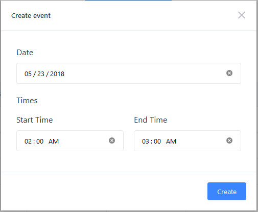
If the user clicks on a date on the `month` view the dialog will populate the `Date` and leave the `Start Time` and `End Time` empty.
If the user clicks on a time block on the `week` or `day` views the dialog will populate the `Date`, the `Start Time` and the `End Time`.
### Dialog settings
To change any setting of the dialog, pass an object with your settings to the `event-dialog-config` prop of the calendar.
::: warning These settings are not global.
Remember that these settings work **per instance** only.
:::
| Setting | Description | Type | Default |
| ------------------ | --------------------------------------------------------------------------------------------------------------------- | ------------- | ---------------- |
| title | Sets the dialog title. | String | `'Create event'` |
| inputClass | Additional classes for the dialog inputs. **Classes are added to input parent**, not the input itself. | String | `null` |
| overrideInputClass | By default classes set with `inputClass` are **appended** to the default class. This setting removes default classes. | Boolean | `false` |
| createButtonLabel | Text for the `Create` button of the dialog. | String | `'Create'` |
| enableTimeInputs | Toggles the `startTime` and `endTime` inputs. | Boolean | `true` |
| fields | Additional fields. | Array[Object]. [Check Custom fields](#custom-fields). ||
### Custom fields
Each field consists of the following attributes:
::: warning Input type support
Checkboxes, radio and selects are **not** supported yet. This will be fixed in the next release.
:::
| Attribute | Description | Type | Default | Required |
| --------- | ------------------------------------------------------------------------------------------------------------------------ | ------- | ---------------- | -------- |
| name | Sets the name of the html input. It should match the name of the [custom attribute](#custom-attributes) you want to set. | String | N/A | Yes |
| type | Sets the input type. Supports almost any HTML5 input type and textarea. | String | `'text'` | No |
| label | Sets the input label. Defaults to the `name` attribute. | String | `name` attribute | No |
| showLabel | Shows/hides the input label. | Boolean | `true` | No |
| required | Adds/removes the `required` HTML attribute. | Boolean | `false` | No |
| value | Sets the initial input value. | Mixed | `null` | No |
::: tip Inline fields
You can group fields to display them inline (like the default `time` fields).
To do this, pass an object with a `fields` array and an optional `label`. Check the example below.
:::
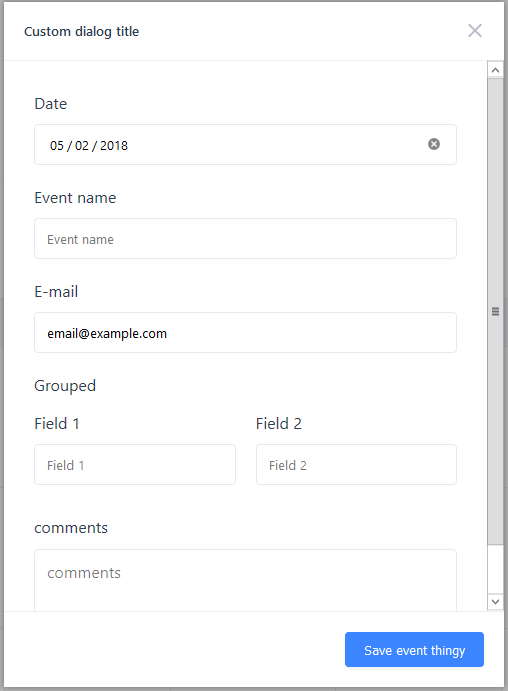
## Dialog example
```vue
```
#### This produces the following dialog: