# v-dialogs
> A simple and powerful dialog, dialog type including Modal, Alert, Mask and Toast, based on Vue2.x
## State
[](https://www.npmjs.com/package/v-dialogs)
[](https://mit-license.org/)
[](https://www.npmjs.com/package/v-dialogs)
### The Dialog Icon
the icons in alert dialog used are made by [Elegant Themes](http://www.elegantthemes.com/blog/freebie-of-the-week/beautiful-flat-icons-for-free)
and control icon, toast icon used are come from [IconFont](http://www.iconfont.cn)
## Install
``` bash
# install dependencies
npm i v-dialogs --save
```
Include plugin in your `main.js` file.
```js
import Vue from 'vue'
import vDialog from 'v-dialogs';
...
Vue.use(vDialog);
```
## Use case
### Modal
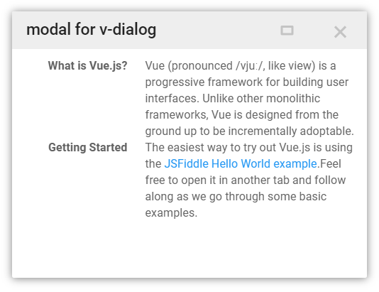
```js
import myComponent from './myComponent';//import component you want to open in Modal dialog
new Vue({
el: '#app',
methods: {
click(){
//open component in Modal, and passing params to component
this.$vDialog.modal(myComponent, {
params: {
a: 1,
b: 2
}
});
}
}
});
```
receive params in component
```js
export default {
name: 'myComponent',
props: ['params']
data(){
console.log(this.params);//{a:1, b:2}
return {};
}
}
```
close dialog and return data in component
```js
export default {
name: 'myComponent',
props: ['params']
data(){
console.log(this.params);//{a:1, b:2}
return {};
},
methods: {
closeDialog(){
let data = {
a: 2,
b: 4
};
//close current Modal dialog and return data to caller
this.$vDialog.close(data);
}
}
}
```
### Alert
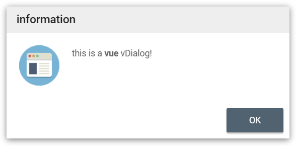
```js
//call a message alert dialog
this.$vDialog.alert('This is a Vue dialog plugin: vDialog!');
//call a message alert dialog with dialog close callback
this.$vDialog.alert('This is a Vue dialog plugin: vDialog!',function(){
//your callback code
});
//call a custom type message alert dialog with dialog close callback
this.$vDialog.alert('This is a Vue dialog plugin: vDialog!',function(){
//your callback code
},{
messageType: 'error',
closeTime: 2,// auto close alert dialog in 2 second,
language: 'en'// i18n support 'cn', 'en', 'jp'
});
```
### Mask
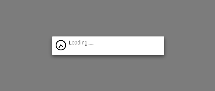
```js
//open a full screen mask
this.$vDialog.mask();
//use custom message
this.$vDialog.mask('my data loading...');
//use mask with callback
this.$vDialog.mask('my data loading...', function(){
// do something when mask close
});
```
some time, you can use mask like this:
```js
let that = this;
let dialogKey = this.$vDialog.mask();
// do some http request
axios.post(...).then(resp){
// do your business
that.$vDialog.close(null, dialogKey);
};
```
### Toast
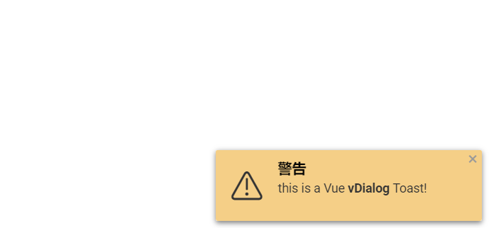
open a Toast dialog in a corner
```js
//open a Toast dialog with message, default show to right bottom position
this.$vDialog.toast('This is a Vue vDialog Toast!');
//open a Toast dialog with a close callback
this.$vDialog.toast('This is a Vue vDialog Toast!', function(){
// do something...
});
//open a Toast with some options
this.$vDialog.toast('This is a Vue vDialog Toast!',null, {
messageType: 'warning',//theme set
position: 'topLeft',// show position
dialogCloseButton: false, // show dialog without close button
closeTime: 3 // auto close toast times(second)
});
```
messageType:
- 'info'(default)
- 'warning'
- 'error'
- 'success'
position:
- 'topLeft'
- 'topCenter'
- 'topRight'
- 'bottomLeft'
- 'bottomCenter'
- 'bottomRight'