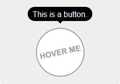
v-tooltip
Easy tooltips, popovers and dropdown with Popper.js
[💚️ Become a Sponsor](https://github.com/sponsors/Akryum)
## Sponsors
[](https://guillaume-chau.info/sponsors)
```
[More info on the directive](#directive)
5. Use the `v-popover` component:
```html
Click me
```
[More info on the component](#component)
```
Of course, you can use a reactive property:
```html
```
**⚠️ HTML is enabled in the tooltip by default. If you plan on using content coming from the users, please disable HTML parsing with the `html` global option to prevent XSS attacks:**
```js
import VTooltip from 'v-tooltip'
Vue.use(VTooltip, {
defaultHtml: false,
})
```
Or directly on package:
```js
import VTooltip from 'v-tooltip'
VTooltip.options.defaultHtml = false
```
*You can then specify `html: true` on each tooltip you want to render HTML in. See below for more info on the tooltip options.*
You can specify the tooltip position as a modifier:
```html
```
The available positions are:
- `'auto'`
- `'auto-start'`
- `'auto-end'`
- `'top'`
- `'top-start'`
- `'top-end'`
- `'right'`
- `'right-start'`
- `'right-end'`
- `'bottom'`
- `'bottom-start'`
- `'bottom-end'`
- `'left'`
- `'left-start'`
- `'left-end'`
**:warning: You need to add style to the tooltips: [examples](#style-examples).**
### Object notation
You can use an object instead of a simple string:
```html
```
### Dynamic CSS classes
You can set the tooltip css classes dynamically with the object notation:
```html
```
This will replace the default CSS classe with 'a b' on the tooltip element.
You can also use the standard class notation:
```html
```
Or a reactive property:
```html
```
### Other options
```html
```
- `content` - HTML text to be displayed in the tooltip. Can also be a function that returns the content or a Promise.
- `classes` - *(see above)*
- `targetClasses` - CSS classes added to the target element of the tooltip.
- `html` - Boolean: allow HTML tooltip content.
- `delay` - Show/Hide delay, or object: `{ show: 500, hide: 100 }` (ms).
- `placement` - *(see above)*
- `trigger` - Events triggering the tooltip separated with spaces: `'hover'`, `'click'`, `'focus'` or `'manual'` (`'manual'` can't be combined with any other event).
- `show` - Boolean to manually open or hide the tooltip.
- `offset` - Offset of the position (px).
- `container` - Selector: Container where the tooltip will be appended (e.g. `'body'`). Set it to `false` to append popover on target parent node.
- `boundariesElement` - DOM element for the tooltip boundaries.
- `template` - HTML template of the tooltip.
- `arrowSelector` - CSS selector to get the arrow element in the tooltip template.
- `innerSelector` - CSS selector to get the inner content element in the tooltip template.
- `autoHide` - Boolean: automatically close the tooltip on mouseover.
- `hideOnTargetClick` - Boolean: automatically close the tooltip on target click.
- `loadingClass` - CSS classes added to the tooltip when content is loading.
- `loadingContent` - Same as `content`, used when the actual tooltip content is loading.
- `popperOptions` - Other Popper.js options.
You can change the default values in the [Global options](#global-options).
### Async content example
The `content` option accepts a promise:
```html
Hover me!
```
### Manual trigger example
Use the `trigger` and `show` options:
```html
A button
```
### Tooltip auto-hiding
By default, if `trigger` contains `'hover'`, the tooltip is automatically hidden on hover or click. To disable this, set the `autoHide` option to `false`:
```javascript
VTooltip.options.autoHide = false
```
### Disabling tooltips
On mobile, you can disable the tooltips with the `VTooltip.enabled` property:
```javascript
VTooltip.enabled = window.innerWidth > 768
```
## Component
If you need to display components inside the tooltip (or popover/dropdown, technically it's the same :smile:), use the `v-popover` component:
```html
Click me
{{ msg }}
```
By default, the popover will have the `tooltip` and `popover` classes, so you can easily override [the style](#style-examples):
```scss
.tooltip {
// ...
&.popover {
$color: #f9f9f9;
.popover-inner {
background: $color;
color: black;
padding: 24px;
border-radius: 5px;
box-shadow: 0 5px 30px rgba(black, .1);
}
.popover-arrow {
border-color: $color;
}
}
}
```
**⚠️ Set the arrow element `z-index` CSS property:**
```scss
.tooltip-arrow {
z-index: 1;
}
```
### Popover Component Reference
**Props:**
- `open` - Boolean that shows or hide the popover.
- `disabled` - Boolean that disables the popover. If it was already open, it will be closed.
- `placement` - *(see above)*
- `delay` - *(see above)*
- `trigger` - *(see above)*
- `offset` - *(see above)*
- `container` - *(see above)*
- `boundariesElement` - *(see above)*
- `popperOptions` - *(see above)*
- `popoverClass` - Classes applied to the popover element. Use this to apply different themes to the popover.
- `popoverBaseClass` - Base classes applied to the popover element (defaults to `'tooltip popover'`).
- `popoverWrapperClass` - Class of the element that contains the arrow and inner content.
- `popoverArrowClass` - Class of the arrow element.
- `popoverInnerClass` - Class of the inner content element.
- `autoHide` - Hide the popover if clicked outside.
- `handleResize` - Automatically update the popover position if its size changes.
- `openGroup` - If set, will close all the open popovers that have a different `open-group` value or unset.
- `openClass` - Class put on the popover when it's open.
You can change the default values in the [Global options](#global-options).
**Events:**
- `update:open(Boolean)` - This allow you to use the `.sync` modifier on the `open` prop.
- `show`
- `apply-show` - Emitted after the show delay
- `hide`
- `apply-hide` - Emitted after the hide delay
- `dispose`
- `auto-hide` - Emitted when the popover is closed if clicked outside.
- `close-directive` - Emitted when the popover is closed with the [Close directive](#close-directive).
- `close-group` - Emitted when the popover is closed because a popover of another `open-group` was shown.
- `resize` - Emitted when the content size changes. You must set the `handleResize` prop to `true`.
### Disable popover
```html
Click me
Close
```
You can also set it to true or false to enable or disable the directive (enabled by default):
```html
Close
Close
```
You can also use a property:
```html
Close
```
```js
data () {
return {
myBooleanProp: true,
}
}
```
Close all the popovers in the page with the `all` modifier:
```html
Close All
```
## Global options
The default global options are:
```javascript
{
// Default tooltip placement relative to target element
defaultPlacement: 'top',
// Default CSS classes applied to the tooltip element
defaultClass: 'vue-tooltip-theme',
// Default CSS classes applied to the target element of the tooltip
defaultTargetClass: 'has-tooltip',
// Is the content HTML by default?
defaultHtml: true,
// Default HTML template of the tooltip element
// It must include `tooltip-arrow` & `tooltip-inner` CSS classes (can be configured, see below)
// Change if the classes conflict with other libraries (for example bootstrap)
defaultTemplate: '',
// Selector used to get the arrow element in the tooltip template
defaultArrowSelector: '.tooltip-arrow, .tooltip__arrow',
// Selector used to get the inner content element in the tooltip template
defaultInnerSelector: '.tooltip-inner, .tooltip__inner',
// Delay (ms)
defaultDelay: 0,
// Default events that trigger the tooltip
defaultTrigger: 'hover focus',
// Default position offset (px)
defaultOffset: 0,
// Default container where the tooltip will be appended
defaultContainer: 'body',
defaultBoundariesElement: undefined,
defaultPopperOptions: {},
// Class added when content is loading
defaultLoadingClass: 'tooltip-loading',
// Displayed when tooltip content is loading
defaultLoadingContent: '...',
// Hide on mouseover tooltip
autoHide: true,
// Close tooltip on click on tooltip target?
defaultHideOnTargetClick: true,
// Auto destroy tooltip DOM nodes (ms)
disposeTimeout: 5000,
// Options for popover
popover: {
defaultPlacement: 'bottom',
// Use the `popoverClass` prop for theming
defaultClass: 'vue-popover-theme',
// Base class (change if conflicts with other libraries)
defaultBaseClass: 'tooltip popover',
// Wrapper class (contains arrow and inner)
defaultWrapperClass: 'wrapper',
// Inner content class
defaultInnerClass: 'tooltip-inner popover-inner',
// Arrow class
defaultArrowClass: 'tooltip-arrow popover-arrow',
// Class added when popover is open
defaultOpenClass: 'open',
defaultDelay: 0,
defaultTrigger: 'click',
defaultOffset: 0,
defaultContainer: 'body',
defaultBoundariesElement: undefined,
defaultPopperOptions: {},
// Hides if clicked outside of popover
defaultAutoHide: true,
// Update popper on content resize
defaultHandleResize: true,
},
}
```
You can change the options during install with the arguments:
```javascript
import VTooltip from 'v-tooltip'
Vue.use(VTooltip, options)
```
Or directly on package:
```javascript
import VTooltip from 'v-tooltip'
// Set custom CSS class
VTooltip.options.defaultClass = 'my-tooltip'
```
# Style Examples
Bellow are some examples of style you need. [Here](https://github.com/Akryum/v-tooltip/blob/83615e394c96ca491a4df04b892ae87e833beb97/demo-src/src/App.vue#L179-L303) is another example, used in the [live demo](https://akryum.github.io/v-tooltip/#/).
## Sass / Less
```less
.tooltip {
display: block !important;
z-index: 10000;
.tooltip-inner {
background: black;
color: white;
border-radius: 16px;
padding: 5px 10px 4px;
}
.tooltip-arrow {
width: 0;
height: 0;
border-style: solid;
position: absolute;
margin: 5px;
border-color: black;
z-index: 1;
}
&[x-placement^="top"] {
margin-bottom: 5px;
.tooltip-arrow {
border-width: 5px 5px 0 5px;
border-left-color: transparent !important;
border-right-color: transparent !important;
border-bottom-color: transparent !important;
bottom: -5px;
left: calc(50% - 5px);
margin-top: 0;
margin-bottom: 0;
}
}
&[x-placement^="bottom"] {
margin-top: 5px;
.tooltip-arrow {
border-width: 0 5px 5px 5px;
border-left-color: transparent !important;
border-right-color: transparent !important;
border-top-color: transparent !important;
top: -5px;
left: calc(50% - 5px);
margin-top: 0;
margin-bottom: 0;
}
}
&[x-placement^="right"] {
margin-left: 5px;
.tooltip-arrow {
border-width: 5px 5px 5px 0;
border-left-color: transparent !important;
border-top-color: transparent !important;
border-bottom-color: transparent !important;
left: -5px;
top: calc(50% - 5px);
margin-left: 0;
margin-right: 0;
}
}
&[x-placement^="left"] {
margin-right: 5px;
.tooltip-arrow {
border-width: 5px 0 5px 5px;
border-top-color: transparent !important;
border-right-color: transparent !important;
border-bottom-color: transparent !important;
right: -5px;
top: calc(50% - 5px);
margin-left: 0;
margin-right: 0;
}
}
&.popover {
$color: #f9f9f9;
.popover-inner {
background: $color;
color: black;
padding: 24px;
border-radius: 5px;
box-shadow: 0 5px 30px rgba(black, .1);
}
.popover-arrow {
border-color: $color;
}
}
&[aria-hidden='true'] {
visibility: hidden;
opacity: 0;
transition: opacity .15s, visibility .15s;
}
&[aria-hidden='false'] {
visibility: visible;
opacity: 1;
transition: opacity .15s;
}
}
```
## CSS
```css
.tooltip {
display: block !important;
z-index: 10000;
}
.tooltip .tooltip-inner {
background: black;
color: white;
border-radius: 16px;
padding: 5px 10px 4px;
}
.tooltip .tooltip-arrow {
width: 0;
height: 0;
border-style: solid;
position: absolute;
margin: 5px;
border-color: black;
z-index: 1;
}
.tooltip[x-placement^="top"] {
margin-bottom: 5px;
}
.tooltip[x-placement^="top"] .tooltip-arrow {
border-width: 5px 5px 0 5px;
border-left-color: transparent !important;
border-right-color: transparent !important;
border-bottom-color: transparent !important;
bottom: -5px;
left: calc(50% - 5px);
margin-top: 0;
margin-bottom: 0;
}
.tooltip[x-placement^="bottom"] {
margin-top: 5px;
}
.tooltip[x-placement^="bottom"] .tooltip-arrow {
border-width: 0 5px 5px 5px;
border-left-color: transparent !important;
border-right-color: transparent !important;
border-top-color: transparent !important;
top: -5px;
left: calc(50% - 5px);
margin-top: 0;
margin-bottom: 0;
}
.tooltip[x-placement^="right"] {
margin-left: 5px;
}
.tooltip[x-placement^="right"] .tooltip-arrow {
border-width: 5px 5px 5px 0;
border-left-color: transparent !important;
border-top-color: transparent !important;
border-bottom-color: transparent !important;
left: -5px;
top: calc(50% - 5px);
margin-left: 0;
margin-right: 0;
}
.tooltip[x-placement^="left"] {
margin-right: 5px;
}
.tooltip[x-placement^="left"] .tooltip-arrow {
border-width: 5px 0 5px 5px;
border-top-color: transparent !important;
border-right-color: transparent !important;
border-bottom-color: transparent !important;
right: -5px;
top: calc(50% - 5px);
margin-left: 0;
margin-right: 0;
}
.tooltip.popover .popover-inner {
background: #f9f9f9;
color: black;
padding: 24px;
border-radius: 5px;
box-shadow: 0 5px 30px rgba(black, .1);
}
.tooltip.popover .popover-arrow {
border-color: #f9f9f9;
}
.tooltip[aria-hidden='true'] {
visibility: hidden;
opacity: 0;
transition: opacity .15s, visibility .15s;
}
.tooltip[aria-hidden='false'] {
visibility: visible;
opacity: 1;
transition: opacity .15s;
}
```
---
LICENCE MIT - Created by Guillaume CHAU (@Akryum)