
# vue-mobcal3

![vue](https://img.shields.io/badge/MADE%20WITH-VUE-42a97a?style=for-the-badge&labelColor=35495d)
[![GitHub stars](https://img.shields.io/github/stars/hoythan/Vue-MobCal3.svg?style=for-the-badge)](https://github.com/hoythan/Vue-MobCal3)
[![npm](https://img.shields.io/npm/v/vue-mobcal3?color=c7343a&label=npm&style=for-the-badge)](https://www.npmjs.com/package/vue-mobcal3)

[![GitHub issues](https://img.shields.io/github/issues-raw/hoythan/Vue-MobCal3.svg?style=for-the-badge)](https://github.com/hoythan/Vue-MobCal3/issues)

[![license](https://img.shields.io/github/license/mashape/apistatus.svg?style=for-the-badge)](https://github.com/hoythan/Vue-MobCal3/blob/master/LICENSE)

[![NPM](https://nodei.co/npm/vue-mobcal3.png?downloads=true&downloadRank=true&stars=true)](https://www.npmjs.com/package/vue-mobcal3)

### Example
- [CodeSandbox](https://codesandbox.io/p/sandbox/goofy-wiles-8kyyrz?file=%2FREADME.md)
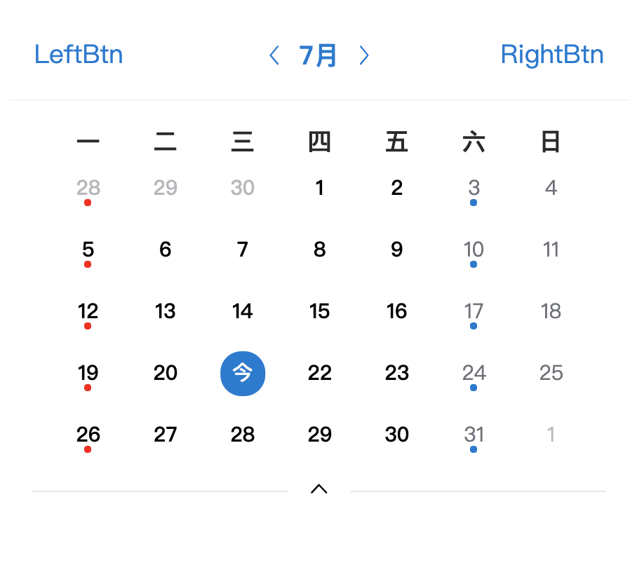
![image.png](https://i.loli.net/2021/07/21/BXli3sGICa5rcEu.png)

---

### Install

``` bash
npm install vue-mobcal3 --save

# or
yarn add vue-mobcal3
```

### Global Registration

``` javascript
import Vue from 'vue'
import VueMobCal from 'vue-mobcal3'

Vue.use(VueMobCal)
```


### Local Registration

```javascript
import { VueMobCal } from 'vue-mobcal3'

export default {
  components: {
    VueMobCal
  }
}
```

### Usage
#### Basic Usage
```html
<vue-mob-cal v-model:value="currentDate" v-model:mode="mode" color="#007873" />
```
```js
import { VueMobCal } from 'vue-mobcal3';
import "vue-mobcal3/dist/index.css";
import { ref } from 'vue';

export default {
  setup() {
    const currentDate = ref(new Date());
    const mode = ref('month');
  }
}
```
#### Custom Slot
```html
<vue-mob-cal v-model:value="currentDate" v-model:mode="mode">
  <template #left>
    <span>LeftBtn</span>
  </template>
  <template #right>
    <span>RightBtn</span>
  </template>
  <template #title>
    <span>Title</span>
  </template>
  <template #week="props">
    <span>周{{ week(props.day) }}</span>
  </template>
  <template #day="props">
    <span v-if="props.util.isToday(props.date)">今</span>
    <span v-else>{{ props.date.getDate() }}</span>
    <!-- A dot will appear at the bottom -->
    <span v-if="props.date.getDay() === 1" class="mindot" style="background-color: red;"></span>
    <span v-if="props.date.getDay() === 6" class="mindot"></span>
    <!-- If you want to display the background, you have to configure this -->
    <span class="dot"></span> 
  </template>
</vue-mob-cal>
```
```js
import { ref } from 'vue'

export default {
  setup() {
    const currentDate = ref(new Date())
    const mode = ref('month')

    const week = (day) => {
      const days = ['一', '二', '三', '四', '五', '六', '日']
      day = day || 7
      return days[day - 1]
    }
  }
}
```

### API

#### Props

| Attribute | Description | Type | Default |
| :----- | :---- | :----: | :---- |
| v-model:value |  Current calendar date | <span class="t">Date</span> | <span class="v">new Date()</span> |
| v-model:mode | Display mode, support monthly or weekly display, params <i>month</i><i>week</i> | <span class="t">String</span> | <span class="v">month</span> |
| v-model:color | Theme color | <span class="t">String</span> | <span class="v"><span class="dot"></span>#007ad3</span> |

### Slot

| Name | Description | SlotProps |
| :----- | :---- | :---- |
| title | Custom title | <span class="t">	{ util: object }</span> |
| week | Custom Week Title | <span class="t">{ day: number }</span> 0-6 |
| left | Custom left icon | - |
| right | Custom right icon | - |
| day | Custom Calendar Item | <span class="t">	{ date: date, util: object }</span> |
| - util | Common method | <div class="t">{<br>&emsp;isToday: function, <br>&emsp;isWorkDay: function, <br>&emsp;isOtherMonth: function, <br>&emsp;isActiveDay: function, <br>&emsp;onPrev: function, <br>&emsp;onNext: function, <br>&emsp;onChangeMode: function<br>}</div> |

### Event
| Event | Description | Arguments |
| :----- | :---- | :---- |
| onPrev | Change to last month/week | - |
| onNext | Change to next month/week | - |
| onChange | When the time is selected, it will be triggered and returns the Date() object of the selected time. | - |
| onChangeMode | Toggles display mode or set display mode | <span class="t">mode:!string</span> |

---

### CDN

``` html
<script src="https://cdn.jsdelivr.net/npm/vue@3.2.1/dist/vue.global.js"></script>
<script type="text/javascript" src="https://unpkg.com/vue-mobcal3/dist/vue-mobcal3.umd.js"></script>

<div id="app">
  <vue-mob-cal v-model:value="currentDate" v-model:mode="mode">
  </vue-mob-cal>
</div>
<script type="text/javascript">
  new Vue({
      el: '#app',
      data: {
          mode: 'month',
          currentDate: new Date()
      }
  })
</script>
```

### Changelog

Detailed changes for each release are documented in the [release notes](https://github.com/hoythan/vue-mobcal3/blob/master/CHANGELOG.md).

### License

[MIT](https://github.com/hoythan/vue-mobcal3/blob/master/LICENSE)
<!-- <style>
  table {
    font-size: 12px;
    width: 100%;
  }
  .t {
    color:green;
  }
  .v {
    color: #58727e;
    background-color:#f7f8fa;
    padding: 2px 5px;
    border-radius: 4px;
  }
  .var {
    color: #1989fa;
    background-color: rgba(25, 137, 250, 0.1);
    padding: 2px 5px;
    border-radius: 4px;
    margin-left: 4px;
  }
  i {
    color: #58727e;
    background-color:#f7f8fa;
    padding: 2px 5px;
    border-radius: 4px;
    margin-right: 4px;
  }
  .dot {
    display: inline-block;
    background: #007ad3;
    width: 10px;
    height: 10px;
    margin-right: 6px;
    border-radius: 100px;
  }
</style> -->