# Stepper [](https://travis-ci.org/PygmySlowLoris/vue-stepper)
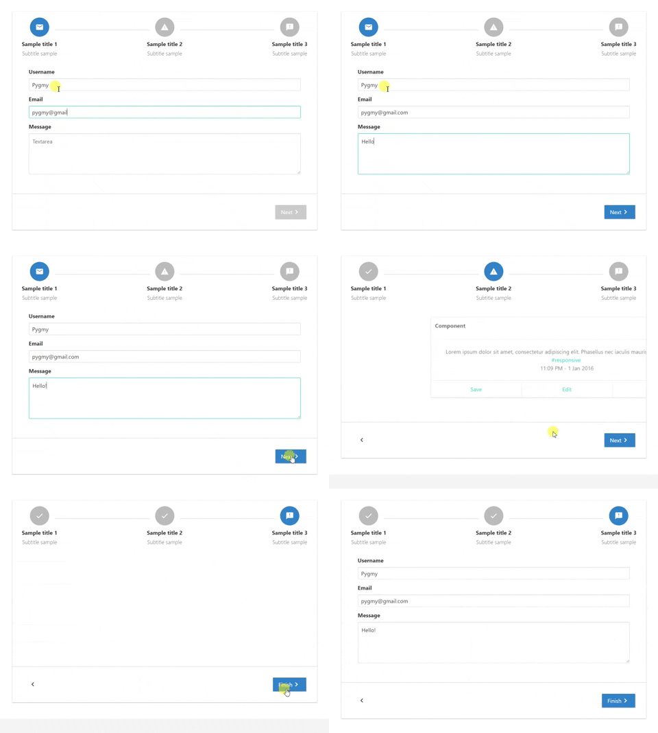
Stepper for Vue with programatic navigation.
This is a fork version of a simple Vue Stepper with the added capability to navigate backwards and forward by emitting the corresponding event from within a child component inside the stepper
Live Demo
## Installation
```
npm install vue-stepper --save
```
## Properties
| Properties | Type | Values |
| :--------------- | :------- | :--------- |
| `steps` | Array of Objects | Each object is a step that will be included in the stepper |
| `locale` | String | Default: `en`. Current options: `en`, `es`, `pt`, `ja`, `he`, `cn`, `ru` , `ar`. |
| `top-buttons` | Boolean | Default: `false`. If `true` buttons on the header, at the start and the end of the steps, will be shown for better user experience. |
| `keep-alive` | Boolean | Default: `true`. If `true` step components won't be destroy in each step change, bue if `false` they will. |
| `reset` | Boolean | Default: `false`. If `true` the steps will be reset |
### Steps object properties
| Properties | Type | Values |
| :--------------- | :------- | :--------- |
| `icon` | String | Ex.: `mail`. Name of icons that belong to material-icons library |
| `name` | String | Name of the step. Each step name **MUST** be unique |
| `title` | String | Title that will be displayed below the step, on bold. |
| `subtitle` | String | Subtitle displayed below the title. |
| `component` | Component | Imported component that will be show on the content area of the step. |
| `completed` | Boolean | If step is completed or not. If `TRUE` a `done` material icon will replace the one given before. Only mark as completed when you want to let know the user that the previous step has been completed |
## Events emitted by stepper
| Event name | When |
| :--------------- | :------- |
| `completed-step` | Triggered when a step is completed. Completed meaning that current step has been left behind on the step list. Now you can mark your step object as completed if you desire it.|
| `active-step` | Current active step. It's `name` and `index` are exposed on the deployed payload.|
| `stepper-finished` | Event emitted when the user clicks the final button. Now it's time to execute a final callback method|
| `clicking-back` | Triggered when user clicks the back button to return to a previous step|
| `reset` | Triggered when the steps have been reset. So now it's pointing to the first step with cleared fields|
## Events that can be emitted by content component
| Event name | When |
| :--------------- | :------- |
| `can-continue` | By default the *next button* will be disabled until the event `can-continue` is triggered with an object containing the property `value`. `Value` accepts a boolean, if `true` next/finish button will be enabled if false disabled. On each next step `canContinue` variable will be set to false.|
| `change-next` | With this event you can change de state of the `clickedNext` prop that each step has. Just emit it with the following payload `{nextBtnValue: boolean}` |
| `next` | With this event you can cause the stepper to go one step forward from within a child component |
| `previous` | With this event you can cause the stepper to go one step backwards from within a child component |
## Exposed props for step component
| Properties | Type | Values |
| :--------------- | :------- | :--------- |
| `currentStep` | Object | Exposes current step for step component |
## Examples
Template example
```html
```
Script example
```javascript
import HorizontalStepper from 'vue-stepper';
// This components will have the content for each stepper step.
import StepOne from './StepOne.vue';
import StepTwo from './StepTwo.vue';
export default {
components: {
HorizontalStepper
},
data(){
return {
demoSteps: [
{
icon: 'mail',
name: 'first',
title: 'Sample title 1',
subtitle: 'Subtitle sample',
component: StepOne,
completed: false
},
{
icon: 'report_problem',
name: 'second',
title: 'Sample title 2',
subtitle: 'Subtitle sample',
component: StepTwo,
completed: false
}
]
}
},
methods: {
// Executed when @completed-step event is triggered
completeStep(payload) {
this.demoSteps.forEach((step) => {
if (step.name === payload.name) {
step.completed = true;
}
})
},
// Executed when @active-step event is triggered
isStepActive(payload) {
this.demoSteps.forEach((step) => {
if (step.name === payload.name) {
if(step.completed === true) {
step.completed = false;
}
}
})
},
// Executed when @stepper-finished event is triggered
alert(payload) {
alert('end')
}
}
}
```
Example of component content that will be displayed on the first step (*vuelidate* used to validate form).
**Template**
```html
```
**Javascript**
```javascript
import {validationMixin} from 'vuelidate'
import {required, email} from 'vuelidate/lib/validators'
export default {
props: ['clickedNext', 'currentStep'],
mixins: [validationMixin],
data() {
return {
form: {
username: '',
demoEmail: '',
message: ''
}
}
},
validations: {
form: {
username: {
required
},
demoEmail: {
required,
email
},
message: {
required
}
}
},
watch: {
$v: {
handler: function (val) {
if(!val.$invalid) {
this.$emit('can-continue', {value: true});
} else {
this.$emit('can-continue', {value: false});
}
},
deep: true
},
clickedNext(val) {
if(val === true) {
this.$v.form.$touch();
}
}
},
mounted() {
if(!this.$v.$invalid) {
this.$emit('can-continue', {value: true});
} else {
this.$emit('can-continue', {value: false});
}
}
}
```