# vue3-color-picker-gradient
[](https://www.npmjs.com/package/vue2-color-picker-gradient)
[](https://www.npmjs.com/package/vue3-color-picker-gradient)
[](https://github.com/CNLHB/vue2-color-picker-gradient/stargazers)
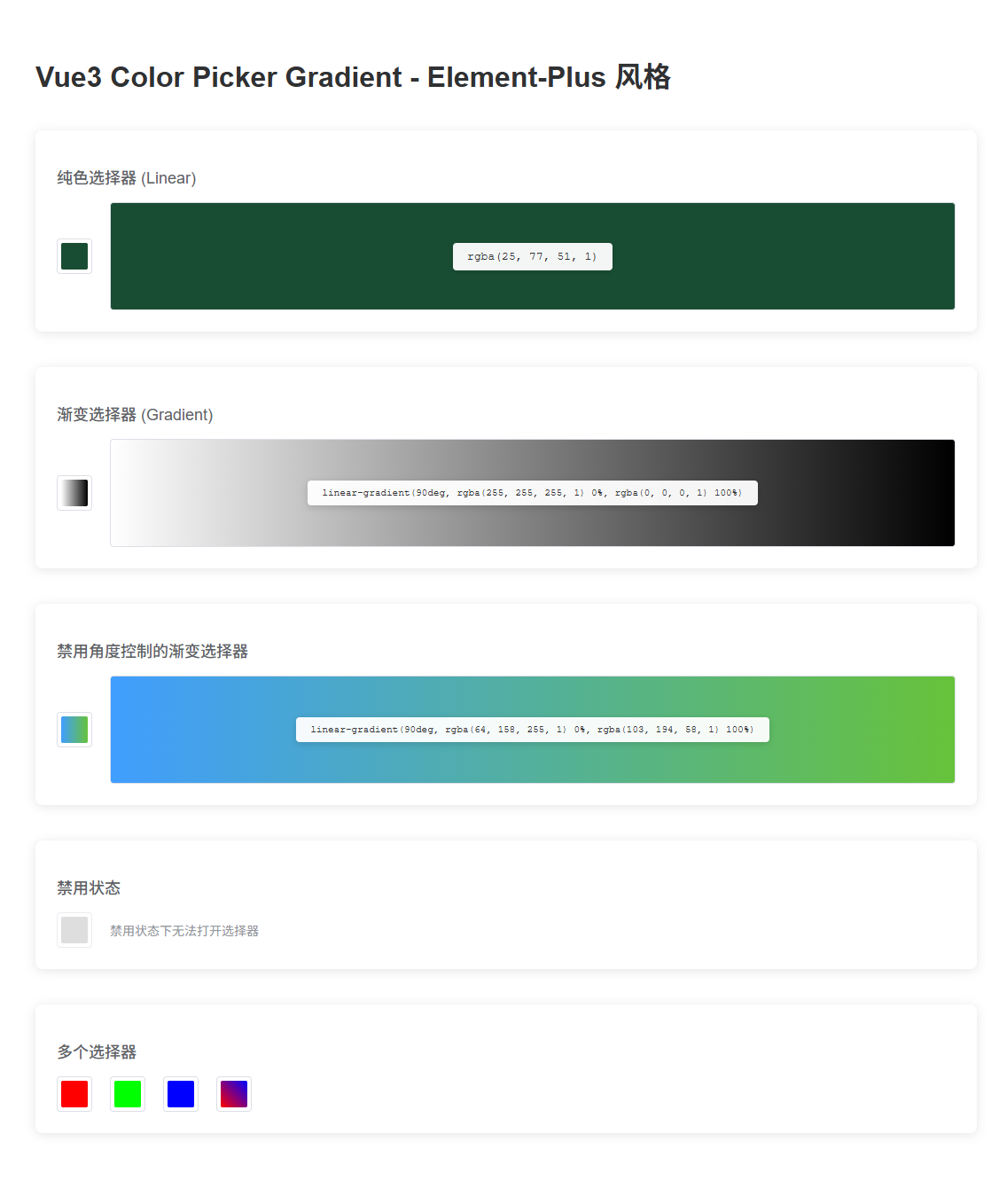
🎨 Color Picker with Gradient support for Vue 3, inspired by Element-Plus design.
Supports both **solid colors** and **gradient colors** with an intuitive trigger button and popup panel.
## ✨ Features
- 🎯 **Element-Plus Style API** - Similar to `el-color-picker` usage
- 🌈 **Dual Mode** - Solid color (`linear`) and Gradient color (`gradient`)
- 📦 **v-model Support** - Direct color value binding
- 🎪 **Popper Dropdown** - Auto-positioning popup panel
- 🚫 **Disabled State** - Support for disabled mode
- 🎨 **Gradient Controls** - Angle adjustment and multi-point gradients
- 🎭 **Click Outside to Close** - Auto-close when clicking outside
- 📱 **Responsive** - Smart positioning on scroll and resize
## [Live demo](https://cnlhb.github.io/vue3-color-picker-gradient/build/index.html)
## Installation
### NPM
```bash
$ npm install vue3-color-picker-gradient
```
### ES6
**Global Registration**
```js
import { createApp } from 'vue'
import ColorPickerGradient from 'vue3-color-picker-gradient'
const app = createApp(App)
app.use(ColorPickerGradient)
```
**Local Registration**
```js
import ColorPickerGradient from 'vue3-color-picker-gradient'
export default {
name: 'App',
components: {
ColorPickerGradient,
},
}
```
## 📚 API
### Props
| Property | Type | Default | Description |
|----------|------|---------|-------------|
| `modelValue` / `v-model` | String | `''` | Binding value (rgba string for solid color, linear-gradient string for gradient) |
| `type` | String | `'linear'` | Picker type: `'linear'` (solid) or `'gradient'` (gradient) |
| `disabled` | Boolean | `false` | Whether to disable the picker |
| `showAlpha` | Boolean | `true` | Whether to display alpha slider |
| `disabledColorDeg` | Boolean | `false` | Whether to disable angle control (gradient mode only) |
| `colorFormat` | String | `'rgba'` | Color format |
| `size` | String | `'default'` | Picker size: `'large'` / `'default'` / `'small'` |
| `titleConfig` | Object | `{text:'颜色选择器',show:true}` | Title configuration |
### Events
| Event Name | Parameters | Description |
|------------|------------|-------------|
| `change` | `(value: string)` | Triggered when the color value changes |
| `active-change` | `(value: string)` | Triggered when the active color changes |
## 📖 Usage Examples
### Basic Usage - Solid Color
```vue
```
### Gradient Color
```vue
```
### Disabled State
```vue
```
### Disable Angle Control (Gradient Mode)
```vue
```
### Complete Example
```vue
Solid Color Picker
{{ solidColor }}
Gradient Color Picker
{{ gradientColor }}
```
## 🔧 Development
### Install Dependencies
```bash
npm install
```
### Compiles and hot-reloads for development
```bash
npm run serve
```
### Compiles and minifies for library
```bash
npm run lib
```
### Lints and fixes files
```bash
npm run lint
```
## 🔄 Migration from Old API
If you're upgrading from the old API, here's a comparison:
**Old API (v-model controls visibility):**
```vue
```
**New API (v-model binds color value):**
```vue
```
### Key Changes:
- ✅ `v-model` now binds the **color value** directly (not visibility)
- ✅ Automatic **trigger button** with popup panel
- ✅ Simplified event: `@change` instead of `@changeColor`
- ✅ Simplified props: direct color string instead of complex objects
- ✅ Auto-close on outside click (no need for `closeOnClickBody`)
## 🤝 Contributing
Contributions are welcome! Feel free to submit issues and pull requests.
## 📄 License
MIT
## ⭐ Show Your Support
If this project helped you, please give it a ⭐️!
欢迎点个 star 🎉🎉🎉
---
### Customize configuration
See [Configuration Reference](https://cli.vuejs.org/config/).