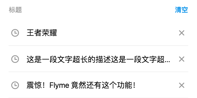
# fm-tag-wall
> Flyme 简单列表组件,可自定义样式
 ## 使用方法
```vue
```
更多详细代码例子可以参考 [demo](https://github.com/FlymeApps/weex-flymeui/blob/master/example/component/simpleList/index.vue)
## 可配置参数
| Prop | Type | Required | Default | Description |
|-------------|------------|--------|-----|-----|
| list | `Array` |`Y`| `-` | 列表数据,可动态更新 |
| list[{`title`}] | `String` |`N`| `''` | 标题 |
| list[{`color`}] | `String` |`N`| `''` | 标题颜色 |
| list[{`backgroundColor`}] | `String` |`N`| `''` | 标签背景颜色 |
| list[{`leftIcon`}] | `String` |`N`| `''` | 左边 Icon |
| list[{`rightIcon`}] | `String` |`N`| `''` | 右边 Icon |
| list[{`leftColor`}] | `String` |`N`| `''` | 左边 Icon 颜色 |
| list[{`rightColor`}] | `String` |`N`| `''` | 右边边 Icon 颜色 |
| title | `String` |`N`| `标题` | 标题 |
| title-color | `String` |`N`| `rgba(0, 0, 0, 0.4)` | 标题颜色 |
| right-text | `String` |`N`| `更多` | 右边按钮文案 |
| right-color | `String` |`N`| `#198DED` | 右边按钮颜色 |
| customStyles | `Object` |`N`| `{}` | 自定义样式 |
| customStyles{`borderColor`} | `String` |`rgba(0, 0, 0, 0.1)`| `6px` | 边框颜色 |
| customStyles{`borderWidth`} | `Number` |`N`| `2px` | 边框宽度 |
| customStyles{`fontSize`} | `Number` |`N`| `42px` | 字体大小 |
| customStyles{`originTitleColor`} | `String` |`N`| `#000000` | 默认的字体颜色,会被 `list item` 中的 `color` 覆盖 |
| customStyles{`originLeftIcon`} | `String` |`N`| `shizhong` | 默认的左 Icon,会被 `list item` 中的 `leftIcon` 覆盖 |
| customStyles{`originRightIcon`} | `String` |`N`| `guanbi` | 默认的右 Icon,会被 `list item` 中的 `leftIcon` 覆盖 |
| customStyles{`originIconColor`} | `String` |`N`| `#999999` | 默认的 Icon 颜色,会被 `list item` 中的 `leftColor` 或 `rightColor` 覆盖 |
## Slot
`fm-simple-list` 提供了两个插槽供用户自定义标题栏。
1. `` : 左边标题插槽
2. `` : 右侧按钮插槽
## 事件回调
- `fmSimpleListRightBtnClicked` 右边按钮被点击时触发
- `fmSimpleListSelected` 列表项被点击时触发
- `fmSimpleListLeftIconClicked` 列表项左边 Icon 被点击时触发
- `fmSimpleListRightIconClicked` 列表项右边 Icon 被点击时触发
- 参数:
```json
{
model: 列表项的数据源,
index: 被点击的 index
}
```
- 示例
```vue
```
## 使用方法
```vue
```
更多详细代码例子可以参考 [demo](https://github.com/FlymeApps/weex-flymeui/blob/master/example/component/simpleList/index.vue)
## 可配置参数
| Prop | Type | Required | Default | Description |
|-------------|------------|--------|-----|-----|
| list | `Array` |`Y`| `-` | 列表数据,可动态更新 |
| list[{`title`}] | `String` |`N`| `''` | 标题 |
| list[{`color`}] | `String` |`N`| `''` | 标题颜色 |
| list[{`backgroundColor`}] | `String` |`N`| `''` | 标签背景颜色 |
| list[{`leftIcon`}] | `String` |`N`| `''` | 左边 Icon |
| list[{`rightIcon`}] | `String` |`N`| `''` | 右边 Icon |
| list[{`leftColor`}] | `String` |`N`| `''` | 左边 Icon 颜色 |
| list[{`rightColor`}] | `String` |`N`| `''` | 右边边 Icon 颜色 |
| title | `String` |`N`| `标题` | 标题 |
| title-color | `String` |`N`| `rgba(0, 0, 0, 0.4)` | 标题颜色 |
| right-text | `String` |`N`| `更多` | 右边按钮文案 |
| right-color | `String` |`N`| `#198DED` | 右边按钮颜色 |
| customStyles | `Object` |`N`| `{}` | 自定义样式 |
| customStyles{`borderColor`} | `String` |`rgba(0, 0, 0, 0.1)`| `6px` | 边框颜色 |
| customStyles{`borderWidth`} | `Number` |`N`| `2px` | 边框宽度 |
| customStyles{`fontSize`} | `Number` |`N`| `42px` | 字体大小 |
| customStyles{`originTitleColor`} | `String` |`N`| `#000000` | 默认的字体颜色,会被 `list item` 中的 `color` 覆盖 |
| customStyles{`originLeftIcon`} | `String` |`N`| `shizhong` | 默认的左 Icon,会被 `list item` 中的 `leftIcon` 覆盖 |
| customStyles{`originRightIcon`} | `String` |`N`| `guanbi` | 默认的右 Icon,会被 `list item` 中的 `leftIcon` 覆盖 |
| customStyles{`originIconColor`} | `String` |`N`| `#999999` | 默认的 Icon 颜色,会被 `list item` 中的 `leftColor` 或 `rightColor` 覆盖 |
## Slot
`fm-simple-list` 提供了两个插槽供用户自定义标题栏。
1. `` : 左边标题插槽
2. `` : 右侧按钮插槽
## 事件回调
- `fmSimpleListRightBtnClicked` 右边按钮被点击时触发
- `fmSimpleListSelected` 列表项被点击时触发
- `fmSimpleListLeftIconClicked` 列表项左边 Icon 被点击时触发
- `fmSimpleListRightIconClicked` 列表项右边 Icon 被点击时触发
- 参数:
```json
{
model: 列表项的数据源,
index: 被点击的 index
}
```
- 示例
```vue
```