# wxc-icon
> Weex common iconfont summary
## [Demo](https://h5.m.taobao.com/trip/wx-detection-demo/icon/index.html?_wx_tpl=https%3A%2F%2Fh5.m.taobao.com%2Ftrip%2Fwx-detection-demo%2Ficon%2Findex.weex.js)
 `weex-ui >= 0.3.10`
## Code Example
```vue
```
More details can be found in [here](https://github.com/apache/incubator-weex-ui/blob/master/icon/loading/index.vue)
Also you can copy the `name` from [demo](https://h5.m.taobao.com/trip/wx-detection-demo/icon/index.html?_wx_tpl=https%3A%2F%2Fh5.m.taobao.com%2Ftrip%2Fwx-detection-demo%2Ficon%2Findex.weex.js)
### API
| Prop | Type | Required | Default | Description |
| ---- |:----:|:---:|:-------:| :----------:|
| **`name`** | `string` | `Y` | `-` | icon name (*1)|
| **`size`** | `String` | `N` | `small` | icon size `xs`/`small`/`medium`/`big`|
| **`icon-style`** | `Object` | `N` | `{}` |style override (*2)|
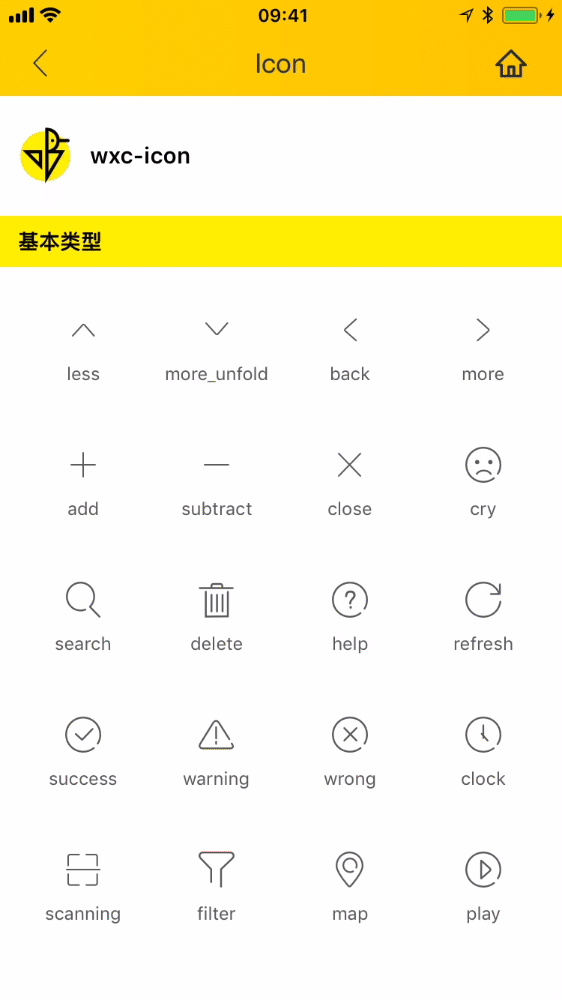
- *1:icon name list:`['less', 'more_unfold', 'back', 'more', 'add', 'subtract', 'close', 'cry', 'search', 'delete', 'help', 'refresh', 'success', 'warning', 'wrong', 'clock', 'scanning', 'filter', 'map', 'play']`
- *2:When size is not satisfied, or needs a custom style size to pass into the `style` overlay, for example:
```
style={color:red,fontSize:'60px'}
```
### Event
```
// `@wxcIconClicked="iconClicked"`
will return name
```
`weex-ui >= 0.3.10`
## Code Example
```vue
```
More details can be found in [here](https://github.com/apache/incubator-weex-ui/blob/master/icon/loading/index.vue)
Also you can copy the `name` from [demo](https://h5.m.taobao.com/trip/wx-detection-demo/icon/index.html?_wx_tpl=https%3A%2F%2Fh5.m.taobao.com%2Ftrip%2Fwx-detection-demo%2Ficon%2Findex.weex.js)
### API
| Prop | Type | Required | Default | Description |
| ---- |:----:|:---:|:-------:| :----------:|
| **`name`** | `string` | `Y` | `-` | icon name (*1)|
| **`size`** | `String` | `N` | `small` | icon size `xs`/`small`/`medium`/`big`|
| **`icon-style`** | `Object` | `N` | `{}` |style override (*2)|
- *1:icon name list:`['less', 'more_unfold', 'back', 'more', 'add', 'subtract', 'close', 'cry', 'search', 'delete', 'help', 'refresh', 'success', 'warning', 'wrong', 'clock', 'scanning', 'filter', 'map', 'play']`
- *2:When size is not satisfied, or needs a custom style size to pass into the `style` overlay, for example:
```
style={color:red,fontSize:'60px'}
```
### Event
```
// `@wxcIconClicked="iconClicked"`
will return name
```