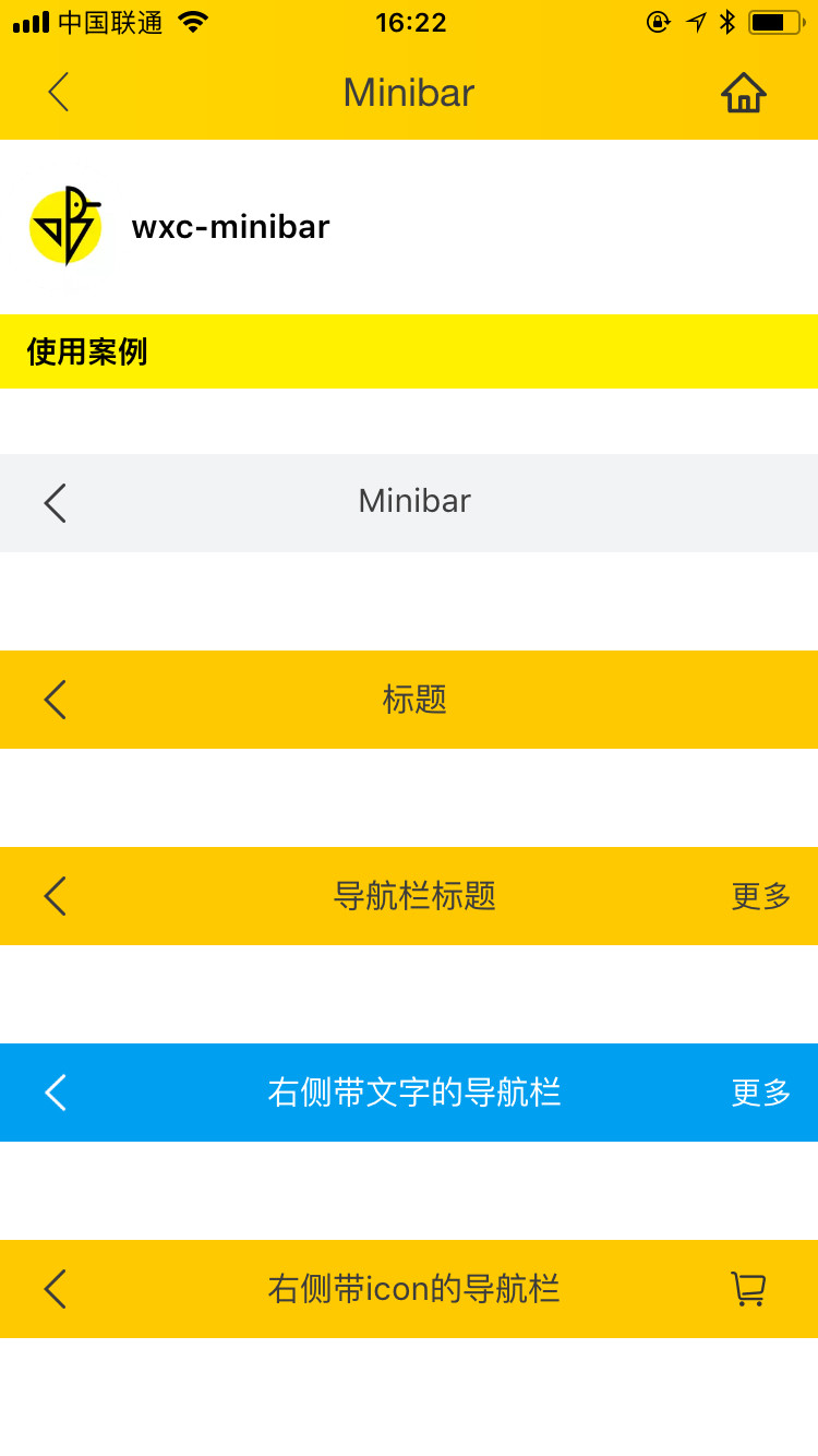
# wxc-minibar
> Title Bar
### Rule
- Use the [Native Navigator Bar](https://developer.apple.com/documentation/uikit/uinavigationbar) `first`.
- If you want to hide the return button on the left, pass `leftButton=""` directly.
## [Demo](https://h5.m.taobao.com/trip/wxc-minibar/index.html?_wx_tpl=https%3A%2F%2Fh5.m.taobao.com%2Ftrip%2Fwxc-minibar%2Fdemo%2Findex.native-min.js)
 ## Code Example
```vue
```
More details can be found in [here](https://github.com/apache/incubator-weex-ui/blob/master/example/minibar/index.vue)
### API
| Prop | Type | Required | Default | Description |
|-------------|------------|--------|-----|-----|
| title | `String` |`Y`| `-` |title|
| right-button | `String` |`N`| `-` | right button icon |
| right-text | `String` |`N`| `-` | right button text |
| left-button | `String` |`N`| `a return icon` | left button icon |
| left-text | `String` |`N`| `` | left text|
| text-color | `String` |`N`| `#333333` | text color |
| background-color | `String` |`N`| `#ffffff` | title bar background color |
| use-default-return | `Boolean` |`N`| `true` | Whether to use the default return |
| show | `Boolean` | `N`|`true` | whether to show |
| bar-style | `Object` | `N`|`{}` | modify original style |
### Slot
When the above configurations are not satisfied, You can customize this component by using slot. `weex-ui>=0.3.9`
1. ``:left slot
2. ``:title slot
3. ``:right slot
## Code Example
```vue
```
More details can be found in [here](https://github.com/apache/incubator-weex-ui/blob/master/example/minibar/index.vue)
### API
| Prop | Type | Required | Default | Description |
|-------------|------------|--------|-----|-----|
| title | `String` |`Y`| `-` |title|
| right-button | `String` |`N`| `-` | right button icon |
| right-text | `String` |`N`| `-` | right button text |
| left-button | `String` |`N`| `a return icon` | left button icon |
| left-text | `String` |`N`| `` | left text|
| text-color | `String` |`N`| `#333333` | text color |
| background-color | `String` |`N`| `#ffffff` | title bar background color |
| use-default-return | `Boolean` |`N`| `true` | Whether to use the default return |
| show | `Boolean` | `N`|`true` | whether to show |
| bar-style | `Object` | `N`|`{}` | modify original style |
### Slot
When the above configurations are not satisfied, You can customize this component by using slot. `weex-ui>=0.3.9`
1. ``:left slot
2. ``:title slot
3. ``:right slot
 ```
Customize this component
```
### Event
```
// @wxcMinibarLeftButtonClicked="minibarLeftButtonClick"
// @wxcMinibarRightButtonClicked="minibarRightButtonClick"
```
```
Customize this component
```
### Event
```
// @wxcMinibarLeftButtonClicked="minibarLeftButtonClick"
// @wxcMinibarRightButtonClicked="minibarRightButtonClick"
```