# wxc-tab-bar
> Weex 版本底部 tab-bar 组件
#### 规则
- 用于底部 Tab 切换页面,目前支持 **icon 、text 、iconFont**形式的底栏
## [Demo](https://h5.m.taobao.com/trip/wx-detection-demo/tab-bar/index.html?_wx_tpl=https%3A%2F%2Fh5.m.taobao.com%2Ftrip%2Fwx-detection-demo%2Ftab-bar%2Findex.weex.js)
 ## 使用方法
```vue
## 使用方法
```vue
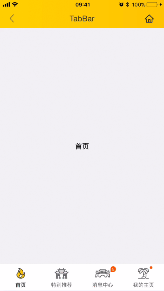
首页
特别推荐
消息中心
我的主页
```
更详细代码可以参考 [demo](https://github.com/apache/incubator-weex-ui/blob/master/example/tab-bar/index.vue)
### 可配置参数
| Prop | Type | Required | Default | Description |
|-------------|------------|--------|-----|-----|
| tab-titles | `Array` |`Y`| `[]` | Tab显示 [配置](https://github.com/apache/incubator-weex-ui/blob/master/example/tab-bar/config.js#L7)|
| title-type | `String` |`N`| `icon` | 类型 `icon`/`text`/`iconFont`(注1)|
| tab-styles | `Array` |`N`| `[]` | 底部 Tab [样式配置](https://github.com/apache/incubator-weex-ui/blob/master/example/tab-bar/config.js)|
| is-tab-view | `Boolean` |`N`| `true` |当设置为`false`,同时 tab 配置 url 参数即可跳出 |
| duration | `Number` |`N`| `300` | 页面切换动画的时间 |
| title-use-slot | `Boolean` |`N`| `false` | 使用 slot 配置底部导航 (注2)|
| timing-function | `String` |`N`| `-` | 页面切换动画函数 |
| wrap-bg-color | `String` |`N`| `#F2F3F4` |页面背景颜色|
| support-x-bar | `Boolean` |`Y`| `true` |假如设置为 false,iPhone X 类型机器将不会有 bar 增高的兼容|
### 注1:使用 iconFont
- 在 Weex Ui 0.3.8以后,我们可以使用 iconFont 来代替原有 tab title 中的图片配置,像下面这个配置即可:
```
// https://github.com/apache/incubator-weex-ui/blob/master/example/tab-bar/config.js#L51
// '' -> '\ue608'
tabIconFontTitles: [
{
title: 'Home',
codePoint: '\ue608'
},
{
title: 'Message',
codePoint: '\ue752',
badge: 5
},
// ....
],
// https://github.com/apache/incubator-weex-ui/blob/master/example/tab-page/config.js#L72
tabIconFontStyles: {
bgColor: '#FFFFFF',
titleColor: '#666666',
activeTitleColor: '#3D3D3D',
activeBgColor: '#FFFFFF',
isActiveTitleBold: true,
width: 160,
height: 120,
fontSize: 24,
textPaddingLeft: 10,
textPaddingRight: 10,
iconFontSize: 50,
iconFontMarginBottom: 8,
iconFontColor: '#333333',
activeIconFontColor: 'red',
iconFontUrl: '//at.alicdn.com/t/font_501019_mauqv15evc1pp66r.ttf'
}
```
### 注2:自定义底部导航块
- 当使用slot的方式配置底部导航的时候,需要确保原有简单配置已经不能满足现有需求情况下再使用,可以传入参数`:title-use-slot="true"`,同时在wxc-tab-bar组件内部传入如下slot对应节点即可
- 可以通过遍历到方式来生成,同时根据wxcTabBarCurrentTabSelected来确定当前的选择页,自己管理颜色即可。
```
111
222
333
```
### 主动触发设置页面
```
// 直接在wxc-tab-bar上面绑定ref="wxc-tab-bar",然后调用即可
this.$refs['wxc-tab-bar'].setPage(2)
// 如果想设置无动画跳转,可以这样使用(中间参数用于设置url,设置null即可)
this.$refs['wxc-tab-bar'].setPage(2,null,false);
```
### 事件回调
```
//当前页面被选中的回调`@wxcTabBarCurrentTabSelected="wxcTabBarCurrentTabSelected"`
```