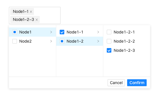
# weike-multi-cascader


<a href="https://codesandbox.io/s/dreamy-jennings-2y1ff?file=/src/App.tsx" target="_blank">Online Demo</a>，<a href="https://juejin.cn/post/6914994241940750343" target="_blank">How it works?</a>

<div style="max-width: 420px">
  <img src="https://raw.githubusercontent.com/HelKyle/antd-multi-cascader/main/demo.png" alt="demo" />
</div>

### How to use?

```
npm install react-multi-cascader or yarn add  react-multi-cascader
```

```js
const [value, setValue] = React.useState<string[]>([]);

return (
  <MultiCascader
    value={value}
    onChange={setValue}
    data={options}
    placeholder="Select Cities"
  />
)
```

### Props

| Props               | Type                                                                                | Description                                                                                                                                                           |
| ------------------- | ----------------------------------------------------------------------------------- | --------------------------------------------------------------------------------------------------------------------------------------------------------------------- |
| value               | string[]                                                                            | Selected value                                                                                                                                                        |
| data                | TreeNode[]                                                                          | Cascader options TreeNode { title: string, value: string, children?: TreeNode, isLeaf?: boolean }                                                                     |
| allowClear          | boolean                                                                             | Whether allow clear                                                                                                                                                   |
| placeholder         | string                                                                              | The input placeholder                                                                                                                                                 |
| onChange            | (newVal) => void                                                                    | Callback when finishing value select                                                                                                                                  |
| selectAll           | boolean                                                                             | Whether allow select all                                                                                                                                              |
| className           | string                                                                              | The additional css class                                                                                                                                             |
| showBottom          | boolean                                                                             | 是否显示底部确认组件                                                                                                                                               |
| fristColumMulti     | boolean                                                                             | 第一栏是否可选                                                                                                                                               |
| isToolTip           | boolean                                                                             | 已选内容是否通过tooltip显示                                                                                                                                             |
| style               | React.CSSProperties                                                                 | The additional style                                                                                                                                                  |
| disabled            | boolean                                                                             | Whether disabled select                                                                                                                                               |
| okText              | string                                                                              | The text of the Confirm button                                                                                                                                        |
| cancelText          | string                                                                              | The text of the Cancel button                                                                                                                                         |
| selectAllText       | string                                                                              | The text of the SelectAll radio                                                                                                                                       |
| onCascaderChange    | (node: TreeNode, operations: { add: (children: TreeNode[]) => TreeNode[] }) => void | Trigger when click a menu item                                                                                                                                        |
| popupTransitionName | string                                                                              | Should set 'ant-slide-up' manually if antd version greater than 4.13.0                                                                                                |
| getPopupContainer   | (props: any) => HTMLElement                                                         | Parent Node which the selector should be rendered to. Default to body. When position issues happen, try to modify it into scrollable content and position it relative |
| maxTagCount         | Max tag count to show. responsive will cost render performance                      | number \| responsive                                                                                                                                                  |

#### Async Data Example

```js
const [asyncOptions, setAsyncOptions] = React.useState([
  {
    value: 'ParentNode1',
    title: 'ParentNode1',
    // tell component this node is not a leaf node
    isLeaf: false,
  },
  {
    value: 'ParentNode2',
    title: 'ParentNode2',
  },
])

const handleCascaderChange = React.useCallback((node, { add }) => {
  // call add function to append children nodes
  if (node.value === 'ParentNode1' && !node.children) {
    setTimeout(() => {
      setAsyncOptions(
        add([
          {
            value: 'ParentNode1-1',
            title: 'ParentNode1-1',
          },
        ])
      )
    }, 1000)
  }
}, [])

    <MultiCascader
        selectAll
        data={options}
        value={state}
        onChange={(v,v1) => onChange(v, v1)}
        disabled={disabled}
        placeholder="Default"
        style={{ width: '320px' }}
        showBottom={true}
        fristColumMulti={true}
        isToolTip={true}
    />
```