If you’ve ever right-clicked on the desktop to set your
Display Properties in Windows, you already know what a JTabbedPane is. It’s a container with labeled
tabs (e.g., Themes, Screen Saver, Appearance). When you click on a tab, a
new set of controls is shown in the body of the JTabbedPane. In Swing, JTabbedPane is simply a specialized
container.
Each tab has a name. To add a tab to the JTabbedPane, simply call addTab(). You’ll need to
specify the name of the tab as well as a component that supplies the tab’s
contents. Typically, it’s a container holding other components.
Even though the JTabbedPane only
shows one set of components at a time, be aware that all the components on
all the pages are alive and in memory at one time. If you have components
that hog processor time or memory, try to put them into a “sleep” state
when they are not showing.
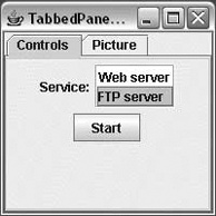
The following example shows how to create a JTabbedPane. It adds standard Swing components
to a tab named Controls. The second tab is filled with a scrollable image,
which was presented in the previous examples.
//file: TabbedPaneFrame.javaimportjava.awt.*;importjava.awt.event.*;importjavax.swing.*;importjavax.swing.border.*;publicclassTabbedPaneFrame{publicstaticvoidmain(String[]args){JFrameframe=newJFrame("TabbedPaneFrame");JTabbedPanetabby=newJTabbedPane();// create the controls paneJPanelcontrols=newJPanel();controls.add(newJLabel("Service:"));JListlist=newJList(newString[]{"Web server","FTP server"});list.setBorder(BorderFactory.createEtchedBorder());controls.add(list);controls.add(newJButton("Start"));// create an image paneStringfilename="Piazza di Spagna.jpg";JLabelimage=newJLabel(newImageIcon(filename));JComponentpicture=newJScrollPane(image);tabby.addTab("Controls",controls);tabby.addTab("Picture",picture);frame.getContentPane().add(tabby);frame.setSize(200,200);frame.setDefaultCloseOperation(JFrame.EXIT_ON_CLOSE);frame.setVisible(true);}}
The code isn’t especially fancy, but the result is an
impressive-looking user interface. The first tab is a JPanel that contains some other components,
including a JList with an etched
border. The second tab simply contains the JLabel with ImageIcon wrapped in a JScrollPane. The running example is shown in
Figure 17-11.
Our example has only two tabs and they fit quite easily, but in a
realistic application it is easy to run out of room. By default, when
there are too many tabs to display in a single row, JTabbedPane automatically wraps them into
additional rows. This behavior fits with the tab notion quite well, giving
the appearance of a filing cabinet, but it also necessitates that when you
select a tab from the back row, the tabs must be rearranged to bring the
selected tab to the foreground. Many users find this confusing, and it
violates a principal of user interface design that says that controls
should remain in the same location. Alternatively, you can configure the
tabbed pane to use a single, scrolling row of tabs by specifying a
scrolling tab layout policy like this:
setTabLayoutPolicy(JTabbedPane.SCROLL_TAB_LAYOUT);
Java 6 introduced the ability to add custom components to tabs. The
most common use of this capability is the addition of buttons on tabs for
functions such as close, info, tear away, etc. The following example
demonstrates how to use the new setTabComponentAt(int index, Component
component) method to add a close button on each tab.
//file: ClosableTabs.javaimportjavax.swing.*;importjava.awt.*;importjava.awt.event.*;publicclassClosableTabsextendsJTabbedPane{publicvoidaddTab(Stringtitle,Colorcolor){JPanelpane=newJPanel();pane.setBackground(color);intloc=getTabCount();insertTab(title,null,pane,null,loc);setTabComponentAt(loc,newTab(title));}publicstaticvoidmain(String[]args){SwingUtilities.invokeLater(newRunnable(){publicvoidrun(){JFrameframe=newJFrame("Closable Tabs");ClosableTabstabs=newClosableTabs();tabs.addTab("Blue",Color.BLUE);tabs.addTab("Green",Color.GREEN);tabs.addTab("Red",Color.RED);frame.add(tabs);frame.setDefaultCloseOperation(JFrame.EXIT_ON_CLOSE);frame.setSize(newDimension(300,150));frame.setLocationRelativeTo(null);frame.setVisible(true);}});}/*** The component used as a tab (i.e., the tab itself as opposed* to the content)*/privateclassTabextendsJPanel{publicTab(Stringtitle){super(newFlowLayout(FlowLayout.LEFT,0,0));setOpaque(false);// The tab's titleJLabellabel=newJLabel(title);// Creating a space to the right of the close buttonlabel.setBorder(BorderFactory.createEmptyBorder(0,0,0,2));add(label);// The tab's close buttonJButtonbutton=newCloseButton();add(button);// This is necessary for vertical alignment of the// tab's contentsetBorder(BorderFactory.createEmptyBorder(2,0,0,0));}privateclassCloseButtonextendsJButtonimplementsActionListener{publicCloseButton(){setPreferredSize(newDimension(17,17));setOpaque(false);setContentAreaFilled(false);setBorderPainted(false);setRolloverEnabled(true);setFocusable(false);addActionListener(this);}publicvoidactionPerformed(ActionEvente){inti=ClosableTabs.this.indexOfTabComponent(Tab.this);if(i!=-1){ClosableTabs.this.remove(i);}}protectedvoidpaintComponent(Graphicsg){Graphics2Dg2=(Graphics2D)g;g2.setStroke(newBasicStroke(2));// Show red on roll-overg2.setColor(Color.BLACK);if(getModel().isRollover()){g2.setColor(Color.RED);}// Paint the "X"intoffset=5;g2.drawLine(offset,offset,getWidth()-offset-1,getHeight()-offset-1);g2.drawLine(getWidth()-offset-1,offset,offset,getHeight()-offset-1);g2.dispose();}}}}